柱,线和饼(Column, Line and Pie)
以下是带有Column,Line和Pie的图表示例。
我们已经在Highcharts Configuration Syntax一章中看到了用于绘制图表的配置 。
下面给出具有Column,Line和Pie的组合图的示例。
配置 (Configurations)
现在让我们看一下所采取的其他配置/步骤。
系列 (series)
将图表类型配置为基于分散。 series.type决定图表的系列类型。 这里,默认值是“line”。
chart.addSeries(chart.createSeries()
   .setType(Type.COLUMN)
);
例子 (Example)
HelloWorld.java
package com.iowiki.client;
import org.moxieapps.gwt.highcharts.client.Chart;
import org.moxieapps.gwt.highcharts.client.LabelItem;
import org.moxieapps.gwt.highcharts.client.Point;
import org.moxieapps.gwt.highcharts.client.Series;
import org.moxieapps.gwt.highcharts.client.Style;
import org.moxieapps.gwt.highcharts.client.ToolTip;
import org.moxieapps.gwt.highcharts.client.ToolTipData;
import org.moxieapps.gwt.highcharts.client.ToolTipFormatter;
import org.moxieapps.gwt.highcharts.client.labels.DataLabels;
import org.moxieapps.gwt.highcharts.client.plotOptions.PiePlotOptions;
import com.google.gwt.core.client.EntryPoint;
import com.google.gwt.user.client.ui.RootPanel;
public class HelloWorld implements EntryPoint {
   public void onModuleLoad() {
      final Chart chart = new Chart()
         .setChartTitleText("Combination chart")
         .setToolTip(new ToolTip()
            .setFormatter(new ToolTipFormatter() {
               @Override
               public String format(ToolTipData toolTipData) {
                  String s;
                  if (toolTipData.getPointName() != null) { // the pie chart
                     s = toolTipData.getPointName() + ": " +
                     toolTipData.getYAsLong() + " fruits";
                  } else {
                     s = toolTipData.getXAsString() + ": " +
                     toolTipData.getYAsLong();
                  }
                  return s;
               }
            })
         )
         .setLabelItems(new  LabelItem()
            .setHtml("Total fruit consumption")
            .setStyle(new Style()
               .setLeft("40px")
               .setTop("8px")
               .setColor("black")
            )
         );
      chart.getXAxis()
         .setCategories("Apples", "Oranges", "Pears", "Bananas", "Plums");
      chart.addSeries(chart.createSeries()
         .setName("Jane")
         .setType(Series.Type.COLUMN)
         .setPoints(new Number[]{3, 2, 1, 3, 4})
      );
      chart.addSeries(chart.createSeries()
         .setName("John")
         .setType(Series.Type.COLUMN)
         .setPoints(new Number[]{2, 3, 5, 7, 6})
      );
      chart.addSeries(chart.createSeries()
         .setName("Joe")
         .setType(Series.Type.COLUMN)
         .setPoints(new Number[]{4, 3, 3, 9, 0})
      );
      chart.addSeries(chart.createSeries()
         .setName("Average")
         .setType(Series.Type.SPLINE)
         .setPoints(new Number[]{3, 2.67, 3, 6.33, 3.33})
      );
      chart.addSeries(chart.createSeries()
         .setName("Total consumption")
         .setType(Series.Type.PIE)
         .setPoints(new Point[]{
            new Point("Jane", 13),
            new Point("John", 23),
            new Point("Joe", 19)
         })
         .setPlotOptions(new PiePlotOptions()
            .setCenter(100, 80)
            .setSize(100)
            .setShowInLegend(false)
            .setDataLabels(new DataLabels()
               .setEnabled(false)
            )
         ));
      RootPanel.get().add(chart);
   }
}
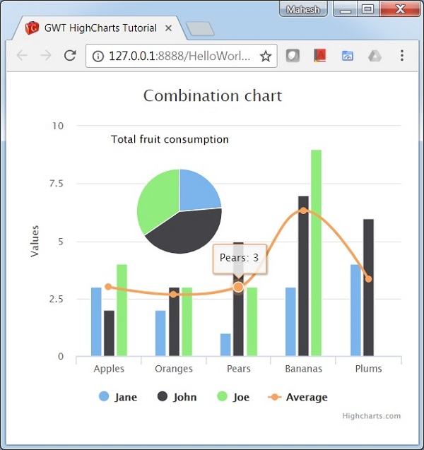
结果 (Result)
验证结果。