NumPy - Matplotlib( Matplotlib)
Matplotlib是Python的绘图库。 它与NumPy一起使用,为MatLab提供了一个有效的开源替代环境。 它也可以用于PyQt和wxPython等图形工具包。
Matplotlib模块最初由John D. Hunter编写。 自2012年以来,Michael Droettboom是首席开发人员。 目前,Matplotlib ver。 1.5.1是可用的稳定版本。 该软件包以二进制分发形式提供,也可在www.matplotlib.org上以源代码形式提供。
通常,通过添加以下语句将包导入Python脚本 -
from matplotlib import pyplot as plt
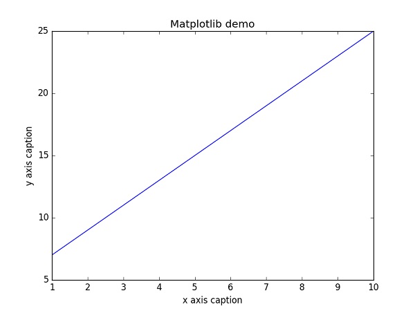
这里pyplot()是matplotlib库中最重要的函数,用于绘制2D数据。 以下脚本绘制了等式y = 2x + 5
例子 (Example)
import numpy as np
from matplotlib import pyplot as plt
x = np.arange(1,11)
y = 2 * x + 5
plt.title("Matplotlib demo")
plt.xlabel("x axis caption")
plt.ylabel("y axis caption")
plt.plot(x,y)
plt.show()
从np.arange() function创建ndarray对象x作为x axis的值。 y axis的相应值存储在另一个ndarray object y 。 使用matplotlib包的plotlot子模块的plot()函数绘制这些值。
图形表示由show()函数show() 。
上面的代码应该产生以下输出 -
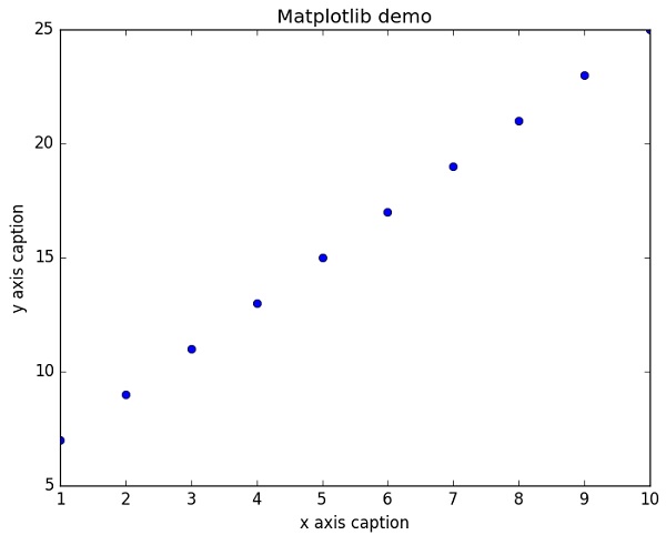
可以通过向plot()函数添加格式字符串来离散显示值,而不是线性图。 可以使用以下格式化字符。
| Sr.No. | 字符和描述 |
|---|---|
| 1 | '-' 实线风格 |
| 2 | '--' 虚线风格 |
| 3 | '-.' 短划线风格 |
| 4 | ':' 虚线样式 |
| 5 | '.' 点标记 |
| 6 | ',' 像素标记 |
| 7 | 'o' 圆形标记 |
| 8 | 'v' Triangle_down标记 |
| 9 | '^' Triangle_up标记 |
| 10 | '《' Triangle_left标记 |
| 11 | '》' Triangle_right标记 |
| 12 | '1' Tri_down标记 |
| 13 | '2' Tri_up标记 |
| 14 | '3' Tri_left标记 |
| 15 | '4' Tri_right标记 |
| 16 | 's' 方形标记 |
| 17 | 'p' 五角大楼标记 |
| 18 | '*' 明星标记 |
| 19 | 'h' Hexagon1标记 |
| 20 | 'H' Hexagon2标记 |
| 21 | '+' 再加上标记 |
| 22 | 'x' X标记 |
| 23 | 'D' 钻石标记 |
| 24 | 'd' Thin_diamond标记 |
| 25 | '|' Vline标记 |
| 26 | '_' Hline标记 |
还定义了以下颜色缩写。
| 字符 | 颜色 |
|---|---|
| 'b' | Blue |
| 'g' | Green |
| 'r' | Red |
| 'c' | Cyan |
| 'm' | Magenta |
| 'y' | Yellow |
| 'k' | Black |
| 'w' | White |
要显示表示点的圆,而不是上例中的线,请使用“ob”作为plot()函数中的格式字符串。
例子 (Example)
import numpy as np
from matplotlib import pyplot as plt
x = np.arange(1,11)
y = 2 * x + 5
plt.title("Matplotlib demo")
plt.xlabel("x axis caption")
plt.ylabel("y axis caption")
plt.plot(x,y,"ob")
plt.show()
上面的代码应该产生以下输出 -
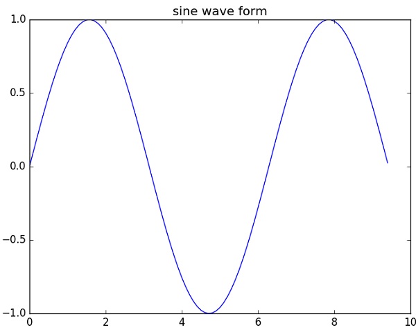
正弦波图
以下脚本使用matplotlib生成sine wave plot 。
例子 (Example)
import numpy as np
import matplotlib.pyplot as plt
# Compute the x and y coordinates for points on a sine curve
x = np.arange(0, 3 * np.pi, 0.1)
y = np.sin(x)
plt.title("sine wave form")
# Plot the points using matplotlib
plt.plot(x, y)
plt.show()
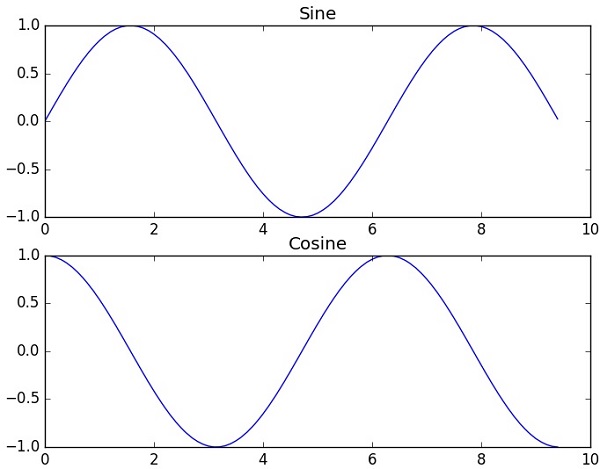
subplot()
subplot()函数允许您在同一图中绘制不同的东西。 在以下脚本中,绘制了sine和cosine values 。
例子 (Example)
import numpy as np
import matplotlib.pyplot as plt
# Compute the x and y coordinates for points on sine and cosine curves
x = np.arange(0, 3 * np.pi, 0.1)
y_sin = np.sin(x)
y_cos = np.cos(x)
# Set up a subplot grid that has height 2 and width 1,
# and set the first such subplot as active.
plt.subplot(2, 1, 1)
# Make the first plot
plt.plot(x, y_sin)
plt.title('Sine')
# Set the second subplot as active, and make the second plot.
plt.subplot(2, 1, 2)
plt.plot(x, y_cos)
plt.title('Cosine')
# Show the figure.
plt.show()
上面的代码应该产生以下输出 -
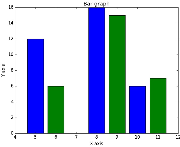
bar()
pyplot submodule提供bar()函数来生成条形图。 以下示例生成两组x和y数组的条形图。
例子 (Example)
from matplotlib import pyplot as plt
x = [5,8,10]
y = [12,16,6]
x2 = [6,9,11]
y2 = [6,15,7]
plt.bar(x, y, align = 'center')
plt.bar(x2, y2, color = 'g', align = 'center')
plt.title('Bar graph')
plt.ylabel('Y axis')
plt.xlabel('X axis')
plt.show()
此代码应产生以下输出 -