Column Range
以下是使用范围的柱形图的示例。
我们已经在Highcharts Configuration Syntax一章中看到了用于绘制图表的配置 。
下面给出使用范围的柱形图的示例。
配置 (Configurations)
现在让我们看看其他配置。
图表
将图表类型配置为“列范围”。 chart.type决定图表的系列类型。 默认值为“line”。
chart.setType(Type.COLUMN_RANGE)
例子 (Example)
HelloWorld.java
package com.iowiki.client;
import org.moxieapps.gwt.highcharts.client.Chart;
import org.moxieapps.gwt.highcharts.client.Legend;
import org.moxieapps.gwt.highcharts.client.Series.Type;
import org.moxieapps.gwt.highcharts.client.Style;
import org.moxieapps.gwt.highcharts.client.ToolTip;
import org.moxieapps.gwt.highcharts.client.labels.DataLabels;
import org.moxieapps.gwt.highcharts.client.labels.DataLabelsData;
import org.moxieapps.gwt.highcharts.client.labels.DataLabelsFormatter;
import org.moxieapps.gwt.highcharts.client.labels.Labels.Align;
import org.moxieapps.gwt.highcharts.client.labels.XAxisLabels;
import org.moxieapps.gwt.highcharts.client.plotOptions.ColumnRangePlotOptions;
import com.google.gwt.core.client.EntryPoint;
import com.google.gwt.i18n.client.NumberFormat;
import com.google.gwt.user.client.ui.RootPanel;
public class HelloWorld implements EntryPoint {
   public void onModuleLoad() {
      final Chart chart = new Chart()
         .setType(Type.COLUMN_RANGE)
         .setChartTitleText("Temperature variation by month")
         .setChartSubtitleText("Observed in Vik i Sogn, Norway, 2009")
         .setInverted(true)
         .setLegend(new Legend()
            .setEnabled(false)
         )
         .setToolTip(new ToolTip()
            .setValueSuffix("°C")
         )
         .setColumnRangePlotOptions(new ColumnRangePlotOptions()
            .setDataLabels(new DataLabels()
               .setEnabled(true)
               .setY(0)
               .setFormatter(new DataLabelsFormatter() {
                  @Override
                  public String format(DataLabelsData dataLabelsData) {
                     return NumberFormat.getFormat("0.0").format(dataLabelsData.getYAsDouble()) + " °C";
                  }
               })
            )
         );
         chart.getXAxis()
            .setCategories("Jan", "Feb", "Mar", "Apr", "May", "Jun", "Jul", "Aug", "Sep", "Oct", "Nov", "Dec"
         )
         .setLabels(new XAxisLabels()
            .setRotation(-45)
            .setAlign(Align.RIGHT)
            .setStyle(new Style()
               .setFont("normal 13px Verdana, sans-serif")
            )
         );
         chart.getYAxis()
            .setMin(0)
            .setAxisTitleText("Temperature ( °C )");
         chart.addSeries(chart.createSeries()
            .setName("Temperatures")
            .setPoints(new Number[][]{
               {-9.7, 9.4},
               {-8.7, 6.5},
               {-3.5, 9.4},
               {-1.4, 19.9},
               {0.0, 22.6},
               {2.9, 29.5},
               {9.2, 30.7},
               {7.3, 26.5},
               {4.4, 18.0},
               {-3.1, 11.4},
               {-5.2, 10.4},
               {-13.5, 9.8}
            })
         );
      RootPanel.get().add(chart);
   }
}
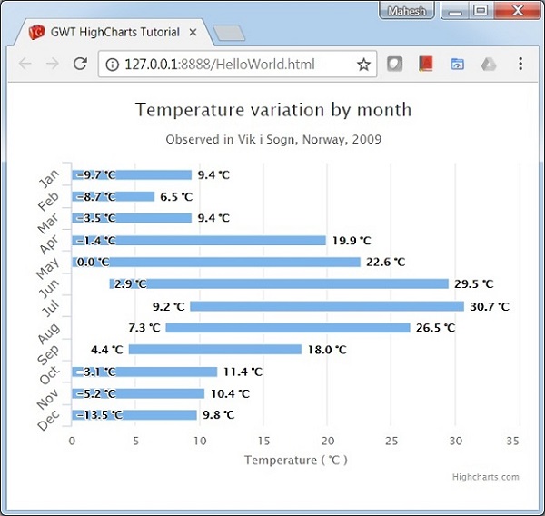
结果 (Result)
验证结果。