Bootstrap - 快速指南
什么是Twitter Bootstrap?
Bootstrap是一个时尚,直观,功能强大的移动第一前端框架,可以更快,更轻松地进行Web开发。 它使用HTML,CSS和Javascript。
历史 (History)
Bootstrap由Mark Otto和Jacob Thornton在Twitter 。 它于2011年8月在GitHub上作为开源产品发布。
为什么要使用Bootstrap?
Mobile first approach - Bootstrap 3,框架由整个库中的Mobile第一个样式组成,而不是在单独的文件中。
Browser Support - 所有流行的浏览Browser Support它。

Easy to get started - 只需掌握HTML和CSS的知识,任何人都可以开始使用Bootstrap。 Bootstrap官方网站也有很好的文档。
Responsive design - Bootstrap的响应式CSS适应桌面,平板电脑和手机。 有关响应式设计的更多信息,请参阅Bootstrap响应式设计一章。

为开发人员构建界面提供干净,统一的解决方案。
它包含美观和功能强大的内置组件,易于定制。
它还提供基于Web的自定义。
最重要的是它是一个开源的。
Bootstrap套件包含哪些内容?
Scaffolding - Bootstrap提供了一个基本结构,包括网格系统,链接样式和背景。 Bootstrap Basic Structure一节中详细介绍了这一点
CSS - Bootstrap具有全局CSS设置功能,基本HTML元素,可扩展类的样式和增强,以及高级网格系统。 Bootstrap with CSS一节中详细介绍了这一点。
Components - Bootstrap包含十几个可重用的组件,用于提供图标,下拉,导航,警报,弹出窗口等等。 Layout Components部分对此进行了详细介绍。
JavaScript Plugins - Bootstrap包含十几个自定义jQuery插件。 您可以轻松地将它们全部或逐个包含在内。 Bootstrap Plugins部分详细介绍了这一点。
Customize - 您可以自定义Bootstrap的组件,LESS变量和jQuery插件,以获得您自己的版本。
Bootstrap - Environment Setup
Try it Option Online
我们已经在线设置了Bootstrap环境,因此您可以在线执行所有可用的示例。 它让您对正在阅读的内容充满信心,并使您能够使用不同的选项验证程序。 随意修改任何示例并在线执行。
使用CodingGround提供的在线编译器尝试以下示例
<!DOCTYPE html> <html lang = "en"> <head> <meta charset = "utf-8"> <meta http-equiv = "X-UA-Compatible" content = "IE = edge"> <meta name = "viewport" content = "width = device-width, initial-scale = 1"> <title>Bootstrap 101 Template</title> <!-- Bootstrap --> <link href = "//maxcdn.bootstrapcdn.com/bootstrap/3.3.1/css/bootstrap.min.css" rel = "stylesheet"> <!-- HTML5 shim and Respond.js for IE8 support of HTML5 elements and media queries --> <!-- WARNING: Respond.js doesn't work if you view the page via file:// --> <!--[if lt IE 9]> <script src = "https://oss.maxcdn.com/html5shiv/3.7.2/html5shiv.min.js"></script> <script src = "https://oss.maxcdn.com/respond/1.4.2/respond.min.js"></script> <![endif]--> </head> <body> <h1>Hello, world!</h1> <!-- jQuery (necessary for Bootstrap's JavaScript plugins) --> <script src = "https://ajax.googleapis.com/ajax/libs/jquery/1.11.1/jquery.min.js"></script> <!-- Include all compiled plugins (below), or include individual files as needed --> <script src = "//maxcdn.bootstrapcdn.com/bootstrap/3.3.1/js/bootstrap.min.js"></script> </body> </html>对于本教程中给出的大多数示例,您可以在右上角的网站代码部分找到Try it选项,它将带您进入在线编译器。 所以,只要利用它,享受你的学习。
设置和开始使用Bootstrap非常容易。 本章将介绍如何下载和设置Bootstrap。 我们还将讨论Bootstrap文件结构,并通过示例演示其用法。
下载Bootstrap
您可以从http://getbootstrap.com/下载最新版本的Bootstrap。 当您点击此链接时,您将看到如下屏幕 -
在这里你可以看到两个按钮 -
Download Bootstrap - 单击此按钮,您可以下载Bootstrap CSS,JavaScript和字体的预编译和缩小版本。 不包含任何文档或原始源代码文件。
Download Source - 点击此链接,您可以直接从GitHub获取最新的Bootstrap LESS和JavaScript源代码。
如果使用Bootstrap的未编译源代码,则需要编译LESS文件以生成可用的CSS文件。 为了将LESS文件编译成CSS,Bootstrap官方只支持Recess ,这是Twitter的基于less.js的CSS hinter。
为了更好地理解和易用,我们将在整个教程中使用Bootstrap的预编译版本。 随着文件的编译和缩小,您不必每次都为单个功能包含单独的文件而烦恼。 在编写本教程时,下载了最新版本(Bootstrap 3)。
文件结构
预编译的Bootstrap
下载编译版本的Bootstrap后,解压缩ZIP文件,您将看到以下文件/目录结构 -
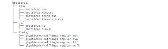
如您所见,有编译的CSS和JS(bootstrap。*),以及编译和缩小的CSS和JS(bootstrap.min。*)。 包含Glyphicons的字体,因为它是可选的Bootstrap主题。
Bootstrap源代码
如果您已下载Bootstrap源代码,则文件结构如下 -
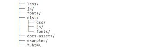
less/ , js/和fonts/下的文件是Bootstrap CSS,JS和图标字体(分别)的源代码。
dist/文件夹包含上面预编译下载部分中列出的所有内容。
docs-assets/ , examples/和所有*.html文件都是Bootstrap文档。
HTML模板
使用Bootstrap的基本HTML模板如下所示 -
<!DOCTYPE html>
<html>
   <head>
      <title>Bootstrap 101 Template</title>
      <meta name = "viewport" content = "width = device-width, initial-scale = 1.0">
      <!-- Bootstrap -->
      <link href = "css/bootstrap.min.css" rel = "stylesheet">
      <!-- HTML5 Shim and Respond.js IE8 support of HTML5 elements and media queries -->
      <!-- WARNING: Respond.js doesn't work if you view the page via file:// -->
      <!--[if lt IE 9]>
      <script src = "https://oss.maxcdn.com/libs/html5shiv/3.7.0/html5shiv.js"></script>
      <script src = "https://oss.maxcdn.com/libs/respond.js/1.3.0/respond.min.js"></script>
      <![endif]-->
   </head>
   <body>
      <h1>Hello, world!</h1>
      <!-- jQuery (necessary for Bootstrap's JavaScript plugins) -->
      <script src = "https://code.jquery.com/jquery.js"></script>
      <!-- Include all compiled plugins (below), or include individual files as needed -->
      <script src = "js/bootstrap.min.js"></script>
   </body>
</html>
在这里,您可以看到包含的jquery.js , bootstrap.min.js和bootstrap.min.css文件,以便为Bootstrapped模板生成正常的HTM文件。 在包含Bootstrap库之前,请确保包含jQuery库。
有关上述代码中每个元素的更多详细信息,请参阅Bootstrap CSS概述一章。
此模板结构已作为Try it (在线编译器)工具的一部分包含在内。 因此,在本教程的所有示例(在以下章节中)中,您将只看到元素的内容。 单击示例右上角的“ Try it选项后,您将看到整个代码。
例子 (Example)
现在让我们使用上面的模板尝试一个例子。 使用我们网站上面示例代码框右上角的“试用”选项,尝试以下示例 -
<h1>Hello, world!</h1>
在随后的所有章节中,我们使用了网站http://www.lipsum.com/虚拟文本。
Bootstrap - Grid System
在本章中,我们将讨论Bootstrap网格系统。
什么是网格?
由wikepedia提出 -
在图形设计中,网格是一种结构(通常是二维的),由一系列用于构造内容的交叉直(垂直,水平)线组成。 它广泛用于设计印刷设计中的布局和内容结构。 在网页设计中,使用HTML和CSS快速有效地创建一致的布局是一种非常有效的方法。
简而言之,网页设计中的网格组织和构建内容,使网站易于扫描,减少用户的认知负担。
什么是Bootstrap网格系统?
正如网状系统Bootstrap官方文档所述 -
Bootstrap包括一个响应式移动第一流体网格系统,随着设备或视口大小的增加,可以适当地扩展到12列。 它包括用于简单布局选项的预定义类,以及用于生成更多语义布局的强大混合。
让我们理解上面的陈述。 Bootstrap 3首先是移动的,因为Bootstrap的代码现在通过定位较小的屏幕(如移动设备,平板电脑)开始,然后“扩展”组件和网格,用于更大的屏幕,如笔记本电脑,台式机。
移动优先战略
Content
- 确定最重要的是什么。
Layout
- 首先设计为较小的宽度。
- 基本CSS地址移动设备首先; 平板电脑,台式机的媒体查询地址。
Progressive Enhancement
- 随着屏幕尺寸的增加添加元素。
Bootstrap网格系统的工作
网格系统用于通过一系列容纳内容的行和列来创建页面布局。 以下是Bootstrap网格系统的工作原理 -
必须将行放在.container类中以进行正确的对齐和填充。
使用行创建水平的列组。
内容应放在列中,只有列可能是行的直接子项。
预定义的网格类(如.row and .col-xs-4可用于快速制作网格布局。 LESS mixins也可用于更多语义布局。
列通过填充创建排水沟(列内容之间的间隙)。 该填充通过.rows上的负边距在第一列和最后一列的行中偏移。
通过指定要跨越的十二个可用列的数量来创建网格列。 例如,三个相等的列将使用三个.col-xs-4 。
媒体查询
媒体查询是“条件CSS规则”的一个非常奇特的术语。 它只是根据提出的某些条件应用一些CSS。 如果满足这些条件,则应用样式。
Bootstrap中的媒体查询允许您根据视口大小移动,显示和隐藏内容。 以下媒体查询在LESS文件中用于在Bootstrap网格系统中创建关键断点。
/* Extra small devices (phones, less than 768px) */
/* No media query since this is the default in Bootstrap */
/* Small devices (tablets, 768px and up) */
@media (min-width: @screen-sm-min) { ... }
/* Medium devices (desktops, 992px and up) */
@media (min-width: @screen-md-min) { ... }
/* Large devices (large desktops, 1200px and up) */
@media (min-width: @screen-lg-min) { ... }
有时,这些扩展为包括max-width以将CSS限制为更窄的设备集。
@media (max-width: @screen-xs-max) { ... }
@media (min-width: @screen-sm-min) and (max-width: @screen-sm-max) { ... }
@media (min-width: @screen-md-min) and (max-width: @screen-md-max) { ... }
@media (min-width: @screen-lg-min) { ... }
媒体查询有两部分,一个是设备规范,另一个是规则规则。 在上述情况下,设置以下规则 -
让我们考虑一下这条线 -
@media (min-width: @screen-sm-min) and (max-width: @screen-sm-max) { ... }
对于所有设备,无论min-width: @screen-sm-min是什么类型min-width: @screen-sm-min如果屏幕宽度小于@screen-sm-max , then do something 。
网格选项
下表总结了Bootstrap网格系统如何跨多个设备工作的各个方面 -
| 超小型设备手机(<768px) | 小型设备平板电脑(≥768px) | 中型设备台式机(≥992px) | 大型设备台式机(≥1200px) | |
|---|---|---|---|---|
| 网格行为 | 始终水平 | 倒塌开始,水平在断点之上 | 倒塌开始,水平在断点之上 | 倒塌开始,水平在断点之上 |
| 最大容器宽度 | 无(自动) | 750px | 970px | 1170px |
| 类前缀 | .col-xs- | .col-sm- | .col-md- | .col-lg- |
| 列数 | 12 | 12 | 12 | 12 |
| 最大列宽 | Auto | 60px | 78px | 95px |
| 天沟宽度 | 30PX (每列15px) | 30PX (每列15px) | 30PX (每列15px) | 30PX (每列15px) |
| Nestable | Yes | Yes | Yes | Yes |
| Offsets | Yes | Yes | Yes | Yes |
| 列排序 | Yes | Yes | Yes | Yes |
基本网格结构
以下是Bootstrap网格的基本结构 -
<div class = "container">
   <div class = "row">
      <div class = "col-*-*"></div>
      <div class = "col-*-*"></div>
   </div>
   <div class = "row">...</div>
</div>
<div class = "container">
   ....
</div>
让我们看一些简单的网格示例 -
响应列重置
有了四层可用的网格,你必然遇到一些问题,在某些断点处,列不能很清楚,因为一个高于另一个。 要解决此问题,请使用类.clearfix和响应实用程序类的组合,如以下示例所示 -
<div class = "container">
   <div class = "row" >
      <div class = "col-xs-6 col-sm-3" style = "background-color: #dedef8;
         box-shadow: inset 1px -1px 1px #444, inset -1px 1px 1px #444;">
         <p>Lorem ipsum dolor sit amet, consectetur adipisicing elit.</p>
      </div>
      <div class = "col-xs-6 col-sm-3" style = "background-color: #dedef8;
         box-shadow: inset 1px -1px 1px #444, inset -1px 1px 1px #444;">
         <p>Lorem ipsum dolor sit amet, consectetur adipisicing elit, sed do
            eiusmod tempor incididunt ut labore et dolore magna aliqua. Ut
            enim ad minim veniam, quis nostrud exercitation ullamco laboris
            nisi ut aliquip ex ea commodo consequat.</p>
         <p>Lorem ipsum dolor sit amet, consectetur adipisicing elit, sed do
            eiusmod tempor incididunt ut.</p>
      </div>
      <div class = "clearfix visible-xs"></div>
      <div class = "col-xs-6 col-sm-3" style = "background-color: #dedef8;
         box-shadow: inset 1px -1px 1px #444, inset -1px 1px 1px #444;">
         <p>Ut enim ad minim veniam, quis nostrud exercitation ullamco
            laboris nisi ut aliquip ex ea commodo consequat.</p>
      </div>
      <div class = "col-xs-6 col-sm-3" style = "background-color: #dedef8;
         box-shadow: inset 1px -1px 1px #444, inset -1px 1px 1px #444;">
         <p>Lorem ipsum dolor sit amet, consectetur adipisicing elit, sed do
            eiusmod tempor incididunt ut labore et dolore magna aliqua. Ut
            enim ad minim</p>
      </div>
   </div>
</div>
这将产生以下结果 -
新页面打开调整视口大小或在手机上查看,以获得此示例的预期效果。
偏移列
偏移是更专业布局的有用功能。 它们可用于推动柱子以获得更多间距(例如)。 .col-xs = *类不支持偏移,但可以使用空单元格轻松复制它们。
要在大型显示器上使用偏移,请使用.offset-md-* class类。 这些类将列的左边距增加*列,其中*范围从1到11 。
在下面的例子中,我们有
<div class = "container">
   <h1>Hello, world!</h1>
   <div class = "row" >
      <div class = "col-xs-6 col-md-offset-3" style = "background-color: #dedef8;
         box-shadow: inset 1px -1px 1px #444, inset -1px 1px 1px #444;">
         <p>Lorem ipsum dolor sit amet, consectetur adipisicing elit.</p>
      </div>
   </div>
</div>
这将产生以下结果 -
新页面打开嵌套列
要使用默认网格嵌套内容,请在现有.col-md-*列中添加新的.row和.col-md-*列。 嵌套行应包含一组最多为12的列。
在下面的示例中,布局有两列,第二列分为两行中的四个框。
<div class = "container">
   <h1>Hello, world!</h1>
   <div class = "row">
      <div class = "col-md-3" style = "background-color: #dedef8;
         box-shadow: inset 1px -1px 1px #444, inset -1px 1px 1px #444;">
         <h4>First Column</h4>
         <p>Lorem ipsum dolor sit amet, consectetur adipisicing elit.</p>
      </div>
      <div class = "col-md-9" style = "background-color: #dedef8;
         box-shadow: inset 1px -1px 1px #444, inset -1px 1px 1px #444;">
         <h4>Second Column- Split into 4 boxes</h4>
         <div class = "row">
            <div class = "col-md-6" style = "background-color: #B18904;
               box-shadow: inset 1px -1px 1px #444, inset -1px 1px 1px #444;">
               <p>Consectetur art party Tonx culpa semiotics.
                  Pinterest assumenda minim organic quis.</p>
            </div>
            <div class = "col-md-6" style = "background-color: #B18904;
               box-shadow: inset 1px -1px 1px #444, inset -1px 1px 1px #444;">
               <p>sed do eiusmod tempor incididunt ut labore et dolore magna
                  aliqua. Ut enim ad minim veniam, quis nostrud exercitation
                  ullamco laboris nisi ut aliquip ex ea commodo consequat.</p>
            </div>
         </div>
         <div class = "row">
            <div class = "col-md-6" style = "background-color: #B18904;
               box-shadow: inset 1px -1px 1px #444, inset -1px 1px 1px #444;">
               <p>quis nostrud exercitation ullamco laboris nisi ut aliquip
                  ex ea commodo consequat.</p>
            </div>
            <div class = "col-md-6" style = "background-color: #B18904;
               box-shadow: inset 1px -1px 1px #444, inset -1px 1px 1px #444;">
               <p>Lorem ipsum dolor sit amet, consectetur adipisicing elit,
                  sed do eiusmod tempor incididunt ut labore et dolore magna
                  aliqua. Ut enim ad minim.</p>
            </div>
         </div>
      </div>
   </div>
</div>
这将产生以下结果 -
新页面打开列订购
Bootstrap网格系统的另一个不错的功能是,您可以轻松地按顺序编写列,并在另一个列中显示它们。 您可以使用.col-md-push-*和.col-md-pull-*修饰符类轻松更改内置网格列的顺序,其中*范围为1到11 。
在下面的示例中,我们有两列布局,左列是最窄的,并充当侧边栏。 我们将使用.col-md-push-*和.col-md-pull-*类来交换这些列的顺序。
<div class = "container">
   <h1>Hello, world!</h1>
   <div class = "row">
      <p>Before Ordering</p>
      <div class = "col-md-4" style = "background-color: #dedef8;
         box-shadow: inset 1px -1px 1px #444, inset -1px 1px 1px #444;">
         I am on left
      </div>
      <div class = "col-md-8" style = "background-color: #dedef8;
         box-shadow: inset 1px -1px 1px #444, inset -1px 1px 1px #444;">
         I am on right
      </div>
   </div>
   <br>
   <div class = "row">
      <p>After Ordering</p>
      <div class = "col-md-4 col-md-push-8" style = "background-color: #dedef8;
         box-shadow: inset 1px -1px 1px #444, inset -1px 1px 1px #444;">
         I was on left
      </div>
      <div class = "col-md-8 col-md-pull-4" style = "background-color: #dedef8;
         box-shadow: inset 1px -1px 1px #444, inset -1px 1px 1px #444;">
         I was on right
      </div>
   </div>
</div>
这将产生以下结果 -
新页面打开Bootstrap - CSS Overview
本章概述了Bootstrap基础架构的关键部分,包括Bootstrap实现更好,更快,更强大的Web开发的方法。
HTML5 doctype
Bootstrap使用某些HTML元素和需要使用HTML5 doctype的CSS属性。 因此,在使用Bootstrap的所有项目的开头包含HTML5 doctype的下面一段代码。
<!DOCTYPE html>
<html>
   ....
</html>
移动优先
自从Bootstrap 3推出以来,Bootstrap已经成为首个移动设备。 这意味着可以在整个库中找到“移动优先”样式,而不是在单独的文件中找到它们。 您需要将viewport meta tag到《head》元素,以确保在移动设备上正确呈现和触摸缩放。
<meta name = "viewport" content = "width = device-width, initial-scale = 1.0">
width属性控制设备的宽度。 将其设置为device-width将确保它正确地在各种设备(移动设备,台式机,平板电脑......)上呈现。
initial-scale = 1.0确保在加载时,您的网页将以1:1的比例呈现,并且不会开箱即可进行缩放。
将user-scalable = no添加到content属性以禁用移动设备上的缩放功能,如下所示。 用户只能滚动而不能使用此更改进行缩放,从而使您的网站感觉更像本机应用程序。
<meta name = "viewport" content = "width = device-width, initial-scale = 1.0, maximum-scale = 1.0, user-scalable = no">
通常, maximum-scale = 1.0与user-scalable = no一起使用。 如上所述, user-scalable = no可能会为用户提供更像本机应用程序的体验,因此Bootstrap不建议使用此属性。
反应性的影像
Bootstrap 3允许您通过添加类“ .img-responsive 《img》标记来使图像响应。 此类适用于max-width: 100%; 和height: auto; 到图像,以便它很好地缩放到父元素。
<img src = "..." class = "img-responsive" alt = "Responsive image">
排版和链接
Bootstrap设置基本的全局显示(背景),排版和链接样式 -
Basic Global display - 设置background-color: #fff; 在《body》元素上。
Typography - 使用@font-family-base , @font-size-base和@line-height-base属性作为排版基础。
Link styles - 通过属性@link-color设置全局链接颜色,并仅在:hover应用链接下划线:hover 。
如果您打算使用LESS代码,您可以在scaffolding.less找到所有这些代码。
标准化(Normalize)
Bootstrap使用Normalize来建立跨浏览器的一致性。
Normalize.css是CSS重置的现代HTML5替代品。 它是一个小型CSS文件,可在HTML元素的默认样式中提供更好的跨浏览器一致性。
容器(Containers)
使用类.container来包装页面的内容并轻松地将内容.container ,如下所示。
<div class = "container">
   ...
</div>
看一下bootstrap.css文件中的.container类 -
.container {
   padding-right: 15px;
   padding-left: 15px;
   margin-right: auto;
   margin-left: auto;
}
请注意,由于填充和固定宽度,容器默认情况下不可嵌套。
看一下bootstrap.css文件 -
@media (min-width: 768px) {
   .container {
      width: 750px;
   }
}
在这里你可以看到CSS有width容器的媒体查询。 这有助于应用响应性,并且在容器类中相应地修改容器类以正确地呈现网格系统。
Bootstrap - Typography
Bootstrap在其默认字体堆栈中使用Helvetica Neue,Helvetica,Arial和sans-serif。 使用Bootstrap的排版功能,您可以创建标题,段落,列表和其他内联元素。 让我们看看以下各节中的每一个。
Headings
所有HTML标题(h1到h6)都在Bootstrap中设置样式。 一个例子如下所示 -
<h1>I'm Heading1 h1</h1>
<h2>I'm Heading2 h2</h2>
<h3>I'm Heading3 h3</h3>
<h4>I'm Heading4 h4</h4>
<h5>I'm Heading5 h5</h5>
<h6>I'm Heading6 h6</h6>
使用Bootstrap的上述代码段将产生以下结果 -
新页面打开内联副标题
要为任何标题添加内联子标题,只需在任何元素周围添加或添加.small类,您将获得更浅的文本,如下例所示 -
<h1>I'm Heading1 h1. <small>I'm secondary Heading1 h1</small></h1>
<h2>I'm Heading2 h2. <small>I'm secondary Heading2 h2</small></h2>
<h3>I'm Heading3 h3. <small>I'm secondary Heading3 h3</small></h3>
<h4>I'm Heading4 h4. <small>I'm secondary Heading4 h4</small></h4>
<h5>I'm Heading5 h5. <small>I'm secondary Heading5 h5</small></h5>
<h6>I'm Heading6 h6. <small>I'm secondary Heading1 h6</small></h6>
使用Bootstrap的上述代码段将产生以下结果 -
新页面打开铅体复印件
要为段落添加一些重点,请添加class =“lead”。 这将为您提供更大的字体,更轻的重量和更高的线高,如下例所示 -
<h2>Lead Example</h2>
<p class = "lead">This is an example paragraph demonstrating
   the use of lead body copy. This is an example paragraph
   demonstrating the use of lead body copy.This is an example
   paragraph demonstrating the use of lead body copy.This is an
   example paragraph demonstrating the use of lead body copy.
   This is an example paragraph demonstrating the use of lead body copy.</p>
Emphasis
HTML的默认强调标记(例如)将文本设置为父级大小的85%,强调具有较重字体权重的文本,强调斜体文本。
Bootstrap提供了一些可用于强调文本的类,如以下示例所示 -
<small>This content is within tag</small><br>
<strong>This content is within tag</strong><br>
<em>This content is within tag and is rendered as italics</em><br>
<p class = "text-left">Left aligned text.</p>
<p class = "text-center">Center aligned text.</p>
<p class = "text-right">Right aligned text.</p>
<p class = "text-muted">This content is muted</p>
<p class = "text-primary">This content carries a primary class</p>
<p class = "text-success">This content carries a success class</p>
<p class = "text-info">This content carries a info class</p>
<p class = "text-warning">This content carries a warning class</p>
<p class = "text-danger">This content carries a danger class</p>
缩写(Abbreviations)
HTML 元素为缩写或首字母缩略词提供标记,如WWW或HTTP。 Bootstrap样式元素,底部带有浅色虚线边框,并在悬停时显示全文(只要将该文本添加到 title属性)。 要获得稍小的字体大小,请将.initialism添加到。
<abbr title = "World Wide Web">WWW</abbr><br>
<abbr title = "Real Simple Syndication" class = "initialism">RSS</abbr>
Addresses
使用
标记可以在网页上显示联系信息。 由于默认显示:block; 你需要使用用于向包含的地址文本添加换行符的标记。
<address>
   <strong>Some Company, Inc.</strong><br>
   007 street<br>
   Some City, State XXXXX<br>
   <abbr title = "Phone">P:</abbr> (123) 456-7890
</address>
<address>
   <strong>Full Name</strong><br>
   <a href = "mailto:#">mailto@somedomain.com</a>
</address>
Blockquotes (Blockquotes)
您可以在任何HTML文本周围使用默认的
。其他选项包括添加标签以识别引用源并使用类.pull-right对齐blockquote。 以下示例演示了所有这些功能 -
<blockquote>
   <p>This is a default blockquote example. This is a default
      blockquote example. This is a default blockquote
      example.This is a default blockquote example. This is a
      default blockquote example.</p>
</blockquote>
<blockquote>
   This is a blockquote with a source title.
   <small>Someone famous in <cite title = "Source Title">Source Title</cite></small>
</blockquote>
<blockquote class = "pull-right">This is a blockquote aligned to the right.
   <small>Someone famous in <cite title = "Source Title">Source Title</cite></small>
</blockquote>
Lists
Bootstrap支持有序列表,无序列表和定义列表。
Ordered lists - 有序列表是按照某种顺序排列的列表,以数字开头。
Unordered lists - 无序列表是一个没有任何特定顺序的列表,传统上使用项目符号进行样式设置。 如果您不希望显示项目符号,则可以使用.list-unstyled类删除样式。 您还可以使用.list-inline类将所有列表项放在一行中。
Definition lists - 在这种类型的列表中,每个列表项都可以包含“dt”和“dd”元素。 “dt”代表definition term ,并且像字典一样,这是正在定义的术语(或短语)。 随后,“dd”是“dt”的定义。 您可以使用dl-horizontal类将“dl”中的术语和描述并排dl-horizontal 。
以下示例演示了这些类型中的每一种 -
<h4>Example of Ordered List</h4>
<ol>
   <li>Item 1</li>
   <li>Item 2</li>
   <li>Item 3</li>
   <li>Item 4</li>
</ol>
<h4>Example of UnOrdered List</h4>
<ul>
   <li>Item 1</li>
   <li>Item 2</li>
   <li>Item 3</li>
   <li>Item 4</li>
</ul>
<h4>Example of Unstyled List</h4>
<ul class = "list-unstyled">
   <li>Item 1</li>
   <li>Item 2</li>
   <li>Item 3</li>
   <li>Item 4</li>
</ul>
<h4>Example of Inline List</h4>
<ul class = "list-inline">
   <li>Item 1</li>
   <li>Item 2</li>
   <li>Item 3</li>
   <li>Item 4</li>
</ul>
<h4>Example of Definition List</h4>
<dl>
   <dt>Description 1</dt>
   <dd>Item 1</dd>
   <dt>Description 2</dt>
   <dd>Item 2</dd>
</dl>
<h4>Example of Horizontal Definition List</h4>
<dl class = "dl-horizontal">
   <dt>Description 1</dt>
   <dd>Item 1</dd>
   <dt>Description 2</dt>
   <dd>Item 2</dd>
</dl>
Bootstrap - Code
Bootstrap允许您使用两种不同的键方式显示代码 -
code第一个是标签。 如果要以内联方式显示代码,则应使用标记code。
第二个是pre标签。如果代码需要显示为独立的块元素,或者如果它有多行,那么您应该使用pre标记。
确保在使用pre和code标记时,使用unicode变体作为开始和结束标记 - < 和> 。
我们来看下面的例子 -
<p><code><header></code> is wrapped as an inline element.</p>
<p>To display code as a standalone block element use <pre> tag as:</p>
<pre>
   <article>
      <h1>Article Heading</h1>
   </article>
</pre>
Bootstrap - Tables
Bootstrap为构建表提供了一个干净的布局。 Bootstrap支持的一些表元素是 -
| 标签 | 描述 |
|---|---|
| <table> | 用于以表格格式显示数据的包装元素 |
| <thead> | 表标题行(tr)的容器元素,用于标记表列。 |
| <tbody> | 表格主体中的表行(tr)的容器元素。 |
| <tr> | 显示在单行上的一组表格单元格(td或th)的容器元素。 |
| <td> | 默认表格单元格。 |
| <th> | 列(或行,取决于范围和位置)标签的特殊表格单元格。 必须在 thead中使用 |
| <caption> | 表格的描述或摘要。 |
基本表
如果你想要一个漂亮的基本表格样式,只需要一些轻量级填充和水平分隔,可以将.table的基类添加到任何表中,如下例所示 -
<table class = "table">
   <caption>Basic Table Layout</caption>
   <thead>
      <tr>
         <th>Name</th>
         <th>City</th>
      </tr>
   </thead>
   <tbody>
      <tr>
         <td>Tanmay</td>
         <td>Bangalore</td>
      </tr>
      <tr>
         <td>Sachin</td>
         <td>Mumbai</td>
      </tr>
   </tbody>
</table>
可选的表类
除了基表标记和.table类之外,还有一些其他类可用于设置标记样式。 以下部分将为您提供所有这些类的一瞥。
条纹表
通过添加.table-striped类,您将在“tbody”中的行上获得条.table-striped ,如以下示例所示 -
<table class = "table table-striped">
   <caption>Striped Table Layout</caption>
   <thead>
      <tr>
         <th>Name</th>
         <th>City</th>
         <th>Pincode</th>
      </tr>
   </thead>
   <tbody>
      <tr>
         <td>Tanmay</td>
         <td>Bangalore</td>
         <td>560001</td>
      </tr>
      <tr>
         <td>Sachin</td>
         <td>Mumbai</td>
         <td>400003</td>
      </tr>
      <tr>
         <td>Uma</td>
         <td>Pune</td>
         <td>411027</td>
      </tr>
   </tbody>
</table>
边界表
通过添加.table-bordered类,您将获得围绕整个表的每个元素和圆角的边框,如以下示例所示 -
<table class = "table table-bordered">
   <caption>Bordered Table Layout</caption>
   <thead>
      <tr>
         <th>Name</th>
         <th>City</th>
         <th>Pincode</th>
      </tr>
   </thead>
   <tbody>
      <tr>
         <td>Tanmay</td>
         <td>Bangalore</td>
         <td>560001</td>
      </tr>
      <tr>
         <td>Sachin</td>
         <td>Mumbai</td>
         <td>400003</td>
      </tr>
      <tr>
         <td>Uma</td>
         <td>Pune</td>
         <td>411027</td>
      </tr>
   </tbody>
</table>
悬停表
通过添加.table-hover类,当光标悬停在行上时,将在行中添加浅灰色背景,如下例所示 -
<table class = "table table-hover">
   <caption>Hover Table Layout</caption>
   <thead>
      <tr>
         <th>Name</th>
         <th>City</th>
         <th>Pincode</th>
      </tr>
   </thead>
   <tbody>
      <tr>
         <td>Tanmay</td>
         <td>Bangalore</td>
         <td>560001</td>
      </tr>
      <tr>
         <td>Sachin</td>
         <td>Mumbai</td>
         <td>400003</td>
      </tr>
      <tr>
         <td>Uma</td>
         <td>Pune</td>
         <td>411027</td>
      </tr>
   </tbody>
</table>
凝聚表
通过添加.table-condensed类,将行填充减半以压缩表。 如下例所示。 如果您想要更密集的信息,这非常有用。
<table class = "table table-condensed">
   <caption>Condensed Table Layout</caption>
   <thead>
      <tr>
         <th>Name</th>
         <th>City</th>
         <th>Pincode</th>
      </tr>
   </thead>
   <tbody>
      <tr>
         <td>Tanmay</td>
         <td>Bangalore</td>
         <td>560001</td>
      </tr>
      <tr>
         <td>Sachin</td>
         <td>Mumbai</td>
         <td>400003</td>
      </tr>
      <tr>
         <td>Uma</td>
         <td>Pune</td>
         <td>411027</td>
      </tr>
   </tbody>
</table>
上下文类
下表中显示的Contextual类将允许您更改表行或单个单元格的背景颜色。
| 类 | 描述 |
|---|---|
| .active | 将悬停颜色应用于特定行或单元格 |
| .success | 表示成功或积极的行动 |
| .warning | 表示可能需要注意的警告 |
| .danger | 表示危险或潜在的负面行为 |
这些类可以应用于
<table class = "table">
   <caption>Contextual Table Layout</caption>
   <thead>
      <tr>
         <th>Product</th>
         <th>Payment Date</th>
         <th>Status</th>
      </tr>
   </thead>
   <tbody>
      <tr class = "active">
         <td>Product1</td>
         <td>23/11/2013</td>
         <td>Pending</td>
      </tr>
      <tr class = "success">
         <td>Product2</td>
         <td>10/11/2013</td>
         <td>Delivered</td>
      </tr>
      <tr class = "warning">
         <td>Product3</td>
         <td>20/10/2013</td>
         <td>In Call to confirm</td>
      </tr>
      <tr class = "danger">
         <td>Product4</td>
         <td>20/10/2013</td>
         <td>Declined</td>
      </tr>
   </tbody>
</table>
响应表
通过将任何.table包装在.table-responsive类中,您将使表格水平滚动到小型设备(768px以下)。 在大于768px宽的任何东西上观看时,您将看不到这些表格中的任何差异。
<div class = "table-responsive">
   <table class = "table">
      <caption>Responsive Table Layout</caption>
      <thead>
         <tr>
            <th>Product</th>
            <th>Payment Date</th>
            <th>Status</th>
         </tr>
      </thead>
      <tbody>
         <tr>
            <td>Product1</td>
            <td>23/11/2013</td>
            <td>Pending</td>
         </tr>
         <tr>
            <td>Product2</td>
            <td>10/11/2013</td>
            <td>Delivered</td>
         </tr>
         <tr>
            <td>Product3</td>
            <td>20/10/2013</td>
            <td>In Call to confirm</td>
         </tr>
         <tr>
            <td>Product4</td>
            <td>20/10/2013</td>
            <td>Declined</td>
         </tr>
      </tbody>
   </table>
</div>
Bootstrap - Forms
在本章中,我们将学习如何使用Bootstrap轻松创建表单。 Bootstrap使用简单的HTML标记和扩展类可以轻松实现不同样式的表单。 在本章中,我们将学习如何使用Bootstrap轻松创建表单。
表格布局
Bootstrap为您提供以下类型的表单布局 -
- 垂直(默认)表单
- In-line form
- 横向形式
垂直或基本形式
基本的表单结构附带Bootstrap; 单独的表单控件自动接收一些全局样式。 要创建基本表单,请执行以下操作 -
将角色form添加到父“form”元素。
使用.form-group类在<div>中包装标签和控件。 这是最佳间距所必需的。
将.form-control类添加到所有文本“input”,“textarea”和“select”元素。
<form role = "form">
   <div class = "form-group">
      <label for = "name">Name</label>
      <input type = "text" class = "form-control" id = "name" placeholder = "Enter Name">
   </div>
   <div class = "form-group">
      <label for = "inputfile">File input</label>
      <input type = "file" id = "inputfile">
      <p class = "help-block">Example block-level help text here.</p>
   </div>
   <div class = "checkbox">
      <label><input type = "checkbox"> Check me out</label>
   </div>
   <button type = "submit" class = "btn btn-default">Submit</button>
</form>
内联表格
要创建一个所有元素都是内联,左对齐和标签的表单,请将.form-inline类添加到“form”标记中。
<form class = "form-inline" role = "form">
   <div class = "form-group">
      <label class = "sr-only" for = "name">Name</label>
      <input type = "text" class = "form-control" id = "name" placeholder = "Enter Name">
   </div>
   <div class = "form-group">
      <label class = "sr-only" for = "inputfile">File input</label>
      <input type = "file" id = "inputfile">
   </div>
   <div class = "checkbox">
      <label><input type = "checkbox"> Check me out</label>
   </div>
   <button type = "submit" class = "btn btn-default">Submit</button>
</form>
默认情况下,输入,选择和textareas在Bootstrap中具有100%的宽度。 使用内联表单时,需要在表单控件上设置宽度。
使用.sr-only类,您可以隐藏内联表单的标签。
横向表格
水平形式与其他形式不同,不仅在标记量方面,而且在形式的呈现方面。 要创建使用水平布局的表单,请执行以下操作 -
将一个.form-horizontal类添加到父“form”元素。
使用.form-group类在<div>中包装标签和控件。
在标签中添加一类.control-label 。
<form class = "form-horizontal" role = "form">
   <div class = "form-group">
      <label for = "firstname" class = "col-sm-2 control-label">First Name</label>
      <div class = "col-sm-10">
         <input type = "text" class = "form-control" id = "firstname" placeholder = "Enter First Name">
      </div>
   </div>
   <div class = "form-group">
      <label for = "lastname" class = "col-sm-2 control-label">Last Name</label>
      <div class = "col-sm-10">
         <input type = "text" class = "form-control" id = "lastname" placeholder = "Enter Last Name">
      </div>
   </div>
   <div class = "form-group">
      <div class = "col-sm-offset-2 col-sm-10">
         <div class = "checkbox">
            <label><input type = "checkbox"> Remember me</label>
         </div>
      </div>
   </div>
   <div class = "form-group">
      <div class = "col-sm-offset-2 col-sm-10">
         <button type = "submit" class = "btn btn-default">Sign in</button>
      </div>
   </div>
</form>
支持的表单控件
Bootstrap本身支持最常见的表单控件,主要是input, textarea, checkbox, radio, and select.
Inputs
最常见的表单文本字段是输入字段。 这是用户输入大部分基本表单数据的地方。 Bootstrap支持所有原生HTML5输入类型: text, password, datetime, datetime-local, date, month, time, week, number, email, url, search, tel,和color 。 需要正确的type声明才能使Inputs完全样式化。
<form role = "form">
   <div class = "form-group">
      <label for = "name">Label</label>
      <input type = "text" class = "form-control" placeholder = "Text input">
   </div>
</form>
Textarea
当您需要多行输入时,将使用textarea。 根据需要更改rows属性(更少的行=更小的框,更多行=更大的框)。
<form role = "form">
   <div class = "form-group">
      <label for = "name">Text Area</label>
      <textarea class = "form-control" rows = "3"></textarea>
   </div>
</form>
复选框和单选按钮
当您希望用户从预设选项列表中进行选择时,复选框和单选按钮非常棒。
构建表单时,如果希望用户从列表中选择任意数量的选项,请使用checkbox 。 如果要将用户限制为仅一个选择,请使用radio 。
将.checkbox-inline或.radio-inline类用于一系列复选框或控件的无线电显示在同一行上。
以下示例演示了(默认和内联)类型 -
<label for = "name">Example of Default Checkbox and radio button </label>
<div class = "checkbox">
   <label>
      <input type = "checkbox" value = "">Option 1
   </label>
</div>
<div class = "checkbox">
   <label>
      <input type = "checkbox" value = "">Option 2
   </label>
</div>
<div class = "radio">
   <label>
      <input type = "radio" name = "optionsRadios" id = "optionsRadios1" value = "option1" checked> Option 1
   </label>
</div>
<div class = "radio">
   <label>
      <input type = "radio" name = "optionsRadios" id = "optionsRadios2" value = "option2">
      Option 2 - selecting it will deselect option 1
   </label>
</div>
<label for = "name">Example of Inline Checkbox and radio button </label>
<div>
   <label class = "checkbox-inline">
      <input type = "checkbox" id = "inlineCheckbox1" value = "option1"> Option 1
   </label>
   <label class = "checkbox-inline">
      <input type = "checkbox" id = "inlineCheckbox2" value = "option2"> Option 2
   </label>
   <label class = "checkbox-inline">
      <input type = "checkbox" id = "inlineCheckbox3" value = "option3"> Option 3
   </label>
   <label class = "checkbox-inline">
      <input type = "radio" name = "optionsRadiosinline" id = "optionsRadios3" value = "option1" checked> Option 1
   </label>
   <label class = "checkbox-inline">
      <input type = "radio" name = "optionsRadiosinline" id = "optionsRadios4" value = "option2"> Option 2
   </label>
</div>
Selects
如果要允许用户从多个选项中进行选择,则使用选择,但默认情况下只允许选择一个选项。
使用
使用multiple = "multiple"允许用户选择多个选项。
以下示例演示了(选择和多个)类型 -
<form role = "form">
   <div class = "form-group">
      <label for = "name">Select list</label>
      <select class = "form-control">
         <option>1</option>
         <option>2</option>
         <option>3</option>
         <option>4</option>
         <option>5</option>
      </select>
      <label for = "name">Mutiple Select list</label>
      <select multiple class = "form-control">
         <option>1</option>
         <option>2</option>
         <option>3</option>
         <option>4</option>
         <option>5</option>
      </select>
   </div>
</form>
静态控制
当您需要在水平表单中的表单标签旁边放置纯文本时,请在“p”上使用.form-control-static类。
<form class = "form-horizontal" role = "form">
   <div class = "form-group">
      <label class = "col-sm-2 control-label">Email</label>
      <div class = "col-sm-10">
         <p class = "form-control-static">email@example.com</p>
      </div>
   </div>
   <div class = "form-group">
      <label for = "inputPassword" class = "col-sm-2 control-label">Password</label>
      <div class = "col-sm-10">
         <input type = "password" class = "form-control" id = "inputPassword" placeholder = "Password">
      </div>
   </div>
</form>
表格控制国
除了:focus (即用户点击输入或其中的选项卡)状态之外,Bootstrap还为禁用的输入和类提供样式以进行表单验证。
输入焦点
当输入接收:focus ,将删除输入的轮廓并应用box-shadow 。
禁用输入
如果您需要禁用输入,只需添加disabled属性不仅会禁用它; 当光标悬停在元素上时,它也会改变样式和鼠标光标。
禁用的字段集
将disabled属性添加到
验证国家
Bootstrap包含错误,警告和成功消息的验证样式。 要使用,只需将适当的类( .has-warning, .has-error, or .has-success )添加到父元素即可。
以下示例演示了所有表单控件状态 -
<form class = "form-horizontal" role = "form">
   <div class = "form-group">
      <label class = "col-sm-2 control-label">Focused</label>
      <div class = "col-sm-10">
         <input class = "form-control" id = "focusedInput" type = "text" value = "This is focused...">
      </div>
   </div>
   <div class = "form-group">
      <label for = "inputPassword" class = "col-sm-2 control-label">Disabled</label>
      <div class = "col-sm-10">
         <input class = "form-control" id = "disabledInput" type = "text" placeholder = "Disabled input here..." disabled>
      </div>
   </div>
   <fieldset disabled>
      <div class = "form-group">
         <label for = "disabledTextInput"  class = "col-sm-2 control-label">
            Disabled input (Fieldset disabled)
         </label>
         <div class = "col-sm-10">
            <input type = "text" id = "disabledTextInput" class = "form-control" placeholder = "Disabled input">
         </div>
      </div>
      <div class = "form-group">
         <label for = "disabledSelect"  class = "col-sm-2 control-label">
            Disabled select menu (Fieldset disabled)
         </label>
         <div class = "col-sm-10">
            <select id = "disabledSelect" class = "form-control">
               <option>Disabled select</option>
            </select>
         </div>
      </div>
   </fieldset>
   <div class = "form-group has-success">
      <label class = "col-sm-2 control-label" for = "inputSuccess">
         Input with success
      </label>
      <div class = "col-sm-10">
         <input type = "text" class = "form-control" id = "inputSuccess">
      </div>
   </div>
   <div class = "form-group has-warning">
      <label class = "col-sm-2 control-label" for = "inputWarning">
         Input with warning
      </label>
      <div class = "col-sm-10">
         <input type = "text" class = "form-control" id = "inputWarning">
      </div>
   </div>
   <div class = "form-group has-error">
      <label class = "col-sm-2 control-label" for = "inputError">
         Input with error
      </label>
      <div class = "col-sm-10">
         <input type = "text" class = "form-control" id = "inputError">
      </div>
   </div>
</form>
表格控制尺寸
您可以分别使用.input-lg和.col-lg-*等类来设置表单的高度和宽度。 以下示例演示了这一点 -
<form role = "form">
   <div class = "form-group">
      <input class = "form-control input-lg" type = "text" placeholder =".input-lg">
   </div>
   <div class = "form-group">
      <input class = "form-control" type = "text" placeholder = "Default input">
   </div>
   <div class = "form-group">
      <input class = "form-control input-sm" type = "text" placeholder = ".input-sm">
   </div>
   <div class = "form-group"></div>
   <div class = "form-group">
      <select class = "form-control input-lg">
         <option value = "">.input-lg</option>
      </select>
   </div>
   <div class = "form-group">
      <select class = "form-control">
         <option value = "">Default select</option>
      </select>
   </div>
   <div class = "form-group">
      <select class = "form-control input-sm">
         <option value = "">.input-sm</option>
      </select>
   </div>
   <div class = "row">
      <div class = "col-lg-2">
         <input type = "text" class = "form-control" placeholder = ".col-lg-2">
      </div>
      <div class = "col-lg-3">
         <input type = "text" class = "form-control" placeholder = ".col-lg-3">
      </div>
      <div class = "col-lg-4">
         <input type = "text" class = "form-control" placeholder = ".col-lg-4">
      </div>
   </div>
</form>
帮助文字
Bootstrap表单控件可以具有与输入一起流动的块级帮助文本。 要添加全宽度的内容.help-block ,请在“输入”后使用.help-block 。 以下示例演示了这一点 -
<form role = "form">
   <span>Example of Help Text</span>
   <input class = "form-control" type = "text" placeholder = "">
   <span class = "help-block">
      A longer block of help text that breaks onto a new line and may extend beyond one line.
   </span>
</form>
Bootstrap - Buttons
本章介绍Bootstrap按钮的使用年限和示例。 任何给定.btn类的.btn都会继承带圆角的灰色按钮的默认外观。 但是,Bootstrap提供了样式按钮的一些选项,如下表所示 -
| 类 | 描述 |
|---|---|
| btn | 默认/标准按钮。 |
| btn-primary | 提供额外的视觉权重,并识别一组按钮中的主要操作。 |
| btn-success | 表示成功或积极的行动。 |
| btn-info | 信息警报消息的上下文按钮。 |
| btn-warning | 表示此操作应谨慎。 |
| btn-danger | 表示危险或潜在的负面行为。 |
| btn-link | 在保持按钮行为的同时,通过使按钮看起来像链接来强调按钮。 |
以下示例演示了上述所有按钮类 -
<!-- Standard button -->
<button type = "button" class = "btn btn-default">Default Button</button>
<!-- Provides extra visual weight and identifies the primary action in a set of buttons -->
<button type = "button" class = "btn btn-primary">Primary Button</button>
<!-- Indicates a successful or positive action -->
<button type = "button" class = "btn btn-success">Success Button</button>
<!-- Contextual button for informational alert messages -->
<button type = "button" class = "btn btn-info">Info Button</button>
<!-- Indicates caution should be taken with this action -->
<button type = "button" class = "btn btn-warning">Warning Button</button>
<!-- Indicates a dangerous or potentially negative action -->
<button type = "button" class = "btn btn-danger">Danger Button</button>
<!-- Deemphasize a button by making it look like a link while maintaining button behavior -->
<button type = "button" class = "btn btn-link">Link Button</button>
按钮大小
下表总结了用于获取各种尺寸按钮的类 -
| 类 | 描述 |
|---|---|
| .btn-lg | 这使按钮尺寸变大。 |
| .btn-sm | 这使按钮尺寸变小。 |
| .btn-xs | 这使按钮尺寸变得更小。 |
| .btn-block | 这将创建块级按钮 - 跨越父级的整个宽度的按钮。 |
以下示例演示了这一点 -
<p>
   <button type = "button" class = "btn btn-primary btn-lg">
      Large Primary button
   </button>
   <button type = "button" class = "btn btn-default btn-lg">
      Large button
   </button>
</p>
<p>
   <button type = "button" class = "btn btn-primary">
      Default size Primary button
   </button>
   <button type = "button" class = "btn btn-default">
      Default size button
   </button>
</p>
<p>
   <button type = "button" class = "btn btn-primary btn-sm">
      Small Primary button
   </button>
   <button type = "button" class = "btn btn-default btn-sm">
      Small button
   </button>
</p>
<p>
   <button type = "button" class = "btn btn-primary btn-xs">
      Extra small Primary button
   </button>
   <button type = "button" class = "btn btn-default btn-xs">
      Extra small button
   </button>
</p>
<p>
   <button type = "button" class = "btn btn-primary btn-lg btn-block">
      Block level Primary button
   </button>
   <button type = "button" class = "btn btn-default btn-lg btn-block">
      Block level button
   </button>
</p>
按钮状态
Bootstrap提供了一些类,允许您将按钮的状态更改为活动,禁用等,以下各节将讨论这些类。
活跃的国家
活动时,按钮将显示为按下(背景较暗,边框较暗,内嵌阴影)。 下表总结了用于使按钮元素和锚元素处于活动状态的类 -
| 元件 | 类 |
|---|---|
| Button element | 使用.active类来显示它已激活。 |
| Anchor element | 将.active类用于<a>按钮以显示它已被激活。 |
以下示例演示了这一点 -
<p>
   <button type = "button" class = "btn btn-default btn-lg ">
      Default Button
   </button>
   <button type = "button" class = "btn btn-default btn-lg active">
      Active Button
   </button>
</p>
<p>
   <button type = "button" class = "btn btn-primary btn-lg">
      Primary button
   </button>
   <button type = "button" class = "btn btn-primary btn-lg active">
      Active Primary button
   </button>
</p>
Disabled State
禁用按钮时,它将淡入淡出50%,并失去渐变。
下表总结了用于禁用按钮元素和锚元素的类 -
| 元件 | 类 |
|---|---|
| Button element | 将disabled attribute添加到<button>按钮。 |
| Anchor element | 将disabled class添加到“a”按钮。 Note - 此类仅更改“a”的外观,而不是其功能。 您需要使用自定义JavaScript来禁用此处的链接。 |
以下示例演示了这一点 -
<p>
   <button type = "button" class = "btn btn-default btn-lg">
      Default Button
   </button>
   <button type = "button" class = "btn btn-default btn-lg" disabled = "disabled">
      Disabled Button
   </button>
</p>
<p>
   <button type = "button" class = "btn btn-primary btn-lg">
      Primary button
   </button>
   <button type = "button" class = "btn btn-primary btn-lg" disabled = "disabled">
      Disabled Primary button
   </button>
</p>
<p>
   <a href = "#" class = "btn btn-default btn-lg" role = "button">
      Link
   </a>
   <a href = "#" class = "btn btn-default btn-lg disabled" role = "button">
      Disabled Link
   </a>
</p>
<p>
   <a href = "#" class = "btn btn-primary btn-lg" role = "button">
      Primary link
   </a>
   <a href = "#" class = "btn btn-primary btn-lg disabled" role = "button">
      Disabled Primary link
   </a>
</p>
按钮标签
您可以将按钮类与, 但建议您将其与
以下示例演示了这一点 -
<a class = "btn btn-default" href = "#" role = "button">Link</a>
<button class = "btn btn-default" type = "submit">Button</button>
<input class = "btn btn-default" type = "button" value = "Input">
<input class = "btn btn-default" type = "submit" value = "Submit">
Bootstrap - Images
本章介绍了对图像的Bootstrap支持。 Bootstrap提供了三个类,可用于将一些简单样式应用于图像 -
.img-rounded - 添加border-radius:6px以赋予图像圆角。
.img-circle - 通过添加border-radius:500px使整个图像变圆。
.img-thumbnail - 添加一些填充和灰色边框 -
以下示例演示了这一点 -
<img src = "/bootstrap/images/download.png" class = "img-rounded">
<img src = "/bootstrap/images/download.png" class = "img-circle">
<img src = "/bootstrap/images/download.png" class = "img-thumbnail">
Bootstrap - Helper Classes
本章讨论Bootstrap中可能派上用场的一些帮助程序类。
关闭图标
使用通用关闭图标来消除模态和警报等内容。 使用close类获取关闭图标。
<p>Close Icon Example
   <button type = "button" class = "close" aria-hidden = "true">
      ×
   </button>
</p>

Carets
使用插入符号来指示下拉功能和方向。 要获得此功能,请使用带有“span”元素的class caret 。
<p>Caret Example<span class = "caret"></span></p>
快速浮动
您可以使用左拉或右pull-left类向左或向右浮动元素,下面的示例演示了这一点。
<div class = "pull-left">Quick Float to left</div>
<div class = "pull-right">Quick Float to right</div>
要将导航栏中的组件与实用程序类对齐,请改用.navbar-left或.navbar-right 。 有关详细信息,请参见导航栏章节 。
中心内容块
使用class center-block将元素设置为居中。
<div class = "row">
   <div class = "center-block" style = "width:200px; background-color:#ccc;">
      This is an example for center-block
   </div>
</div>
Clearfix
要清除任何元素的浮动,请使用.clearfix类。
<div class = "clearfix" style = "background: #D8D8D8;border: 1px solid #000; padding: 10px;">
   <div class = "pull-left" style = "background:#58D3F7;">
      Quick Float to left
   </div>
   <div class = "pull-right" style = "background: #DA81F5;">
      Quick Float to right
   </div>
</div>
显示和隐藏内容
您可以使用类.show和.show强制显示或隐藏元素(包括屏幕阅读器)。
<div class = "row" style = "padding: 91px 100px 19px 50px;">
   <div class = "show" style = "left-margin:10px; width:300px; background-color:#ccc;">
      This is an example for show class
   </div>
   <div class = "hidden" style = "width:200px; background-color:#ccc;">
      This is an example for hide class
   </div>
</div>
屏幕阅读器内容
您可以使用类.sr-only将元素隐藏到除屏幕阅读器之外的所有设备。
<div class = "row" style = "padding: 91px 100px 19px 50px;">
   <form class = "form-inline" role = "form">
      <div class = "form-group">
         <label class = "sr-only" for = "email">Email address</label>
         <input type = "email" class = "form-control" placeholder = "Enter email">
      </div>
      <div class = "form-group">
         <label class = "sr-only" for = "pass">Password</label>
         <input type = "password" class = "form-control" placeholder = "Password">
      </div>
   </form>
</div>
在这里我们可以看到两个输入类型的标签都被赋予了sr-only class类,因此标签只对屏幕阅读器可见。
Bootstrap - Responsive utilities
Bootstrap提供了一些辅助类,以便更快地进行移动友好的开发。 这些可以用于通过媒体查询显示和隐藏内容,并结合大,小和中型设备。
谨慎使用这些,避免创建完全不同版本的同一站点。 Responsive utilities are currently only available for block and table toggling 。
| 类 | 设备 |
|---|---|
| .visible-xs | visible超小(小于768px) |
| .visible-sm | 小(最高768像素) visible |
| .visible-md | 中等(768 px至991 px) visible |
| .visible-lg | visible更大(992像素及以上) |
| .hidden-xs | hidden超小(小于768px) |
| .hidden-sm | 小(最多768像素) hidden |
| .hidden-md | 中等(768 px至991 px) hidden |
| .hidden-lg | 更大(992像素及以上) hidden |
打印课程
下表列出了打印类。 使用这些来切换要打印的内容。
| 类 | 打印 |
|---|---|
| .visible-print | 是可见的 |
| .hidden-print | 仅对浏览器不可打印。 |
例子 (Example)
以下示例演示了上面列出的帮助程序类的用法。 调整浏览器大小或在不同设备上加载示例以测试响应式实用程序类。
<div class = "container" style = "padding: 40px;">
   <div class = "row visible-on">
      <div class = "col-xs-6 col-sm-3" style = "background-color: #dedef8;
         box-shadow: inset 1px -1px 1px #444, inset -1px 1px 1px #444;">
         <span class = "hidden-xs">Extra small</span>
         <span class = "visible-xs">✔ Visible on x-small</span>
      </div>
      <div class = "col-xs-6 col-sm-3" style = "background-color: #dedef8;
         box-shadow: inset 1px -1px 1px #444, inset -1px 1px 1px #444;">
         <span class = "hidden-sm">Small</span>
         <span class = "visible-sm">✔ Visible on small</span>
      </div>
      <div class = "clearfix visible-xs"></div>
      <div class = "col-xs-6 col-sm-3" style = "background-color: #dedef8;
         box-shadow: inset 1px -1px 1px #444, inset -1px 1px 1px #444;">
         <span class = "hidden-md">Medium</span>
         <span class = "visible-md">✔ Visible on medium</span>
      </div>
      <div class = "col-xs-6 col-sm-3" style = "background-color: #dedef8;
         box-shadow: inset 1px -1px 1px #444, inset -1px 1px 1px #444;">
         <span class = "hidden-lg">Large</span>
         <span class = "visible-lg">✔ Visible on large</span>
      </div>
  </div>
</div>
Checkmarks表示该元素在当前视口中可见。
Bootstrap - Glyphicons
本章将讨论Glyphicons,它的用途和一些例子。 Bootstrap以字体格式捆绑200个字形。 现在让我们了解Glyphicons是什么。
什么是Glyphicons?
Glyphicons是您可以在Web项目中使用的图标字体。 Glyphicons Halflings不是免费的并且需要许可,但是他们的创建者已经免费提供Bootstrap项目。
“建议,作为一种感谢,我们要求您在实际情况下将可选链接包含在GLYPHICONS中”。 - Bootstrap文档
哪里可以找到Glyphicons?
现在我们已经从环境设置一章下载了Bootstrap 3.x版本并了解其目录结构,可以在fonts文件夹中找到glyphicons。 这包含以下文件 -
- glyphicons-halflings-regular.eot
- glyphicons-halflings-regular.svg
- glyphicons-halflings-regular.ttf
- glyphicons-halflings-regular.woff
相关的CSS规则存在于dist文件夹的css文件夹中的bootstrap.css和bootstrap-min.css文件中。 你可以在这个链接GLYPHICONS看到可用的GLYPHICONS 。
用法 (Usage)
要使用图标,只需在代码中的任何位置使用以下代码即可。 在图标和文本之间留一个空格以进行正确的填充。
<span class = "glyphicon glyphicon-search"></span>
以下示例演示了这一点 -
<p>
   <button type = "button" class = "btn btn-default">
      <span class = "glyphicon glyphicon-sort-by-attributes"></span>
   </button>
   <button type = "button" class = "btn btn-default">
      <span class = "glyphicon glyphicon-sort-by-attributes-alt"></span>
   </button>
   <button type = "button" class = "btn btn-default">
      <span class = "glyphicon glyphicon-sort-by-order"></span>
   </button>
   <button type = "button" class = "btn btn-default">
      <span class = "glyphicon glyphicon-sort-by-order-alt"></span>
   </button>
</p>
<button type = "button" class = "btn btn-default btn-lg">
   <span class = "glyphicon glyphicon-user"></span>
   User
</button>
<button type = "button" class = "btn btn-default btn-sm">
   <span class = "glyphicon glyphicon-user"></span>
   User
</button>
<button type ="button" class = "btn btn-default btn-xs">
   <span class = "glyphicon glyphicon-user"></span>
   User
</button>
Bootstrap - Dropdowns
本章将重点介绍Bootstrap下拉菜单。 下拉菜单是可切换的上下文菜单,用于以列表格式显示链接。 这可以通过下拉JavaScript插件进行交互。
要使用下拉列表,只需将下拉菜单包装在类.dropdown 。以下示例演示了一个基本的下拉菜单 -
<div class = "dropdown">
   <button type = "button" class = "btn dropdown-toggle" id = "dropdownMenu1" data-toggle = "dropdown">
      Topics
      <span class = "caret"></span>
   </button>
   <ul class = "dropdown-menu" role = "menu" aria-labelledby = "dropdownMenu1">
      <li role = "presentation">
         <a role = "menuitem" tabindex = "-1" href = "#">Java</a>
      </li>
      <li role = "presentation">
         <a role = "menuitem" tabindex = "-1" href = "#">Data Mining</a>
      </li>
      <li role = "presentation">
         <a role = "menuitem" tabindex = "-1" href = "#">
            Data Communication/Networking
         </a>
      </li>
      <li role = "presentation" class = "divider"></li>
      <li role = "presentation">
         <a role = "menuitem" tabindex = "-1" href = "#">Separated link</a>
      </li>
   </ul>
</div>
选项 (Options)
对齐(Alignment)
通过将.pull-right类添加到.dropdown-menu将下拉菜单右对齐。 以下示例演示了这一点 -
<div class = "dropdown">
   <button type = "button" class = "btn dropdown-toggle" id = "dropdownMenu1" data-toggle = "dropdown">
      Topics
      <span class = "caret"></span>
   </button>
   <ul class = "dropdown-menu pull-right" role = "menu" aria-labelledby = "dropdownMenu1">
      <li role = "presentation">
         <a role = "menuitem" tabindex = "-1" href = "#">Java</a>
      </li>
      <li role = "presentation">
         <a role = "menuitem" tabindex = "-1" href = "#">Data Mining</a>
      </li>
      <li role = "presentation">
         <a role = "menuitem" tabindex = "-1" href = "#">
            Data Communication/Networking
         </a>
      </li>
      <li role = "presentation" class = "divider"></li>
      <li role = "presentation">
         <a role = "menuitem" tabindex = "-1" href = "#">Separated link</a>
      </li>
   </ul>
</div>
Headers
您可以使用class dropdown-header在任何下拉菜单中添加标题以标记操作的各个部分。 以下示例演示了这一点 -
<div class = "dropdown">
   <button type = "button" class = "btn dropdown-toggle" id = "dropdownMenu1" data-toggle = "dropdown">
      Topics
      <span class = "caret"></span>
   </button>
   <ul class = "dropdown-menu" role = "menu" aria-labelledby = "dropdownMenu1">
      <li role = "presentation" class = "dropdown-header">Dropdown header</li>
      <li role = "presentation" >
         <a role = "menuitem" tabindex = "-1" href = "#">Java</a>
      </li>
      <li role = "presentation">
         <a role = "menuitem" tabindex = "-1" href = "#">Data Mining</a>
      </li>
      <li role = "presentation">
         <a role = "menuitem" tabindex = "-1" href = "#">
            Data Communication/Networking
         </a>
      </li>
      <li role = "presentation" class = "divider"></li>
      <li role = "presentation" class = "dropdown-header">Dropdown header</li>
      <li role = "presentation">
         <a role = "menuitem" tabindex = "-1" href = "#">Separated link</a>
      </li>
   </ul>
</div>
Bootstrap - Button Groups
按钮组允许多个按钮在一条线上堆叠在一起。 当您想要将对齐按钮等项目放在一起时,这非常有用。 您可以使用Bootstrap Button Plugin添加可选的JavaScript单选按钮和复选框样式行为。
下表总结了Bootstrap提供的重要类以使用按钮组 -
| 类 | 描述 | 代码示例 |
|---|---|---|
| .btn-group | 此类用于基本按钮组。 用.btn-group中的.btn-group类包装一系列按钮。 | |
| .btn-toolbar | 这有助于将 的集合组合成 | |
| .btn-group-lg, .btn-group-sm, .btn-group-xs | 这些类可以应用于按钮组,而不是调整每个按钮的大小。 | |
| .btn-group-vertical | 此类使一组按钮垂直堆叠而不是水平堆叠。 | |
基本按钮组
以下示例演示了上表中讨论的类.btn-group的使用 -
<div class = "btn-group">
   <button type = "button" class = "btn btn-default">Button 1</button>
   <button type = "button" class = "btn btn-default">Button 2</button>
   <button type = "button" class = "btn btn-default">Button 3</button>
</div>
按钮工具栏
以下示例演示了上表中讨论的类.btn-toolbar的使用 -
<div class = "btn-toolbar" role = "toolbar">
   <div class = "btn-group">
      <button type = "button" class = "btn btn-default">Button 1</button>
      <button type = "button" class = "btn btn-default">Button 2</button>
      <button type = "button" class = "btn btn-default">Button 3</button>
   </div>
   <div class = "btn-group">
      <button type = "button" class = "btn btn-default">Button 4</button>
      <button type = "button" class = "btn btn-default">Button 5</button>
      <button type = "button" class = "btn btn-default">Button 6</button>
   </div>
   <div class = "btn-group">
      <button type = "button" class = "btn btn-default">Button 7</button>
      <button type = "button" class = "btn btn-default">Button 8</button>
      <button type = "button" class = "btn btn-default">Button 9</button>
   </div>
</div>
按钮大小
以下示例演示了上表中讨论的类.btn-group-*的使用 -
<div class = "btn-group btn-group-lg">
   <button type = "button" class = "btn btn-default">Button 1</button>
   <button type = "button" class = "btn btn-default">Button 2</button>
   <button type = "button" class = "btn btn-default">Button 3</button>
</div>
<div class = "btn-group btn-group-sm">
   <button type = "button" class = "btn btn-default">Button 4</button>
   <button type = "button" class = "btn btn-default">Button 5</button>
   <button type = "button" class = "btn btn-default">Button 6</button>
</div>
<div class = "btn-group btn-group-xs">
   <button type = "button" class = "btn btn-default">Button 7</button>
   <button type = "button" class = "btn btn-default">Button 8</button>
   <button type = "button" class = "btn btn-default">Button 9</button>
</div>
Nesting
您可以将按钮组嵌套在另一个按钮组中, .btn-group放在另一个.btn-group 。 当您希望下拉菜单与一系列按钮混合时,即可完成此操作。
<div class = "btn-group">
   <button type = "button" class = "btn btn-default">Button 1</button>
   <button type = "button" class = "btn btn-default">Button 2</button>
   <div class = "btn-group">
      <button type = "button" class = "btn btn-default dropdown-toggle" data-toggle = "dropdown">
         Dropdown
         <span class = "caret"></span>
      </button>
      <ul class = "dropdown-menu">
         <li><a href = "#">Dropdown link 1</a></li>
         <li><a href = "#">Dropdown link 2</a></li>
      </ul>
   </div>
</div>
垂直Buttongroup
以下示例演示了上表中讨论的类.btn-group-vertical的使用 -
<div class = "btn-group-vertical">
   <button type = "button" class = "btn btn-default">Button 1</button>
   <button type = "button" class = "btn btn-default">Button 2</button>
   <div class = "btn-group-vertical">
      <button type = "button" class = "btn btn-default dropdown-toggle" data-toggle = "dropdown">
         Dropdown
         <span class = "caret"></span>
      </button>
      <ul class = "dropdown-menu">
         <li><a href = "#">Dropdown link 1</a></li>
         <li><a href = "#">Dropdown link 2</a></li>
      </ul>
   </div>
</div>
Bootstrap - Button Dropdowns
本章将讨论如何使用Bootstrap类向按钮添加下拉菜单。 要向按钮添加下拉列表,只需将按钮和下拉菜单包装在.btn-group 。 您还可以使用“span class =”caret“”“/ span”作为按钮是下拉列表的指示符。
以下示例演示了基本的单按钮下拉菜单 -
<div class = "btn-group">
   <button type = "button" class = "btn btn-default dropdown-toggle" data-toggle = "dropdown">
      Default
      <span class = "caret"></span>
   </button>
   <ul class = "dropdown-menu" role = "menu">
      <li><a href = "#">Action</a></li>
      <li><a href = "#">Another action</a></li>
      <li><a href = "#">Something else here</a></li>
      <li class = "divider"></li>
      <li><a href = "#">Separated link</a></li>
   </ul>
</div>
<div class = "btn-group">
   <button type = "button" class = "btn btn-primary dropdown-toggle" data-toggle = "dropdown">
      Primary
      <span class = "caret"></span>
   </button>
   <ul class = "dropdown-menu" role = "menu">
      <li><a href = "#">Action</a></li>
      <li><a href = "#">Another action</a></li>
      <li><a href = "#">Something else here</a></li>
      <li class = "divider"></li>
      <li><a href = "#">Separated link</a></li>
   </ul>
</div>
拆分按钮下拉菜单
拆分按钮下拉菜单使用与下拉按钮相同的常规样式,但添加主要操作以及下拉列表。 拆分按钮左侧有主要操作,右侧有切换按钮,显示下拉列表。
<div class = "btn-group">
   <button type = "button" class = "btn btn-default">Default</button>
   <button type = "button" class = "btn btn-default dropdown-toggle" data-toggle = "dropdown">
      <span class = "caret"></span>
      <span class = "sr-only">Toggle Dropdown</span>
   </button>
   <ul class = "dropdown-menu" role = "menu">
      <li><a href = "#">Action</a></li>
      <li><a href = "#">Another action</a></li>
      <li><a href = "#">Something else here</a></li>
      <li class = "divider"></li>
      <li><a href = "#">Separated link</a></li>
   </ul>
</div>
<div class = "btn-group">
   <button type = "button" class = "btn btn-primary">Primary</button>
   <button type = "button" class = "btn btn-primary dropdown-toggle" data-toggle = "dropdown">
      <span class = "caret"></span>
      <span class = "sr-only">Toggle Dropdown</span>
   </button>
   <ul class = "dropdown-menu" role = "menu">
      <li><a href = "#">Action</a></li>
      <li><a href = "#">Another action</a></li>
      <li><a href = "#">Something else here</a></li>
      <li class = "divider"></li>
      <li><a href = "#">Separated link</a></li>
   </ul>
</div>
按钮下拉大小
您可以使用任何按钮大小的下拉列表 - .btn-large, .btn-sm,或.btn-xs 。
<div class = "btn-group">
   <button type = "button" class = "btn btn-default dropdown-toggle btn-lg" data-toggle = "dropdown">
      Default
      <span class = "caret"></span>
   </button>
   <ul class = "dropdown-menu" role = "menu">
      <li><a href = "#">Action</a></li>
      <li><a href = "#">Another action</a></li>
      <li><a href = "#">Something else here</a></li>
      <li class = "divider"></li>
      <li><a href = "#">Separated link</a></li>
   </ul>
</div>
<div class = "btn-group">
   <button type = "button" class = "btn btn-primary dropdown-toggle btn-sm" data-toggle = "dropdown">
      Primary
      <span class = "caret"></span>
   </button>
   <ul class = "dropdown-menu" role = "menu">
      <li><a href = "#">Action</a></li>
      <li><a href = "#">Another action</a></li>
      <li><a href = "#">Something else here</a></li>
      <li class = "divider"></li>
      <li><a href = "#">Separated link</a></li>
   </ul>
</div>
<div class = "btn-group">
   <button type = "button" class = "btn btn-success dropdown-toggle btn-xs" data-toggle = "dropdown">
      Success
      <span class = "caret"></span>
   </button>
   <ul class = "dropdown-menu" role = "menu">
      <li><a href = "#">Action</a></li>
      <li><a href = "#">Another action</a></li>
      <li><a href = "#">Something else here</a></li>
      <li class = "divider"></li>
      <li><a href = "#">Separated link</a></li>
   </ul>
</div>
降落变化
菜单也可以建立起来而不是下降。 要实现此目的,只需将.dropup添加到父.btn-group容器即可。
<div class = "row" style = "margin-left:50px; margin-top:200px">
   <div class = "btn-group dropup">
      <button type = "button" class = "btn btn-default dropdown-toggle" data-toggle = "dropdown">
         Default
         <span class = "caret"></span>
      </button>
      <ul class = "dropdown-menu" role = "menu">
         <li><a href = "#">Action</a></li>
         <li><a href = "#">Another action</a></li>
         <li><a href = "#">Something else here</a></li>
         <li class = "divider"></li>
         <li><a href = "#">Separated link</a></li>
      </ul>
   </div>
   <div class = "btn-group dropup">
      <button type = "button" class = "btn btn-primary dropdown-toggle" data-toggle = "dropdown">
         Primary
         <span class = "caret"></span>
      </button>
      <ul class = "dropdown-menu" role = "menu">
         <li><a href = "#">Action</a></li>
         <li><a href = "#">Another action</a></li>
         <li><a href = "#">Something else here</a></li>
         <li class = "divider"></li>
         <li><a href = "#">Separated link</a></li>
      </ul>
   </div>
</div>
Bootstrap - Input Groups
本章介绍了Bootstrap支持的另一个功能,即输入组。 输入组是扩展的表单控件 。 使用输入组,您可以轻松地在文本输入中添加和附加文本或按钮。
通过在输入字段中添加前置和附加内容,可以将常用元素添加到用户的输入中。 例如,您可以添加美元符号,@用于Twitter用户名,或者您的应用程序界面可能常见的任何其他内容。
要将元素添加到.form-control或附加元素 -
用类.input-group将它包装在<div>中
作为下一步,在同一个div中,将您的额外内容放在带有.input-group-addon类的<span>中。
现在将放在《input》元素之前或之后。
对于跨浏览器兼容性,请避免在此处使用 也不要直接将输入组类应用于表单组。 输入组是一个独立的组件。
基本输入组
以下示例演示了基本输入组 -
<div style = "padding: 100px 100px 10px;">
   <form class = "bs-example bs-example-form" role = "form">
      <div class = "input-group">
         <span class = "input-group-addon">@</span>
         <input type = "text" class = "form-control" placeholder = "twitterhandle">
      </div>
      <br>
      <div class = "input-group">
         <input type = "text" class = "form-control">
         <span class = "input-group-addon">.00</span>
      </div>
      <br>
      <div class = "input-group">
         <span class = "input-group-addon">$</span>
         <input type = "text" class =" form-control">
         <span class = "input-group-addon">.00</span>
      </div>
   </form>
</div>
输入组大小调整
您可以通过将相对的表单大小调整类(如.input-group-lg, input-group-sm, input-group-xs到.input-group本身来.input-group .input-group-lg, input-group-sm, input-group-xs的.input-group 。 其中的内容将自动调整大小。
以下示例演示了这一点
<div style = "padding: 100px 100px 10px;">
   <form class = "bs-example bs-example-form" role = "form">
      <div class = "input-group input-group-lg">
         <span class = "input-group-addon">@</span>
         <input type = "text" class = "form-control" placeholder = "Twitterhandle">
      </div>
      <br>
      <div class = "input-group">
         <span class = "input-group-addon">@</span>
         <input type = "text" class = "form-control" placeholder = "Twitterhandle">
      </div>
      <br>
      <div class = "input-group input-group-sm">
         <span class = "input-group-addon">@</span>
         <input type = "text" class = "form-control" placeholder = "Twitterhandle">
      </div>
   </form>
</div>
复选框和无线电插件
您可以预先添加或附加单选按钮和复选框,而不是文本,如以下示例所示 -
<div style = "padding: 100px 100px 10px;">
   <form class = "bs-example bs-example-form" role = "form">
      <div class = "row">
         <div class = "col-lg-6">
            <div class = "input-group">
               <span class = "input-group-addon">
                  <input type = "checkbox">
               </span>
               <input type = "text" class = "form-control">
            </div><!-- /input-group -->
         </div><!-- /.col-lg-6 --><br>
         <div class = "col-lg-6">
            <div class = "input-group">
               <span class = "input-group-addon">
                  <input type = "radio">
               </span>
               <input type = "text" class = "form-control">
            </div><!-- /input-group -->
         </div><!-- /.col-lg-6 -->
      </div><!-- /.row -->
   </form>
</div>
按钮插件
您甚至可以在输入组中预先添加或附加按钮。 而不是.input-group-addon类,您需要使用类.input-group-btn来包装按钮。 由于无法覆盖的默认浏览器样式,因此这是必需的。 以下示例演示了这一点
<div style = "padding: 100px 100px 10px;">
   <form class = "bs-example bs-example-form" role = "form">
      <div class = "row">
         <div class = "col-lg-6">
            <div class = "input-group">
               <span class = "input-group-btn">
                  <button class = "btn btn-default" type = "button">
                     Go!
                  </button>
               </span>
               <input type = "text" class = "form-control">
            </div><!-- /input-group -->
         </div><!-- /.col-lg-6 --><br>
         <div class = "col-lg-6">
            <div class = "input-group">
               <input type = "text" class = "form-control">
               <span class = "input-group-btn">
                  <button class = "btn btn-default" type = "button">
                     Go!
                  </button>
               </span>
            </div><!-- /input-group -->
         </div><!-- /.col-lg-6 -->
      </div><!-- /.row -->
   </form>
</div>
带下拉菜单的按钮
在输入组中添加带下拉菜单的按钮可以通过简单地将按钮和下拉菜单包装在.input-group-btn类中来完成,如以下示例所示 -
<div style = "padding: 100px 100px 10px;">
   <form class = "bs-example bs-example-form" role = "form">
      <div class = "row">
         <div class = "col-lg-6">
            <div class = "input-group">
               <div class = "input-group-btn">
                  <button type = "button" class = "btn btn-default dropdown-toggle"
                     data-toggle = "dropdown">
                     DropdownMenu
                     <span class = "caret"></span>
                  </button>
                  <ul class = "dropdown-menu">
                     <li><a href = "#">Action</a></li>
                     <li><a href = "#">Another action</a></li>
                     <li><a href = "#">Something else here</a></li>
                     <li class = "divider"></li>
                     <li><a href = "#">Separated link</a></li>
                  </ul>
               </div><!-- /btn-group -->
               <input type = "text" class = "form-control">
            </div><!-- /input-group -->
         </div><!-- /.col-lg-6 --><br>
         <div class = "col-lg-6">
            <div class = "input-group">
               <input type = "text" class = "form-control">
               <div class = "input-group-btn">
                  <button type = "button" class = "btn btn-default dropdown-toggle"
                     data-toggle = "dropdown">
                     DropdownMenu
                     <span class = "caret"></span>
                  </button>
                  <ul class = "dropdown-menu pull-right">
                     <li><a href = "#">Action</a></li>
                     <li><a href = "#">Another action</a></li>
                     <li><a href = "#">Something else here</a></li>
                     <li class = "divider"></li>
                     <li><a href = "#">Separated link</a></li>
                  </ul>
               </div><!-- /btn-group -->
            </div><!-- /input-group -->
         </div><!-- /.col-lg-6 -->
      </div><!-- /.row -->
   </form>
</div>
分段按钮
要分割输入组中的按钮下拉菜单,请使用与下拉按钮相同的常规样式,但添加主要操作以及下拉列表,如以下示例所示 -
<div style = "padding: 100px 100px 10px;">
   <form class = "bs-example bs-example-form" role = "form">
      <div class = "row">
         <div class = "col-lg-6">
            <div class = "input-group">
               <div class = "input-group-btn">
                  <button type = "button" class = "btn btn-default"
                     tabindex = "-1">Dropdown Menu</button>
                  <button type = "button" class = "btn btn-default dropdown-toggle"
                     data-toggle = "dropdown" tabindex = "-1">
                     <span class = "caret"></span>
                     <span class = "sr-only">Toggle Dropdown</span>
                  </button>
                  <ul class = "dropdown-menu">
                     <li><a href = "#">Action</a></li>
                     <li><a href ="#">Another action</a></li>
                     <li><a href = "#">Something else here</a></li>
                     <li class = "divider"></li>
                     <li><a href = "#">Separated link</a></li>
                  </ul>
               </div><!-- /btn-group -->
               <input type = "text" class = "form-control">
            </div><!-- /input-group -->
         </div><!-- /.col-lg-6 --><br>
         <div class = "col-lg-6">
            <div class = "input-group">
               <input type = "text" class = "form-control">
               <div class = "input-group-btn">
                  <button type = "button" class = "btn btn-default" tabindex = "-1">
                     Dropdown Menu
                  </button>
                  <button type = "button" class = "btn btn-default dropdown-toggle"
                     data-toggle = "dropdown" tabindex = "-1">
                     <span class = "caret"></span>
                     <span class = "sr-only">Toggle Dropdown</span>
                  </button>
                  <ul class = "dropdown-menu pull-right">
                     <li><a href = "#">Action</a></li>
                     <li><a href = "#">Another action</a></li>
                     <li><a href = "#">Something else here</a></li>
                     <li class = "divider"></li>
                     <li><a href = "#">Separated link</a></li>
                  </ul>
               </div><!-- /btn-group -->
            </div><!-- /input-group -->
         </div><!-- /.col-lg-6 -->
      </div><!-- /.row -->
   </form>
</div>
Bootstrap - Navigation Elements
Bootstrap为样式导航元素提供了一些不同的选项。 它们都共享相同的标记和基类, .nav 。 Bootstrap还提供了一个帮助类,用于共享标记和状态。 交换修饰符类以在每种样式之间切换。
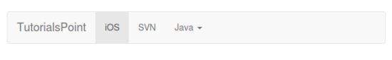
表格导航或标签
要创建选项卡式导航菜单 -
从基本无序列表开始,基类为.nav
添加类.nav-tabs 。
以下示例演示了这一点 -
<p>Tabs Example</p>
<ul class = "nav nav-tabs">
   <li class = "active"><a href = "#">Home</a></li>
   <li><a href = "#">SVN</a></li>
   <li><a href = "#">iOS</a></li>
   <li><a href = "#">VB.Net</a></li>
   <li><a href = "#">Java</a></li>
   <li><a href = "#">PHP</a></li>
</ul>
丸导航
基本药丸
要将标签变为药片,请按照上述相同步骤使用.nav-pills类而不是.nav-tabs 。
以下示例演示了这一点 -
<p>Pills Example</p>
<ul class = "nav nav-pills">
   <li class = "active"><a href = "#">Home</a></li>
   <li><a href = "#">SVN</a></li>
   <li><a href = "#">iOS</a></li>
   <li><a href = "#">VB.Net</a></li>
   <li><a href = "#">Java</a></li>
   <li><a href = "#">PHP</a></li>
</ul>
垂直丸
您可以使用类.nav-stacked以及类 - .nav, .nav-pills垂直.nav-stacked .nav, .nav-pills 。
以下示例演示了这一点 -
<p>Vertical Pills Example</p>
<ul class = "nav nav-pills nav-stacked">
   <li class = "active"><a href = "#">Home</a></li>
   <li><a href = "#">SVN</a></li>
   <li><a href = "#">iOS</a></li>
   <li><a href = "#">VB.Net</a></li>
   <li><a href = "#">Java</a></li>
   <li><a href = "#">PHP</a></li>
</ul>
Justified Nav
您可以使用类.nav-justified以及.nav, .nav-tabs或.nav, .nav-pills分别制作宽度超过768px的父屏幕的父级相同宽度.nav, .nav-tabs或.nav, .nav-pills 。 在较小的屏幕上,导航链接是堆叠的。
以下示例演示了这一点 -
<p>Justified Nav Elements Example</p>
<ul class = "nav nav-pills nav-justified">
   <li class = "active"><a href = "#">Home</a></li>
   <li><a href = "#">SVN</a></li>
   <li><a href = "#">iOS</a></li>
   <li><a href = "#">VB.Net</a></li>
   <li><a href = "#">Java</a></li>
   <li><a href = "#">PHP</a></li>
</ul>
<br>
<br>
<br>
<ul class = "nav nav-tabs nav-justified">
   <li class = "active"><a href = "#">Home</a></li>
   <li><a href = "#">SVN</a></li>
   <li><a href = "#">iOS</a></li>
   <li><a href = "#">VB.Net</a></li>
   <li><a href = "#">Java</a></li>
   <li><a href = "#">PHP</a></li>
</ul>
禁用链接
对于每个.nav类,如果添加.disabled类,它将创建一个灰色链接,同时禁用:hover状态,如以下示例所示 -
<p>Disabled Link Example</p>
<ul class = "nav nav-pills">
   <li class = "active"><a href = "#">Home</a></li>
   <li><a href = "#">SVN</a></li>
   <li class = "disabled"><a href = "#">iOS(disabled link)</a></li>
   <li><a href = "#">VB.Net</a></li>
   <li><a href = "#">Java</a></li>
   <li><a href = "#">PHP</a></li>
</ul>
<br>
<br>
<ul class = "nav nav-tabs">
   <li class = "active"><a href = "#">Home</a></li>
   <li><a href = "#">SVN</a></li>
   <li><a href = "#">iOS</a></li>
   <li class = "disabled"><a href = "#">VB.Net(disabled link)</a></li>
   <li><a href = "#">Java</a></li>
   <li><a href = "#">PHP</a></li>
</ul>
这个类只会改变的外观,而不是它的功能。 使用自定义JavaScript在此处禁用链接。
下拉(Dropdowns)
导航菜单与下拉菜单共享类似的语法。 默认情况下,您有一个列表项,其中一个锚点与一些数据属性一起使用,以触发带有.dropdown-menu类的无序列表。
带下拉列表的标签
要向标签添加下拉菜单 -
从基本无序列表开始,基类为.nav
添加类.nav-tabs 。
现在添加一个带有.dropdown-menu类的无序列表。
<p>Tabs With Dropdown Example</p>
<ul class = "nav nav-tabs">
   <li class = "active"><a href = "#">Home</a></li>
   <li><a href = "#">SVN</a></li>
   <li><a href = "#">iOS</a></li>
   <li><a href = "#">VB.Net</a></li>
   <li class = "dropdown">
      <a class = "dropdown-toggle" data-toggle = "dropdown" href = "#">
         Java
         <span class = "caret"></span>
      </a>
      <ul class = "dropdown-menu">
         <li><a href = "#">Swing</a></li>
         <li><a href = "#">jMeter</a></li>
         <li><a href = "#">EJB</a></li>
         <li class = "divider"></li>
         <li><a href = "#">Separated link</a></li>
      </ul>
   </li>
   <li><a href = "#">PHP</a></li>
</ul>
药丸与下拉菜单
要使用药丸做同样的事情,只需将.nav-tabs类与.nav-pills交换,如下例所示。
<p>Pills With Dropdown Example</p>
<ul class = "nav nav-pills">
   <li class = "active"><a href = "#">Home</a></li>
   <li><a href = "#">SVN</a></li>
   <li><a href = "#">iOS</a></li>
   <li><a href = "#">VB.Net</a></li>
   <li class = "dropdown">
      <a class = "dropdown-toggle" data-toggle = "dropdown" href = "#">
         Java <span class = "caret"></span>
      </a>
      <ul class = "dropdown-menu">
         <li><a href = "#">Swing</a></li>
         <li><a href = "#">jMeter</a></li>
         <li><a href = "#">EJB</a></li>
         <li class = "divider"></li>
         <li><a href = "#">Separated link</a></li>
      </ul>
   </li>
   <li><a href = "#">PHP</a></li>
</ul>
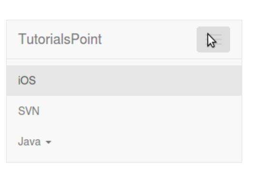
Bootstrap - Navbar
导航栏是Bootstrap站点的突出功能之一。 Navbars是响应式“元”组件,可用作应用程序或站点的导航标题。 Navbars在移动视图中折叠,并在可用视口宽度增加时变为水平。 导航栏的核心包括网站名称和基本导航的样式。
默认导航栏
要创建默认导航栏 -
将类.navbar, .navbar-default到“nav”标记。
将role = "navigation"添加到上面的元素,以帮助获取可访问性。
将标题类.navbar-header添加到“div”元素。 包含类navbar-brand的“a”元素。 这将使文本的大小略大。
要添加指向导航栏的链接,只需添加类别为.nav, .navbar-nav的无序列表。
以下示例演示了这一点 -
<nav class = "navbar navbar-default" role = "navigation">
   <div class = "navbar-header">
      <a class = "navbar-brand" href = "#">IoWiki</a>
   </div>
   <div>
      <ul class = "nav navbar-nav">
         <li class = "active"><a href = "#">iOS</a></li>
         <li><a href = "#">SVN</a></li>
         <li class = "dropdown">
            <a href = "#" class = "dropdown-toggle" data-toggle = "dropdown">
               Java
               <b class = "caret"></b>
            </a>
            <ul class = "dropdown-menu">
               <li><a href = "#">jmeter</a></li>
               <li><a href = "#">EJB</a></li>
               <li><a href = "#">Jasper Report</a></li>
               <li class = "divider"></li>
               <li><a href = "#">Separated link</a></li>
               <li class = "divider"></li>
               <li><a href = "#">One more separated link</a></li>
            </ul>
         </li>
      </ul>
   </div>
</nav>
响应Navbar
要向导航栏添加响应功能,您要折叠的内容需要包含在
以下示例演示了这一点 -
<nav class = "navbar navbar-default" role = "navigation">
   <div class = "navbar-header">
      <button type = "button" class = "navbar-toggle"
         data-toggle = "collapse" data-target = "#example-navbar-collapse">
         <span class = "sr-only">Toggle navigation</span>
         <span class = "icon-bar"></span>
         <span class = "icon-bar"></span>
         <span class = "icon-bar"></span>
      </button>
      <a class = "navbar-brand" href = "#">IoWiki</a>
   </div>
   <div class = "collapse navbar-collapse" id = "example-navbar-collapse">
      <ul class = "nav navbar-nav">
         <li class = "active"><a href = "#">iOS</a></li>
         <li><a href = "#">SVN</a></li>
         <li class = "dropdown">
            <a href = "#" class = "dropdown-toggle" data-toggle = "dropdown">
               Java
               <b class = "caret"></b>
            </a>
            <ul class = "dropdown-menu">
               <li><a href = "#">jmeter</a></li>
               <li><a href = "#">EJB</a></li>
               <li><a href = "#">Jasper Report</a></li>
               <li class = "divider"></li>
               <li><a href = "#">Separated link</a></li>
               <li class = "divider"></li>
               <li><a href = "#">One more separated link</a></li>
            </ul>
         </li>
      </ul>
   </div>
</nav>
Navbar中的表单
而不是使用导航.navbar-form Bootstrap Forms中的默认基于类的表单,使用.navbar-form类。 这可以确保窗体在窄视口中的正确垂直对齐和折叠行为。 使用对齐选项(在“组件对齐”部分中进行说明)来确定它在导航栏内容中的位置。
以下示例演示了这一点 -
<nav class = "navbar navbar-default" role = "navigation">
   <div class = "navbar-header">
      <a class = "navbar-brand" href = "#">IoWiki</a>
   </div>
   <div>
      <form class = "navbar-form navbar-left" role = "search">
         <div class = "form-group">
            <input type = "text" class = "form-control" placeholder = "Search">
         </div>
         <button type = "submit" class = "btn btn-default">Submit</button>
      </form>
   </div>
</nav>
Navbar中的按钮
您可以使用类.navbar-btn将按钮添加到不存在于“窗体”中的“按钮”元素,以使它们在导航.navbar-btn垂直居中。 .navbar-btn可用于“a”和“input”元素。
不要在.navbar-nav <a>元素上使用.navbar-btn和标准按钮类 。
以下示例演示了这一点 -
<nav class = "navbar navbar-default" role = "navigation">
   <div class = "navbar-header">
      <a class = "navbar-brand" href = "#">IoWiki</a>
   </div>
   <div>
      <form class = "navbar-form navbar-left" role = "search">
         <div class = "form-group">
            <input type = "text" class = "form-control" placeholder = "Search">
         </div>
         <button type = "submit" class = "btn btn-default">Submit Button</button>
      </form>
      <button type = "button" class = "btn btn-default navbar-btn">Navbar Button</button>
   </div>
</nav>
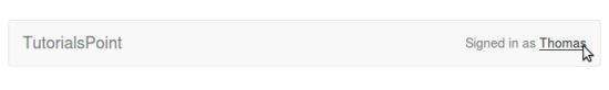
Navbar中的文本
要在元素中包装文本字符串,请使用类.navbar-text 。 这通常与“p”标签一起使用,以获得正确的前导和颜色。 以下示例演示了这一点 -
<nav class = "navbar navbar-default" role = "navigation">
   <div class = "navbar-header">
      <a class = "navbar-brand" href = "#">IoWiki</a>
   </div>
   <div>
      <p class = "navbar-text">Signed in as Thomas</p>
   </div>
</nav>
Non-nav Links
如果要使用不在常规导航栏导航组件中的标准链接,请使用类navbar-link为默认和反向导航栏选项添加适当的颜色,如以下示例所示 -
<nav class = "navbar navbar-default" role = "navigation">
   <div class = "navbar-header">
      <a class = "navbar-brand" href = "#">IoWiki</a>
   </div>
   <div>
      <p class = "navbar-text navbar-right">
         Signed in as
         <a href = "#" class = "navbar-link">Thomas</a>
      </p>
   </div>
</nav>
组件对齐
您可以使用实用程序类.navbar-left或.navbar-right在nav links, forms, buttons, or text左侧或右侧对齐nav links, forms, buttons, or text等组件。 这两个类都将在指定的方向上添加一个CSS浮点数。 以下示例演示了这一点 -
<nav class = "navbar navbar-default" role = "navigation">
   <div class = "navbar-header">
      <a class = "navbar-brand" href = "#">IoWiki</a>
   </div>
   <div>
      <!--Left Align-->
      <ul class = "nav navbar-nav navbar-left">
         <li class = "dropdown">
            <a href = "#" class = "dropdown-toggle" data-toggle = "dropdown">
               Java
               <b class = "caret"></b>
            </a>
            <ul class = "dropdown-menu">
               <li><a href = "#">jmeter</a></li>
               <li><a href = "#">EJB</a></li>
               <li><a href = "#">Jasper Report</a></li>
               <li class = "divider"></li>
               <li><a href = "#">Separated link</a></li>
               <li class = "divider"></li>
               <li><a href = "#">One more separated link</a></li>
            </ul>
         </li>
      </ul>
      <form class = "navbar-form navbar-left" role = "search">
         <button type = "submit" class = "btn btn-default">Left align-Submit Button</button>
      </form>
      <p class = "navbar-text navbar-left">Left align-Text</p>
      <!--Right Align-->
      <ul class = "nav navbar-nav navbar-right">
         <li class = "dropdown">
            <a href = "#" class = "dropdown-toggle" data-toggle = "dropdown">
               Java
               <b class = "caret"></b>
            </a>
            <ul class = "dropdown-menu">
               <li><a href = "#">jmeter</a></li>
               <li><a href = "#">EJB</a></li>
               <li><a href = "#">Jasper Report</a></li>
               <li class = "divider"></li>
               <li><a href = "#">Separated link</a></li>
               <li class = "divider"></li>
               <li><a href = "#">One more separated link</a></li>
            </ul>
         </li>
      </ul>
      <form class = "navbar-form navbar-right" role = "search">
         <button type = "submit" class = "btn btn-default">
            Right align-Submit Button
         </button>
      </form>
      <p class = "navbar-text navbar-right">Right align-Text</p>
   </div>
</nav>

固定到顶部
Bootstrap导航栏的位置可以是动态的。 默认情况下,它是一个块级元素,根据其在HTML中的位置来定位。 使用一些辅助类,您可以将其放在页面的顶部或底部,也可以使其与页面静态滚动。
如果您希望导航栏固定在顶部,请将.navbar-fixed-top类添加到.navbar class 。 以下示例演示了这一点 -
要防止导航栏位于页面正文中的其他内容之上,请在标记中添加至少50个像素的填充或尝试自己的值。
<nav class = "navbar navbar-default navbar-fixed-top" role = "navigation">
   <div class = "navbar-header">
      <a class = "navbar-brand" href = "#">IoWiki</a>
   </div>
   <div>
      <ul class = "nav navbar-nav">
         <li class = "active"><a href = "#">iOS</a></li>
         <li><a href = "#">SVN</a></li>
         <li class = "dropdown">
            <a href = "#" class = "dropdown-toggle" data-toggle = "dropdown">
               Java
               <b class = "caret"></b>
            </a>
            <ul class = "dropdown-menu">
               <li><a href = "#">jmeter</a></li>
               <li><a href = "#">EJB</a></li>
               <li><a href = "#">Jasper Report</a></li>
               <li class = "divider"></li>
               <li><a href = "#">Separated link</a></li>
               <li class = "divider"></li>
               <li><a href = "#">One more separated link</a></li>
            </ul>
         </li>
      </ul>
   </div>
</nav>
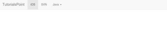
固定到底部
如果您希望导航栏固定在页面底部,请将.navbar-fixed-bottom类添加到.navbar class 。 以下示例演示了这一点 -
<nav class = "navbar navbar-default navbar-fixed-bottom" role = "navigation">
   <div class = "navbar-header">
      <a class = "navbar-brand" href = "#">IoWiki</a>
   </div>
   <div>
      <ul class = "nav navbar-nav">
         <li class = "active"><a href = "#">iOS</a></li>
         <li><a href="#">SVN</a></li>
         <li class = "dropdown">
            <a href = "#" class = "dropdown-toggle" data-toggle = "dropdown">
               Java
               <b class ="caret"></b>
            </a>
            <ul class = "dropdown-menu">
               <li><a href = "#">jmeter</a></li>
               <li><a href = "#">EJB</a></li>
               <li><a href = "#">Jasper Report</a></li>
               <li class = "divider"></li>
               <li><a href = "#">Separated link</a></li>
               <li class = "divider"></li>
               <li><a href = "#">One more separated link</a></li>
            </ul>
         </li>
      </ul>
   </div>
</nav>
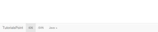
静态顶部
要创建随页面滚动的导航栏,请添加.navbar-static-top类。 此类不需要将填充添加到“正文”。
<nav class = "navbar navbar-default navbar-static-top" role = "navigation">
   <div class = "navbar-header">
      <a class = "navbar-brand" href = "#">IoWiki</a>
   </div>
   <div>
      <ul class = "nav navbar-nav">
         <li class = "active"><a href = "#">iOS</a></li>
         <li><a href = "#">SVN</a></li>
         <li class = "dropdown">
            <a href = "#" class = "dropdown-toggle" data-toggle = "dropdown">
               Java
               <b class = "caret"></b>
            </a>
            <ul class = "dropdown-menu">
               <li><a href = "#">jmeter</a></li>
               <li><a href = "#">EJB</a></li>
               <li><a href = "#">Jasper Report</a></li>
               <li class = "divider"></li>
               <li><a href = "#">Separated link</a></li>
               <li class = "divider"></li>
               <li><a href = "#">One more separated link</a></li>
            </ul>
         </li>
      </ul>
   </div>
</nav>
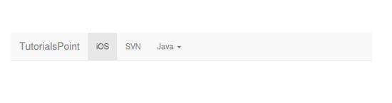
反向导航栏
要创建具有黑色背景和白色文本的反向导航栏,只需将.navbar-inverse类添加到.navbar类,如以下示例所示 -
要防止导航栏位于页面正文中的其他内容之上,请在标记中添加至少50个像素的填充或尝试自己的值。
<nav class = "navbar navbar-inverse" role = "navigation">
   <div class = "navbar-header">
      <a class = "navbar-brand" href = "#">IoWiki</a>
   </div>
   <div>
      <ul class = "nav navbar-nav">
         <li class = "active"><a href = "#">iOS</a></li>
         <li><a href = "#">SVN</a></li>
         <li class = "dropdown">
            <a href = "#" class = "dropdown-toggle" data-toggle = "dropdown">
               Java
               <b class = "caret"></b>
            </a>
            <ul class = "dropdown-menu">
               <li><a href = "#">jmeter</a></li>
               <li><a href = "#">EJB</a></li>
               <li><a href = "#">Jasper Report</a></li>
               <li class = "divider"></li>
               <li><a href = "#">Separated link</a></li>
               <li class = "divider"></li>
               <li><a href = "#">One more separated link</a></li>
            </ul>
         </li>
      </ul>
   </div>
</nav>
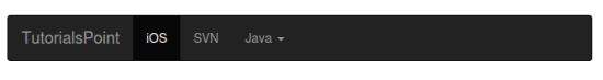
Bootstrap - Breadcrumb
面包屑是显示网站基于层次结构的信息的好方法。 对于博客,面包屑可以显示发布日期,类别或标签。 它们指示当前页面在导航层次结构中的位置。
Bootstrap中的面包屑只是一个带有.breadcrumb类的无序列表。 CSS(bootstrap.min.css)通过以下类自动添加分隔符 -
.breadcrumb > li + li:before {
   color: #CCCCCC;
   content: "/ ";
   padding: 0 5px;
}
以下示例演示了面包屑 -
<ol class = "breadcrumb">
   <li><a href = "#">Home</a></li>
   <li><a href = "#">2013</a></li>
   <li class = "active">November</li>
</ol>
Bootstrap - Pagination
本章讨论Bootstrap支持的分页功能。 分页,无序列表由Bootstrap处理,就像许多其他界面元素一样。
分页(Pagination)
下表列出了Bootstrap提供的用于处理分页的类。
| 类 | 描述 | 示例代码 |
|---|---|---|
| .pagination | 添加此类以获取页面上的分页。 | |
| .disabled, .active | 您可以使用.disabled为.disabled点击的链接自定义链接,使用.disabled指示当前页面。 | |
| .pagination-lg, .pagination-sm | 使用这些类可以获得不同大小的项目。 | |
默认分页
以下示例演示了上表中讨论的类.pagination的使用 -
<ul class = "pagination">
   <li><a href = "#">«</a></li>
   <li><a href = "#">1</a></li>
   <li><a href = "#">2</a></li>
   <li><a href = "#">3</a></li>
   <li><a href = "#">4</a></li>
   <li><a href = "#">5</a></li>
   <li><a href = "#">»</a></li>
</ul>
States
以下示例演示了上表中讨论的类.disabled, .active -
<ul class = "pagination">
   <li><a href = "#">«</a></li>
   <li class = "active"><a href = "#">1</a></li>
   <li class = "disabled"><a href = "#">2</a></li>
   <li><a href = "#">3</a></li>
   <li><a href = "#">4</a></li>
   <li><a href = "#">5</a></li>
   <li><a href = "#">»</a></li>
</ul>
Sizing
以下示例演示了如何使用类进行大小调整, .pagination-*在上表中讨论 -
<ul class = "pagination pagination-lg">
   <li><a href = "#">«</a></li>
   <li><a href = "#">1</a></li>
   <li><a href = "#">2</a></li>
   <li><a href = "#">3</a></li>
   <li><a href = "#">4</a></li>
   <li><a href = "#">5</a></li>
   <li><a href = "#">»</a></li>
</ul>
<br>
<ul class = "pagination">
   <li><a href = "#">«</a></li>
   <li><a href = "#">1</a></li>
   <li><a href = "#">2</a></li>
   <li><a href = "#">3</a></li>
   <li><a href = "#">4</a></li>
   <li><a href = "#">5</a></li>
   <li><a href = "#">»</a></li>
</ul>
<br>
<ul class = "pagination pagination-sm">
   <li><a href = "#">«</a></li>
   <li><a href = "#">1</a></li>
   <li><a href = "#">2</a></li>
   <li><a href = "#">3</a></li>
   <li><a href = "#">4</a></li>
   <li><a href = "#">5</a></li>
   <li><a href = "#">»</a></li>
</ul>
Pager
如果您需要创建超出文本的简单分页链接,则寻呼机可以很好地工作。 与分页链接一样,寻呼机是无序列表。 默认情况下,链接居中。 下表列出了Bootstrap为寻呼机提供的类。
| 类 | 描述 | 示例代码 |
|---|---|---|
| .pager | 添加此类以获取寻呼机链接。 | |
| .previous, .next | 使用类.previous左对齐和.next右对齐链接。 | |
| .disabled | 添加此类以获得静音外观。 | |
默认寻呼机
以下示例演示了上表中讨论的类.pager的使用 -
<ul class = "pager">
   <li><a href = "#">Previous</a></li>
   <li><a href = "#">Next</a></li>
</ul>
对齐链接
下面的示例演示如何使用类对齐, .previous, .next在上表中讨论 -
<ul class = "pager">
   <li class = "previous"><a href = "#">← Older</a></li>
   <li class = "next"><a href = "#">Newer →</a></li>
</ul>
States
以下示例演示了上表中讨论的类.disabled的使用 -
<ul class = "pager">
   <li class = "previous disabled"><a href = "#">← Older</a></li>
   <li class = "next"><a href = "#">Newer →</a></li>
</ul>
Bootstrap - Labels
本章介绍Bootstrap标签。 标签非常适合为页面提供计数,提示或其他标记。 使用类.label显示标签,如以下示例所示 -
<h1>Example Heading <span class = "label label-default">Label</span></h1>
<h2>Example Heading <span class =" label label-default">Label</span></h2>
<h3>Example Heading <span class = "label label-default">Label</span></h3>
<h4>Example Heading <span class = "label label-default">Label</span></h4>
您可以使用修饰符类修改标签的外观,例如, label-default, label-primary, label-success, label-info, label-warning, label-danger ,如以下示例所示 -
<span class = "label label-default">Default Label</span>
<span class = "label label-primary">Primary Label</span>
<span class = "label label-success">Success Label</span>
<span class = "label label-info">Info Label</span>
<span class = "label label-warning">Warning Label</span>
<span class = "label label-danger">Danger Label</span>
Bootstrap - Badges
本章将讨论Bootstrap徽章。 徽章与标签类似; 主要区别在于角落更圆润。
徽章主要用于突出显示新的或未读的项目。 要使用徽章,只需在链接,Bootstrap导航等中添加《span class = "badge"》 。
以下示例演示了这一点 -
<a href = "#">Mailbox <span class = "badge">50</span></a>
当没有新的或未读的项目时,如果内部不存在任何内容,则徽章将通过CSS的:empty选择器简单地折叠。
主动导航状态
您可以将徽章置于活动状态的药丸和列表导航中。 您可以通过将《span class = "badge"》放置到活动链接来实现此目的,如以下示例所示 -
<h4>Example for Active State in Pill </h4>
<ul class = "nav nav-pills">
   <li class = "active"><a href = "#">Home <span class ="badge">42</span></a></li>
   <li><a href = "#">Profile</a></li>
   <li><a href = "#">Messages <span class = "badge">3</span></a></li>
</ul>
<br>
<h4>Example for Active State in navigations</h4>
<ul class = "nav nav-pills nav-stacked" style = "max-width: 260px;">
   <li class = "active">
      <a href = "#">
         <span class = "badge pull-right">42</span>
         Home
      </a>
   </li>
   <li><a href = "#">Profile</a></li>
   <li>
      <a href = "#">
         <span class = "badge pull-right">3</span>
         Messages
      </a>
   </li>
</ul>
Bootstrap - Jumbotron
本章将讨论Bootstrap支持的另一个功能,即Jumbotron。 顾名思义,这个组件可以选择性地增加标题的大小,并为登陆页面内容增加很多余量。 使用Jumbotron -
使用.jumbotron类创建容器<div>。
除了更大的
之外, font-weight还减少到200px。
以下示例演示了这一点 -
<div class = "container">
   <div class = "jumbotron">
      <h1>Welcome to landing page!</h1>
      <p>This is an example for jumbotron.</p>
      <p>
         <a class = "btn btn-primary btn-lg" role = "button">Learn more</a>
      </p>
   </div>
</div>
要获得一个全宽的jumbotron,并且没有圆角, .jumbotron在所有.container类之外使用.container类,而是在其中添加.container ,如下例所示 -
<div class = "jumbotron">
   <div class = "container">
      <h1>Welcome to landing page!</h1>
      <p>This is an example for jumbotron.</p>
      <p>
         <a class = "btn btn-primary btn-lg" role = "button">Learn more</a>
      </p>
   </div>
</div>
Bootstrap - Page Header
页眉是一个很好的小功能,可以在页面上的标题周围添加适当的间距。 这对于您可能拥有多个帖子标题的网页尤其有用,并且需要一种方法来为每个帖子添加区别。 要使用页眉,请将您的标题包装在带有.page-header类的<div>中 -
<div class = "page-header">
   <h1>
      Example page header
      <small>Subtext for header</small>
   </h1>
</div>
<p>This is a sample text.This is a sample text.This is a sample text. This is a sample text.</p>
Bootstrap - Thumbnails
本章讨论Bootstrap缩略图。 许多网站需要一种在网格中布置图像,视频,文本等的方法,而Bootstrap可以通过缩略图轻松实现此目的。 使用Bootstrap创建缩略图 -
在图像周围添加一个带有.thumbnail类的<a>标签。
这会添加四个填充像素和一个灰色边框。
在悬停时,动画光晕会勾勒出图像。
以下示例演示了一个默认缩略图 -
<div class = "row">
   <div class = "col-sm-6 col-md-3">
      <a href = "#" class = "thumbnail">
         <img src = "/bootstrap/images/kittens.jpg" alt = "Generic placeholder thumbnail">
      </a>
   </div>
   <div class = "col-sm-6 col-md-3">
      <a href = "#" class = "thumbnail">
         <img src = "/bootstrap/images/kittens.jpg" alt = "Generic placeholder thumbnail">
      </a>
   </div>
   <div class = "col-sm-6 col-md-3">
      <a href = "#" class = "thumbnail">
         <img src = "/bootstrap/images/kittens.jpg" alt = "Generic placeholder thumbnail">
      </a>
   </div>
   <div class = "col-sm-6 col-md-3">
      <a href = "#" class = "thumbnail">
         <img src = "/bootstrap/images/kittens.jpg" alt = "Generic placeholder thumbnail">
      </a>
   </div>
</div>

添加自定义内容
现在我们有了一个基本的缩略图,可以将任何类型的HTML内容(如标题,段落或按钮)添加到缩略图中。 请按照以下步骤操作 -
在div里面,你可以添加你需要的任何东西。 由于这是一个div,我们可以使用默认的基于span的命名约定来调整大小。
如果要对多个图像进行分组,请将它们放在无序列表中,每个列表项将浮动到左侧。
以下示例演示了这一点 -
<div class = "row">
   <div class = "col-sm-6 col-md-3">
      <div class = "thumbnail">
         <img src = "/bootstrap/images/kittens.jpg" alt = "Generic placeholder thumbnail">
      </div>
      <div class = "caption">
         <h3>Thumbnail label</h3>
         <p>Some sample text. Some sample text.</p>
         <p>
            <a href = "#" class = "btn btn-primary" role = "button">
               Button
            </a>
            <a href = "#" class = "btn btn-default" role = "button">
               Button
            </a>
         </p>
      </div>
   </div>
   <div class = "col-sm-6 col-md-3">
      <div class = "thumbnail">
         <img src = "/bootstrap/images/kittens.jpg" alt = "Generic placeholder thumbnail">
      </div>
      <div class = "caption">
         <h3>Thumbnail label</h3>
         <p>Some sample text. Some sample text.</p>
         <p>
            <a href = "#" class = "btn btn-primary" role = "button">
               Button
            </a>
            <a href = "#" class = "btn btn-default" role =" button">
               Button
            </a>
         </p>
      </div>
   </div>
   <div class = "col-sm-6 col-md-3">
      <div class = "thumbnail">
         <img src = "/bootstrap/images/kittens.jpg" alt = "Generic placeholder thumbnail">
      </div>
      <div class = "caption">
         <h3>Thumbnail label</h3>
         <p>Some sample text. Some sample text.</p>
         <p>
            <a href = "#" class = "btn btn-primary" role = "button">
               Button
            </a>
            <a href = "#" class = "btn btn-default" role = "button">
               Button
            </a>
         </p>
      </div>
   </div>
</div>
Bootstrap - Alerts
本章将讨论警报和Bootstrap为警报提供的类。 警报提供了一种为用户设置消息样式的方法。 它们为典型的用户操作提供上下文反馈消息。
您可以添加可选的关闭图标以发出警报。 对于内联解雇,请使用Alerts jQuery插件 。
您可以通过创建包装器
<div class = "alert alert-success">Success! Well done its submitted.</div>
<div class = "alert alert-info">Info! take this info.</div>
<div class = "alert alert-warning">Warning ! Dont submit this.</div>
<div class = "alert alert-danger">Error ! Change few things.</div>
解雇警报
建立dismissal alert
通过创建包装器
并添加.alert类和四个上下文类之一(例如, .alert-success, .alert-info, .alert-warning, .alert-danger )来添加基本警报还可以在上面的“div”类中添加可选的.alert-dismissable 。
添加关闭按钮。
以下示例演示了这一点 -
<div class = "alert alert-success alert-dismissable">
   <button type = "button" class = "close" data-dismiss = "alert" aria-hidden = "true">
      ×
   </button>
   Success! Well done its submitted.
</div>
<div class = "alert alert-info alert-dismissable">
   <button type = "button" class = "close" data-dismiss = "alert" aria-hidden = "true">
      ×
   </button>
   Info! take this info.
</div>
<div class = "alert alert-warning alert-dismissable">
   <button type = "button" class = "close" data-dismiss = "alert" aria-hidden = "true">
      ×
   </button>
   Warning ! Dont submit this.
</div>
<div class = "alert alert-danger alert-dismissable">
   <button type = "button" class = "close" data-dismiss = "alert" aria-hidden = "true">
      ×
   </button>
   Error ! Change few things.
</div>
请务必将新页面打开
警报中的链接
获取警报中的链接 -
通过创建包装器
并添加.alert类和四个上下文类之一(例如, .alert-success, .alert-info, .alert-warning, .alert-danger )来添加基本警报使用.alert-link实用程序类可以在任何警报中快速提供匹配的彩色链接。
<div class = "alert alert-success">
   <a href = "#" class = "alert-link">Success! Well done its submitted.</a>
</div>
<div class = "alert alert-info">
   <a href = "#" class = "alert-link">Info! take this info.</a>
</div>
<div class = "alert alert-warning">
   <a href = "#" class = "alert-link">Warning ! Dont submit this.</a>
</div>
<div class = "alert alert-danger">
   <a href = "#" class = "alert-link">Error ! Change few things.</a>
</div>
Bootstrap - Progress Bars
本章讨论Bootstrap进度条。 进度条的目的是显示资产正在加载,正在进行中,或者是否正在对页面上的元素进行操作。
进度条使用CSS3过渡和动画来实现它们的一些效果。 Internet Explorer 9及更低版本或旧版本的Firefox不支持这些功能。 Opera 12不支持动画。
默认进度条
创建基本进度条 -
添加一个带有.progress类的<div>。
接下来,在上面的div中,添加一个带有.progress-bar类的空<div>。
添加样式属性,其宽度表示为百分比。 比如说,style =“60%”; 表示进度条为60%。
我们来看下面的例子 -
<div class = "progress">
   <div class = "progress-bar" role = "progressbar" aria-valuenow = "60"
      aria-valuemin = "0" aria-valuemax = "100" style = "width: 40%;">
      <span class = "sr-only">40% Complete</span>
   </div>
</div>
替代进度条
要创建具有不同样式的进度条 -
添加一个带有.progress类的<div>。
接下来,在上面的div中,添加一个空的div和一个类.progress-bar和class progress-bar-*其中*可以是success, info, warning, danger 。
添加样式属性,其宽度表示为百分比。 比如说,style =“60%”; 表示进度条为60%。
我们来看下面的例子 -
<div class = "progress">
   <div class = "progress-bar progress-bar-success" role = "progressbar"
      aria-valuenow = "60" aria-valuemin = "0" aria-valuemax = "100" style = "width: 90%;">
      <span class = "sr-only">90% Complete (Sucess)</span>
   </div>
</div>
<div class = "progress">
   <div class = "progress-bar progress-bar-info" role = "progressbar"
      aria-valuenow = "60" aria-valuemin = "0" aria-valuemax = "100" style = "width: 30%;">
      <span class = "sr-only">30% Complete (info)</span>
   </div>
</div>
<div class = "progress">
   <div class = "progress-bar progress-bar-warning" role = "progressbar"
      aria-valuenow = "60" aria-valuemin = "0" aria-valuemax = "100" style = "width: 20%;">
      <span class = "sr-only">20%Complete (warning)</span>
   </div>
</div>
<div class = "progress">
   <div class = "progress-bar progress-bar-danger" role = "progressbar"
      aria-valuenow = "60" aria-valuemin = "0" aria-valuemax = "100" style = "width: 10%;">
      <span class = "sr-only">10% Complete (danger)</span>
   </div>
</div>
条纹进度条
创建条带进度条 -
添加一个带有.progress和.progress-striped类的<div>。
接下来,在上面的div中,添加一个空的div和一个类.progress-bar和class progress-bar-*其中*可以是success, info, warning, danger 。
添加样式属性,其宽度表示为百分比。 比如说,style =“60%”; 表示进度条为60%。
我们来看下面的例子 -
<div class = "progress progress-striped">
   <div class = "progress-bar progress-bar-success" role = "progressbar"
      aria-valuenow = "60" aria-valuemin = "0" aria-valuemax = "100" style = "width: 90%;">
      <span class = "sr-only">90% Complete (Sucess)</span>
   </div>
</div>
<div class = "progress progress-striped">
   <div class = "progress-bar progress-bar-info" role = "progressbar"
      aria-valuenow = "60" aria-valuemin = "0" aria-valuemax = "100" style = "width: 30%;">
      <span class = "sr-only">30% Complete (info)</span>
   </div>
</div>
<div class = "progress progress-striped">
   <div class = "progress-bar progress-bar-warning" role = "progressbar"
      aria-valuenow = "60" aria-valuemin = "0" aria-valuemax = "100" style="width: 20%;">
      <span class = "sr-only">20%Complete (warning)</span>
   </div>
</div>
<div class = "progress progress-striped">
   <div class = "progress-bar progress-bar-danger" role = "progressbar"
      aria-valuenow = "60" aria-valuemin = "0" aria-valuemax = "100" style = "width: 10%;">
      <span class = "sr-only">10% Complete (danger)</span>
   </div>
</div>
动画进度条
要创建动画进度条 -
添加一个带有.progress和.progress-striped类的<div>。 还要将.active添加到.progress-striped 。
接下来,在上面的div中,添加一个带有.progress-bar类的空<div>。
添加样式属性,其宽度表示为百分比。 比如说,style =“60%”; 表示进度条为60%。
这将从右到左为条纹设置动画。
我们来看下面的例子 -
<div class = "progress progress-striped active">
   <div class = "progress-bar progress-bar-success" role = "progressbar"
      aria-valuenow = "60" aria-valuemin = "0" aria-valuemax = "100" style = "width: 40%;">
      <span class = "sr-only">40% Complete</span>
   </div>
</div>
堆叠进度条
您甚至可以堆叠多个进度条。 将多个进度条放在同一个.progress以堆叠它们,如下例所示 -
<div class = "progress">
   <div class = "progress-bar progress-bar-success" role = "progressbar"
      aria-valuenow = "60" aria-valuemin = "0" aria-valuemax = "100" style = "width: 40%;">
      <span class = "sr-only">40% Complete</span>
   </div>
   <div class = "progress-bar progress-bar-info" role = "progressbar"
      aria-valuenow = "60" aria-valuemin = "0" aria-valuemax = "100" style = "width: 30%;">
      <span class = "sr-only">30% Complete (info)</span>
   </div>
   <div class = "progress-bar progress-bar-warning" role = "progressbar"
      aria-valuenow = "60" aria-valuemin = "0" aria-valuemax = "100" style = "width: 20%;">
      <span class = "sr-only">20%Complete (warning)</span>
   </div>
</div>
Bootstrap - Media Object
本章讨论Media对象。 这些是抽象对象样式,用于构建各种类型的组件(如博客评论,推文等),这些组件在文本内容旁边具有左对齐或右对齐图像。 媒体对象的目标是使用于开发这些信息块的代码大大缩短。
媒体对象的目标(轻量级标记,易扩展性)是通过将类应用于某些简单标记来实现的。 媒体对象有两种形式 -
.media - 此类允许将媒体对象(图像,视频和音频)浮动到内容块的左侧或右侧。
.media-list - 如果您准备的列表中的项目将成为无序列表的一部分,请使用类。 对评论主题或文章列表有用。
让我们看一下默认媒体对象的下面一个例子 -
<div class = "media">
   <a class = "pull-left" href = "#">
      <img class = "media-object" src = "/bootstrap/images/64.jpg" alt = "Media Object">
   </a>
   <div class = "media-body">
      <h4 class = "media-heading">Media heading</h4>
      This is some sample text. This is some sample text.
      This is some sample text. This is some sample text.
      This is some sample text. This is some sample text.
      This is some sample text. This is some sample text.
   </div>
</div>
<div class = "media">
   <a class = "pull-left" href = "#">
      <img class = "media-object" src = "/bootstrap/images/64.jpg" alt = "Media Object">
   </a>
   <div class = "media-body">
      <h4 class = "media-heading">Media heading</h4>
      This is some sample text. This is some sample text.
      This is some sample text. This is some sample text.
      This is some sample text. This is some sample text.
      This is some sample text. This is some sample text.
      <div class = "media">
         <a class = "pull-left" href = "#">
            <img class = "media-object" src = "/bootstrap/images/64.jpg" alt = "Media Object">
         </a>
         <div class = "media-body">
            <h4 class = "media-heading">Media heading</h4>
            This is some sample text. This is some sample text.
            This is some sample text. This is some sample text.
            This is some sample text. This is some sample text.
            This is some sample text. This is some sample text.
         </div>
      </div>
   </div>
</div>
让我们看一下媒体列表的一个例子 -
<ul class = "media-list">
   <li class = "media">
      <a class = "pull-left" href = "#">
         <img class = "media-object" src = "/bootstrap/images/64.jpg" alt = "Generic placeholder image">
      </a>
      <div class = "media-body">
         <h4 class = "media-heading">Media heading</h4>
         <p>
            This is some sample text. This is some sample text.
            This is some sample text. This is some sample text.
            This is some sample text. This is some sample text.
            This is some sample text. This is some sample text.
         </p>
         <!-- Nested media object -->
         <div class = "media">
            <a class = "pull-left" href = "#">
               <img class = "media-object" src = "/bootstrap/images/64.jpg"
                  alt = "Generic placeholder image">
            </a>
            <div class = "media-body">
               <h4 class = "media-heading">Nested media heading</h4>
               This is some sample text. This is some sample text.
               This is some sample text. This is some sample text.
               This is some sample text. This is some sample text.
               This is some sample text. This is some sample text.
               <!-- Nested media object -->
               <div class = "media">
                  <a class = "pull-left" href = "#">
                     <img class = "media-object" src = "/bootstrap/images/64.jpg"
                        alt = "Generic placeholder image">
                  </a>
                  <div class = "media-body">
                     <h4 class = "media-heading">Nested media heading</h4>
                     This is some sample text. This is some sample text.
                     This is some sample text. This is some sample text.
                     This is some sample text. This is some sample text.
                     This is some sample text. This is some sample text.
                  </div>
               </div>
            </div>
         </div>
         <!-- Nested media object -->
         <div class = "media">
            <a class = "pull-left" href = "#">
               <img class = "media-object" src = "/bootstrap/images/64.jpg"
                  alt = "Generic placeholder image">
            </a>
            <div class = "media-body">
               <h4 class = "media-heading">Nested media heading</h4>
               This is some sample text. This is some sample text.
               This is some sample text. This is some sample text.
               This is some sample text. This is some sample text.
               This is some sample text. This is some sample text.
            </div>
         </div>
      </div>
   </li>
   <li class = "media">
      <a class = "pull-right" href = "#">
         <img class = "media-object" src = "/bootstrap/images/64.jpg"
            alt = "Generic placeholder image">
      </a>
      <div class = "media-body">
         <h4 class = "media-heading">Media heading</h4>
         This is some sample text. This is some sample text.
         This is some sample text. This is some sample text.
         This is some sample text. This is some sample text.
         This is some sample text. This is some sample text.
      </div>
   </li>
</ul>
Bootstrap - List Group
列表组组件的目的是在列表中呈现复杂和自定义的内容。 要获得基本列表组 -
将类.list-group添加到元素“ul”。
将class .list-group-item添加到“li”。
以下示例演示了这一点 -
<ul class = "list-group">
   <li class = "list-group-item">Free Domain Name Registration</li>
   <li class = "list-group-item">Free Window Space hosting</li>
   <li class = "list-group-item">Number of Images</li>
   <li class = "list-group-item">24*7 support</li>
   <li class = "list-group-item">Renewal cost per year</li>
</ul>
将徽章添加到列表组
我们可以将徽章组件添加到任何列表组项目中,它将自动定位在右侧。 只需在“li”元素中添加《span class = "badge"》 。 以下示例演示了这一点 -
<ul class = "list-group">
   <li class = "list-group-item">Free Domain Name Registration</li>
   <li class = "list-group-item">Free Window Space hosting</li>
   <li class = "list-group-item">Number of Images</li>
   <li class = "list-group-item">
      <span class = "badge">New</span>
      24*7 support
   </li>
   <li class = "list-group-item">Renewal cost per year</li>
   <li class = "list-group-item">
      <span class = "badge">New</span>
      Disocunt Offer
   </li>
</ul>
链接列表组项目
通过使用锚标签而不是列表项,我们可以链接列表组。 我们需要使用
- 元素。
<a href = "#" class = "list-group-item active">
   Free Domain Name Registration
</a>
<a href = "#" class = "list-group-item">24*7 support</a>
<a href = "#" class = "list-group-item">Free Window Space hosting</a>
<a href = "#" class = "list-group-item">Number of Images</a>
<a href = "#" class = "list-group-item">Renewal cost per year</a>
将自定义内容添加到列表组
我们可以将任何HTML内容添加到上面的链接列表组中。 以下示例演示了这一点 -
<div class = "list-group">
   <a href = "#" class = "list-group-item active">
      <h4 class = "list-group-item-heading">
         Starter Website Package
      </h4>
   </a>
   <a href = "#" class = "list-group-item">
      <h4 class = "list-group-item-heading">
         Free Domain Name Registration
      </h4>
      <p class = "list-group-item-text">
         You will get a free domain registration with website pages.
      </p>
   </a>
   <a href = "#" class = "list-group-item">
      <h4 class = "list-group-item-heading">
         24*7 support
      </h4>
      <p class = "list-group-item-text">
         We provide 24*7 support.
      </p>
   </a>
</div>
<div class = "list-group">
   <a href = "#" class = "list-group-item active">
      <h4 class = "list-group-item-heading">
         Business Website Package
      </h4>
   </a>
   <a href = "#" class="list-group-item">
      <h4 class = "list-group-item-heading">
         Free Domain Name Registration
      </h4>
      <p class = "list-group-item-text">
         You will get a free domain registration with website pages.
      </p>
   </a>
   <a href = "#" class = "list-group-item">
      <h4 class = "list-group-item-heading">24*7 support</h4>
      <p class = "list-group-item-text">We provide 24*7 support.</p>
   </a>
</div>
Bootstrap - Panels
本章将讨论Bootstrap面板。 当您想要将DOM组件放在一个盒子中时,可以使用面板组件。 要获得基本面板,只需将类.panel添加到“div”元素即可。 还要将class .panel-default添加到此元素,如以下示例所示 -
<div class = "panel panel-default">
   <div class = "panel-body">
      This is a Basic panel
   </div>
</div>
带标题的面板
有两种方法可以添加面板标题 -
使用.panel-heading类可以轻松地向面板添加标题容器。
使用带有.panel-title类的任何<h1> - <h6>添加预先设置的标题。
以下示例演示了两种方式 -
<div class = "panel panel-default">
   <div class = "panel-heading">
      Panel heading without title
   </div>
   <div class = "panel-body">
      Panel content
   </div>
</div>
<div class = "panel panel-default">
   <div class = "panel-heading">
      <h3 class = "panel-title">
         Panel With title
      </h3>
   </div>
   <div class = "panel-body">
      Panel content
   </div>
</div>
面板与页脚
您可以通过在包含类.panel-footer的<div>中包装按钮或辅助文本来向页面添加页脚。 以下示例演示了这一点。
<div class = "panel panel-default">
   <div class = "panel-body">
      This is a Basic panel
   </div>
   <div class = "panel-footer">Panel footer</div>
</div>
使用上下文变体时,面板页脚不会继承颜色和边框,因为它们不在前景中。
小组背景替代方案
使用上下文状态类(例如, panel-primary, panel-success, panel-info, panel-warning, panel-danger )使面板对特定上下文更有意义。
<div class = "panel panel-primary">
   <div class = "panel-heading">
      <h3 class = "panel-title">Panel title</h3>
   </div>
   <div class = "panel-body">
      This is a Basic panel
   </div>
</div>
<div class = "panel panel-success">
   <div class = "panel-heading">
      <h3 class = "panel-title">Panel title</h3>
   </div>
   <div class = "panel-body">
      This is a Basic panel
   </div>
</div>
<div class = "panel panel-info">
   <div class = "panel-heading">
      <h3 class = "panel-title">Panel title</h3>
   </div>
   <div class = "panel-body">
      This is a Basic panel
   </div>
</div>
<div class = "panel panel-warning">
   <div class = "panel-heading">
      <h3 class = "panel-title">Panel title</h3>
   </div>
   <div class = "panel-body">
      This is a Basic panel
   </div>
</div>
<div class = "panel panel-danger">
   <div class = "panel-heading">
      <h3 class = "panel-title">Panel title</h3>
   </div>
   <div class = "panel-body">
      This is a Basic panel
   </div>
</div>
面板与表
要在面板中获取非边界表,请使用面板中的类.table 。 假设有一个包含.panel-body的“div”,我们在表的顶部添加一个额外的边框以便分离。 如果没有包含.panel-body “div”,则组件会从面板标题移动到表而不会中断。
以下示例演示了这一点 -
<div class = "panel panel-default">
   <div class = "panel-heading">
      <h3 class = "panel-title">Panel title</h3>
   </div>
   <div class = "panel-body">
      This is a Basic panel
   </div>
   <table class = "table">
      <tr>
         <th>Product</th>
         <th>Price </th>
      </tr>
      <tr>
         <td>Product A</td>
         <td>200</td>
      </tr>
      <tr>
         <td>Product B</td>
         <td>400</td>
      </tr>
   </table>
</div>
<div class = "panel panel-default">
   <div class = "panel-heading">Panel Heading</div>
   <table class = "table">
      <tr>
         <th>Product</th>
         <th>Price </th>
      </tr>
      <tr>
         <td>Product A</td>
         <td>200</td>
      </tr>
      <tr>
         <td>Product B</td>
         <td>400</td>
      </tr>
   </table>
</div>
带列表组的面板
您可以在任何面板中包含列表组。 通过将类.panel添加到“div”元素来创建面板。 还要为此元素添加类.panel-default 。 现在,在此面板中包括您的列表组。 您可以从章节列表组中学习创建列表组 。
<div class = "panel panel-default">
   <div class ="panel-heading">Panel heading</div>
   <div class = "panel-body">
      <p>This is a Basic panel content. This is a Basic panel content.
         This is a Basic panel content. This is a Basic panel content.
         This is a Basic panel content. This is a Basic panel content.
         This is a Basic panel content.</p>
   </div>
   <ul class = "list-group">
      <li class = "list-group-item">Free Domain Name Registration</li>
      <li class = "list-group-item">Free Window Space hosting</li>
      <li class = "list-group-item">Number of Images</li>
      <li class = "list-group-item">24*7 support</li>
      <li class = "list-group-item">Renewal cost per year</li>
   </ul>
</div>
Bootstrap - Wells
井是
<div class = "well">Hi, am in well !!</div>
Sizing
您可以使用可选类(例如well-lg或well-lg更改井的大小。 这些类与.well类一起使用。 这些会影响衬垫,使得钻孔更大或更小,具体取决于类别。
<div class = "well well-lg">Hi, am in large well !!</div>
<div class = "well well-sm">Hi, am in small well !!</div>
Bootstrap - Plugins Overview
在Layout Components下的前几章中讨论的Layout Components仅仅是开始。 Bootstrap捆绑了12个jQuery插件,可以扩展这些功能,并可以为您的网站添加更多交互。 要开始使用Bootstrap的JavaScript插件,您不需要成为高级JavaScript开发人员。 通过使用Bootstrap Data API,可以在不编写任何代码的情况下触发大多数插件。
Bootstrap插件可以以两种形式包含在您的网站上 -
Individually使用 - 使用Bootstrap的各个*.js文件。 一些插件和CSS组件依赖于其他插件。 如果单独包含插件,请确保在文档中检查这些依赖项。
或compiled (all at once) - 使用bootstrap.js或缩小的bootstrap.min.js 。 不要尝试包含两者,因为bootstrap.js和bootstrap.min.js都包含单个文件中的所有插件。
所有插件都依赖于jQuery。 因此必须在插件文件之前包含jQuery。 检查bower.json以查看支持哪些版本的jQuery。
数据属性
可以使用附带的Data API访问所有Bootstrap插件。 因此,您不需要包含一行JavaScript来调用任何插件功能。
在某些情况下,可能需要关闭Data API的此功能。 如果您需要关闭Data API,可以通过添加以下JavaScript行来取消绑定属性 -
$(document).off('.data-api')
要关闭特定/单个插件,只需将插件的名称作为命名空间以及data-api命名空间包含,如下所示 -
$(document).off('.alert.data-api')
程序化API
Bootstrap的开发人员相信你应该能够纯粹通过JavaScript API使用所有插件。 所有公共API都是单一的,可链接的方法,并返回收集的集合,例如 -
$(".btn.danger").button("toggle").addClass("fat")
所有方法都接受一个可选的选项对象,一个以特定方法为目标的字符串,或者什么都没有(它启动一个具有默认行为的插件),如下所示 -
// initialized with defaults
$("#myModal").modal()
 // initialized with no keyboard
$("#myModal").modal({ keyboard: false })
// initializes and invokes show immediately
$("#myModal").modal('show')
每个插件还在Constructor属性上公开其原始构造Constructor : $.fn.popover.Constructor 。 如果您想获得特定的插件实例,请直接从元素中检索它 -
$('[rel = popover]').data('popover').
没有冲突
Bootstrap插件有时可以与其他UI框架一起使用。 在这些情况下,偶尔会发生命名空间冲突。 要在插件上克服此调用.noConflict ,您希望还原其值。
// return $.fn.button to previously assigned value
var bootstrapButton = $.fn.button.noConflict()
// give $().bootstrapBtn the Bootstrap functionality
$.fn.bootstrapBtn = bootstrapButton
事件 (Events)
Bootstrap为大多数插件的独特操作提供自定义事件。 一般来说,这些事件有两种形式 -
Infinitive form - 这是在事件开始时触发的。 Eg show 。 不定式事件提供preventDefault功能。 这提供了在动作开始之前停止执行的能力。
$('#myModal').on('show.bs.modal', function (e) {
   // stops modal from being shown
   if (!data) return e.preventDefault()
})
Past participle form - 这是在动作完成时触发的。 Eg shown.
Bootstrap - Transition Plugin
转换插件提供了简单的过渡效果。
如果您想单独包含此插件功能,那么您需要将transition.js与其他JS文件一起使用。 另外,如Bootstrap插件概述一章所述,您可以包含bootstrap.js或缩小的bootstrap.min.js 。
Transition.js是transitionEnd事件以及CSS转换模拟器的基本帮助器。 其他插件使用它来检查CSS转换支持和捕获挂起转换。
用例
过渡插件的几个例子是 -
模态滑动或褪色。 您可以在Bootstrap Modal Plugin一章中找到一个示例。
淡出标签。 您可以在Bootstrap Tab插件一章中找到一个示例。
淡出警报。 您可以在Bootstrap Alerts一章中找到一个示例。
滑动旋转木马窗格。 您可以在Bootstrap Carousel Plugin一章中找到一个示例。
Bootstrap - Modal Plugin
模态是在其父窗口上分层的子窗口。 通常,目的是显示来自单独源的内容,该源可以在不离开父窗口的情况下进行一些交互。 子窗口可以提供信息,交互等。
如果您想单独包含此插件功能,那么您将需要modal.js 。 另外,如Bootstrap插件概述一章所述,您可以包含bootstrap.js或缩小的bootstrap.min.js 。
用法 (Usage)
您可以切换模态插件的隐藏内容 -
Via data attributes - 在控制器元素上设置属性data-toggle = "modal" ,如按钮或链接,以及data-target = "#identifier"或href = "#identifier"以定位特定模态(使用id =“identifier”)切换。
Via JavaScript - 使用这种技术,您可以使用一行JavaScript调用id =“identifier”的模态 -
$('#identifier').modal(options)
例子 (Example)
以下示例中显示了静态模态窗口示例 -
<h2>Example of creating Modals with Twitter Bootstrap</h2>
<!-- Button trigger modal -->
<button class = "btn btn-primary btn-lg" data-toggle = "modal" data-target = "#myModal">
   Launch demo modal
</button>
<!-- Modal -->
<div class = "modal fade" id = "myModal" tabindex = "-1" role = "dialog"
   aria-labelledby = "myModalLabel" aria-hidden = "true">
   <div class = "modal-dialog">
      <div class = "modal-content">
         <div class = "modal-header">
            <button type = "button" class = "close" data-dismiss = "modal" aria-hidden = "true">
                  ×
            </button>
            <h4 class = "modal-title" id = "myModalLabel">
               This Modal title
            </h4>
         </div>
         <div class = "modal-body">
            Add some text here
         </div>
         <div class = "modal-footer">
            <button type = "button" class = "btn btn-default" data-dismiss = "modal">
               Close
            </button>
            <button type = "button" class = "btn btn-primary">
               Submit changes
            </button>
         </div>
      </div><!-- /.modal-content -->
   </div><!-- /.modal-dialog -->
</div><!-- /.modal -->
Details of the preceding code −
要调用模态窗口,您需要具有某种触发器。 您可以使用按钮或链接。 这里我们使用了一个按钮。
如果您查看上面的代码,您会看到在 此代码允许您在页面上创建多个模态,然后为每个模式设置不同的触发器。 现在,要清楚,您不能同时加载多个模态,但您可以在不同时间加载的页面上创建许多模式。
模态中有两个类需要注意 -
第一个是.modal ,它只是将“div”的内容标识为模态。
第二个是.fade类。 切换模态时,会导致内容淡入淡出。
aria-labelledby = "myModalLabel" ,属性引用模态标题。
属性aria-hidden = "true"用于保持模态窗口不可见,直到触发器出现(如单击相关按钮)。
- ,modal-header是为模态窗口的标题定义样式的类。
class = "close" ,是一个CSS类关闭,它为模态窗口的“关闭”按钮设置样式。
data-dismiss = "modal" ,是一个自定义的HTML5数据属性。 在这里它用于关闭模态窗口。
class = "modal-body" ,是一个CSS类的Bootstrap CSS,用于设置模态窗口主体的样式。
class = "modal-footer" ,是一个CSS类的Bootstrap CSS,用于设置模态窗口页脚的样式。
data-toggle = "modal" ,HTML5自定义数据属性数据切换用于打开模态窗口。
选项 (Options)
某些选项可以通过数据属性或JavaScript传递,以自定义模态窗口的外观。 下表列出了选项 -
| 选项名称 | 类型/默认值 | 数据属性名称 | 描述 |
|---|---|---|---|
| backdrop | 布尔值或字符串'static' Default: true | data-backdrop | 如果您不希望在用户单击模态外部时关闭模态,请为背景指定静态。 |
| keyboard | boolean Default: true | data-keyboard | 按下转义键时关闭模态; 设置为false以禁用。 |
| show | boolean Default: true | data-show | 初始化时显示模态。 |
| remote | path Default: false | data-remote | 使用jQuery .load方法,将内容注入模态体。 如果添加了具有有效URL的href,则会加载该内容。 这方面的一个例子如下所示 - |
方法 (Methods)
以下是一些可用于modal()的有用方法。
| 方法 | 描述 | 例 |
|---|---|---|
| Options - .modal(选项) | 将您的内容激活为模态。 接受可选的选项对象。 | |
| Toggle - .modal('切换') | 手动切换模态。 | |
| Show - .modal('show') | 手动打开模态。 | |
| Hide - .modal('隐藏') | 手动隐藏模态。 | |
例子 (Example)
以下示例演示了方法的用法 -
<h2>Example of using methods of Modal Plugin</h2>
<!-- Button trigger modal -->
<button class = "btn btn-primary btn-lg" data-toggle = "modal" data-target = "#myModal">
   Launch demo modal
</button>
<!-- Modal -->
<div class = "modal fade" id = "myModal" tabindex = "-1" role = "dialog"
   aria-labelledby = "myModalLabel" aria-hidden = "true">
   <div class = "modal-dialog">
      <div class = "modal-content">
         <div class = "modal-header">
            <button type = "button" class = "close" data-dismiss = "modal" aria-hidden = "true">
               ×
            </button>
            <h4 class = "modal-title" id = "myModalLabel">
               This Modal title
            </h4>
         </div>
         <div class = "modal-body">
            Press ESC button to exit.
         </div>
         <div class = "modal-footer">
            <button type = "button" class = "btn btn-default" data-dismiss = "modal">
               Close
            </button>
            <button type = "button" class = "btn btn-primary">
               Submit changes
            </button>
         </div>
      </div><!-- /.modal-content -->
   </div><!-- /.modal-dialog -->
</div><!-- /.modal -->
<script>
   $(function () { $('#myModal').modal({
      keyboard: true
   })});
</script>
只需单击Esc按钮,即可退出模态窗口。
事件 (Events)
下表列出了使用模态的事件。 这些事件可用于挂钩函数。
| 事件 | 描述 | 例 |
|---|---|---|
| show.bs.modal | 调用show方法后触发。 | |
| shown.bs.modal | 当模态已对用户可见时将触发(将等待CSS过渡完成)。 | |
| hide.bs.modal | 调用hide实例方法时触发。 | |
| hidden.bs.modal | 当模态完成对用户隐藏时触发。 | |
例子 (Example)
以下示例演示了事件的用法 -
<h2>Example of using events of Modal Plugin</h2>
<!-- Button trigger modal -->
<button class = "btn btn-primary btn-lg" data-toggle = "modal" data-target = "#myModal">
   Launch demo modal
</button>
<!-- Modal -->
<div class = "modal fade" id = "myModal" tabindex = "-1" role = "dialog"
   aria-labelledby = "myModalLabel" aria-hidden = "true">
   <div class = "modal-dialog">
      <div class = "modal-content">
         <div class = "modal-header">
            <button type = "button" class = "close" data-dismiss = "modal" aria-hidden = "true">
               ×
            </button>
            <h4 class = "modal-title" id = "myModalLabel">
               This Modal title
            </h4>
         </div>
         <div class = "modal-body">
            Click on close button to check Event functionality.
         </div>
         <div class = "modal-footer">
            <button type = "button" class = "btn btn-default" data-dismiss = "modal">
               Close
            </button>
            <button type = "button" class = "btn btn-primary">
               Submit changes
            </button>
         </div>
      </div><!-- /.modal-content -->
   </div><!-- /.modal-dialog -->
</div><!-- /.modal -->
<script>
   $(function () { $('#myModal').modal('hide')})});
</script>
<script>
   $(function () { $('#myModal').on('hide.bs.modal', function () {
      alert('Hey, I heard you like modals...');})
   });
</script>
如上面的屏幕所示,如果单击“ Close按钮即hide事件,则会显示警告消息。
Bootstrap - Dropdown Plugin
使用Dropdown插件,您可以将下拉菜单添加到任何组件,如导航栏,选项卡,药片和按钮。
如果您想单独包含此插件功能,则需要dropdown.js 。 另外,如Bootstrap插件概述一章所述,您可以包含bootstrap.js或缩小的bootstrap.min.js 。
用法 (Usage)
您可以切换下拉插件的隐藏内容 -
Via data attributes - 将data-toggle = "dropdown"到链接或按钮以切换下拉列表,如下所示 -
<div class = "dropdown">
   <a data-toggle = "dropdown" href = "#">Dropdown trigger</a>
   <ul class = "dropdown-menu" role = "menu" aria-labelledby = "dLabel">
      ...
   </ul>
</div>
如果您需要保持链接完整(如果浏览器未启用JavaScript,这很有用),请使用data-target属性而不是href = "#" -
<div class = "dropdown">
   <a id = "dLabel" role = "button" data-toggle = "dropdown" data-target = "#" href = "/page.html">
      Dropdown
      <span class = "caret"></span>
   </a>
   <ul class = "dropdown-menu" role = "menu" aria-labelledby = "dLabel">
      ...
   </ul>
</div>
Via JavaScript - 要Via JavaScript调用下拉切换,请使用以下方法 -
$('.dropdown-toggle').dropdown()
例子 (Example)
Within Navbar
以下示例演示了导航栏中下拉菜单的用法 -
<nav class = "navbar navbar-default" role = "navigation">
   <div class = "navbar-header">
      <a class = "navbar-brand" href = "#">IoWiki</a>
   </div>
   <div>
      <ul class = "nav navbar-nav">
         <li class = "active"><a href = "#">iOS</a></li>
         <li><a href = "#">SVN</a></li>
         <li class = "dropdown">
            <a href = "#" class = "dropdown-toggle" data-toggle = "dropdown">
               Java
               <b class="caret"></b>
            </a>
            <ul class = "dropdown-menu">
               <li><a href = "#">jmeter</a></li>
               <li><a href = "#">EJB</a></li>
               <li><a href = "#">Jasper Report</a></li>
               <li class = "divider"></li>
               <li><a href = "#">Separated link</a></li>
               <li class = "divider"></li>
               <li><a href = "#">One more separated link</a></li>
            </ul>
         </li>
      </ul>
   </div>
</nav>
Within Tabs
以下示例演示了选项卡中下拉菜单的用法 -
<p>Tabs With Dropdown Example</p>
<ul class = "nav nav-tabs">
   <li class = "active"><a href = "#">Home</a></li>
   <li><a href = "#">SVN</a></li>
   <li><a href = "#">iOS</a></li>
   <li><a href = "#">VB.Net</a></li>
   <li class = "dropdown">
      <a class = "dropdown-toggle" data-toggle = "dropdown" href = "#">
         Java
         <span class = "caret"></span>
      </a>
      <ul class = "dropdown-menu">
         <li><a href = "#">Swing</a></li>
         <li><a href = "#">jMeter</a></li>
         <li><a href = "#">EJB</a></li>
         <li class = "divider"></li>
         <li><a href = "#">Separated link</a></li>
      </ul>
   </li>
   <li><a href = "#">PHP</a></li>
</ul>
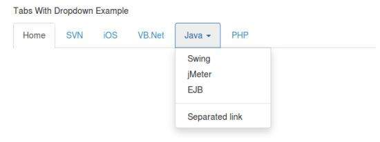
选项 (Options)
There are no options.
方法 (Methods)
下拉切换有一种显示或隐藏下拉列表的简单方法。
$().dropdown('toggle')
例子 (Example)
以下示例演示了dropdown插件方法的用法。
<nav class = "navbar navbar-default" role = "navigation">
   <div class = "navbar-header">
      <a class = "navbar-brand" href = "#">IoWiki</a>
   </div>
   <div id = "myexample">
      <ul class = "nav navbar-nav">
         <li class = "active"><a href = "#">iOS</a></li>
         <li><a href = "#">SVN</a></li>
         <li class = "dropdown">
            <a href = "#" class = "dropdown-toggle">Java <b class = "caret"></b></a>
            <ul class = "dropdown-menu">
               <li><a id = "action-1" href = "#">jmeter</a></li>
               <li><a href = "#">EJB</a></li>
               <li><a href = "#">Jasper Report</a></li>
               <li class = "divider"></li>
               <li><a href = "#">Separated link</a></li>
               <li class = "divider"></li>
               <li><a href = "#">One more separated link</a></li>
            </ul>
         </li>
      </ul>
   </div>
</nav>
<script>
   $(function(){
      $(".dropdown-toggle").dropdown('toggle');
   });
</script>
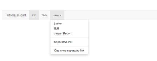
Bootstrap - Scroll spy Plugin
Scroll间谍(自动更新导航)插件允许您根据滚动位置定位页面的各个部分。 在其基本实现中,滚动时,可以根据滚动位置向导航栏添加.active类。
如果要单独包含此插件功能,则需要scrollspy.js 。 另外,如Bootstrap插件概述一章所述,您可以包含bootstrap.js或缩小的bootstrap.min.js 。
用法 (Usage)
您可以将滚动行为添加到顶部栏导航 -
Via data attributes - 将data-spy = "scroll"到您想要侦听的元素(通常是正文)。 然后使用任何Bootstrap .nav组件的父元素的ID或类添加属性data-target 。 为此,您必须在页面正文中包含与您正在监视的链接的匹配ID的元素。
<body data-spy = "scroll" data-target = ".navbar-example">
   ...
   <div class = "navbar-example">
      <ul class = "nav nav-tabs">
         ...
      </ul>
   </div>
   ...
</body>
Via JavaScript - 您可以使用JavaScript调用scrollspy而不是使用数据属性,通过选择要监视的元素,然后调用.scrollspy()函数 -
$('body').scrollspy({ target: '.navbar-example' })
例子 (Example)
以下示例显示了通过数据属性使用scrollspy插件 -
<nav id = "navbar-example" class = "navbar navbar-default navbar-static" role = "navigation">
   <div class = "navbar-header">
      <button class = "navbar-toggle" type = "button" data-toggle = "collapse"
         data-target = ".bs-js-navbar-scrollspy">
         <span class = "sr-only">Toggle navigation</span>
         <span class = "icon-bar"></span>
         <span class = "icon-bar"></span>
         <span class = "icon-bar"></span>
      </button>
      <a class = "navbar-brand" href = "#">Tutorial Name</a>
   </div>
   <div class = "collapse navbar-collapse bs-js-navbar-scrollspy">
      <ul class = "nav navbar-nav">
         <li><a href = "#ios">iOS</a></li>
         <li><a href = "#svn">SVN</a></li>
         <li class = "dropdown">
            <a href = "#" id = "navbarDrop1" class = "dropdown-toggle" data-toggle = "dropdown">
               Java
               <b class = "caret"></b>
            </a>
            <ul class = "dropdown-menu" role = "menu" aria-labelledby = "navbarDrop1">
               <li><a href = "#jmeter" tabindex = "-1">jmeter</a></li>
               <li><a href = "#ejb" tabindex = "-1">ejb</a></li>
               <li class = "divider"></li>
               <li><a href = "#spring" tabindex = "-1">spring</a></li>
            </ul>
         </li>
      </ul>
   </div>
</nav>
<div data-spy = "scroll" data-target = "#navbar-example" data-offset = "0"
   style = "height:200px; overflow:auto; position: relative;">
   <h4 id = "ios">iOS</h4>
   <p>iOS is a mobile operating system developed and distributed by Apple
      Inc. Originally released in 2007 for the iPhone, iPod Touch, and Apple
      TV. iOS is derived from OS X, with which it shares the Darwin
      foundation. iOS is Apple's mobile version of the OS X operating system
      used on Apple computers.</p>
   <h4 id = "svn">SVN</h4>
   <p>Apache Subversion which is often abbreviated as SVN, is a software
      versioning and revision control system distributed under an open source
      license. Subversion was created by CollabNet Inc. in 2000, but now it
      is developed as a project of the Apache Software Foundation, and as
      such is part of a rich community of developers and users.</p>
   <h4 id = "jmeter">jMeter</h4>
   <p>jMeter is an Open Source testing software. It is 100% pure Java
      application for load and performance testing.</p>
   <h4 id = "ejb">EJB</h4>
   <p>Enterprise Java Beans (EJB) is a development architecture for building
      highly scalable and robust enterprise level applications to be deployed
      on J2EE compliant Application Server such as JBOSS, Web Logic etc.</p>
   <h4 id = "spring">Spring</h4>
   <p>Spring framework is an open source Java platform that provides
      comprehensive infrastructure support for developing robust Java
      applications very easily and very rapidly.</p>
   <p>Spring framework was initially written by Rod Johnson and was first
      released under the Apache 2.0 license in June 2003.</p>
</div>
选项 (Options)
选项可以通过数据属性或JavaScript传递。 下表列出了选项 -
| 选项名称 | 类型/默认值 | 数据属性名称 | 描述 |
|---|---|---|---|
| offset | 数字Default: 10 | data-offset | 在计算滚动位置时从顶部偏移的像素。 |
方法 (Methods)
.scrollspy('refresh') - 通过JavaScript方法调用scrollspy时,需要调用.refresh方法来更新DOM。 如果DOM的任何元素已更改,即如果您添加或删除了某些元素,这将非常有用。 以下是使用此方法的语法。
$('[data-spy = "scroll"]').each(function () {
   var $spy = $(this).scrollspy('refresh')
})
例子 (Example)
以下示例演示了.scrollspy('refresh')方法的使用 -
<nav id = "myScrollspy" class = "navbar navbar-default navbar-static" role = "navigation">
   <div class = "navbar-header">
      <button class = "navbar-toggle" type = "button" data-toggle = "collapse"
         data-target = ".bs-js-navbar-scrollspy">
         <span class = "sr-only">Toggle navigation</span>
         <span class = "icon-bar"></span>
         <span class = "icon-bar"></span>
         <span class = "icon-bar"></span>
      </button>
      <a class = "navbar-brand" href = "#">Tutorial Name</a>
   </div>
   <div class = "collapse navbar-collapse bs-js-navbar-scrollspy">
      <ul class = "nav navbar-nav">
         <li class = "active"><a href = "#ios">iOS</a></li>
         <li><a href = "#svn">SVN</a></li>
         <li class = "dropdown">
            <a href = "#" id = "navbarDrop1" class = "dropdown-toggle" data-toggle  = "dropdown">
               Java
               <b class = "caret"></b>
            </a>
            <ul class = "dropdown-menu" role = "menu" aria-labelledby = "navbarDrop1">
               <li><a href = "#jmeter" tabindex = "-1">jmeter</a></li>
               <li><a href = "#ejb" tabindex = "-1">ejb</a></li>
               <li class = "divider"></li>
               <li><a href = "#spring" tabindex = "-1">spring</a></li>
            </ul>
         </li>
      </ul>
   </div>
</nav>
<div data-spy = "scroll" data-target = "#myScrollspy" data-offset = "0"
   style = "height:200px; overflow:auto; position: relative;">
   <div class = "section">
      <h4 id = "ios">iOS<small><a href = "#" onclick = "removeSection(this);">
         × Remove this section</a></small>
      </h4>
      <p>iOS is a mobile operating system developed and distributed by
         Apple Inc. Originally released in 2007 for the iPhone, iPod Touch, and
         Apple TV. iOS is derived from OS X, with which it shares the Darwin
         foundation. iOS is Apple's mobile version of the OS X operating system
         used on Apple computers.</p>
   </div>
   <div class = "section">
      <h4 id = "svn">SVN<small></small></h4>
      <p>Apache Subversion which is often abbreviated as SVN, is a software
         versioning and revision control system distributed under an open source
         license. Subversion was created by CollabNet Inc. in 2000, but
         now it is developed as a project of the Apache Software Foundation,
         and as such is part of a rich community of developers and users.</p>
   </div>
   <div class = "section">
      <h4 id = "jmeter">jMeter<small><a href = "#" onclick = "removeSection(this);">
         × Remove this section</a></small>
      </h4>
      <p>jMeter is an Open Source testing software. It is 100% pure Java
         application for load and performance testing.</p>
   </div>
   <div class = "section">
      <h4 id = "ejb">EJB</h4>
      <p>Enterprise Java Beans (EJB) is a development architecture for
         building highly scalable and robust enterprise level applications
         to be deployed on J2EE compliant Application Server such as
         JBOSS, Web Logic etc.</p>
   </div>
   <div class = "section">
      <h4 id = "spring">Spring</h4>
      <p>Spring framework is an open source Java platform that provides
         comprehensive infrastructure support for developing robust Java
         applications very easily and very rapidly.</p>
      <p>Spring framework was initially written by Rod Johnson and was first
         released under the Apache 2.0 license in June 2003.</p>
   </div>
</div>
<script type = "text/javascript">
   $(function(){
      removeSection = function(e) {
         $(e).parents(".section").remove();
         $('[data-spy = "scroll"]').each(function () {
            var $spy = $(this).scrollspy('refresh')
         });
      }
      $("#myScrollspy").scrollspy();
   });
</script>
事件 (Events)
下表列出了使用scrollspy的事件。 此事件可用于挂钩函数。
| 事件 | 描述 | 例 |
|---|---|---|
| activate.bs.scrollspy | 每当一个新项目被scrollspy激活时,此事件就会触发。 | |
例子 (Example)
以下示例演示了activate.bs.scrollspy事件的用法 -
<html>
   <head>
      <link rel = "stylesheet" href = "bootstrap/css/bootstrap.min.css">
      <script src = "bootstrap/scripts/jquery.min.js"></script>
      <script src = "bootstrap/js/bootstrap.min.js"></script>
      <script>
         $(document).ready(function(){
            removeSection = function(e) {
               $(e).parents(".subject").remove();
               $('[data-spy="scroll"]').each(function () {
                  var $spy = $(this).scrollspy('refresh')
               });
            }
            $("#Navexample").scrollspy();
            // The event is fired when an item gets actived with the scrollspy
            $("#Navexample").on('activate.bs.scrollspy', function () {
               var currentSection = $(".nav li.active > a").text();
               $("#spyevent").html("Current Item being viewed >> " + currentSection);
            })
         });
      </script>
      <style>
         .scroll-box {
            height: 250px;
            position: relative;
            overflow: auto;
            font-size:2em;
         }
      </style>
   </head>
   <body>
      <div class = "container">
         <nav id = "Navexample" class = "navbar navbar-default" role = "navigation">
            <!-- Nav Bar -->
            <div class = "navbar-header">
               <button type = "button" class = "navbar-toggle"
                  data-toggle = "collapse" data-target = "#navbarCollapse">
                  <span class = "sr-only">Toggle navigation</span>
                  <span class = "icon-bar"></span>
                  <span class = "icon-bar"></span>
                  <span class = "icon-bar"></span>
               </button>
               <a class = "navbar-brand" href = "#">IOWIKI</a>
            </div>
            <!-- Links and Sublinks -->
            <div class = "collapse navbar-collapse" id = "navbarCollapse">
               <ul class = "nav navbar-nav">
                  <li class = "active"><a href = "#subject-1">Subject 1</a></li>
                  <li><a href = "#subject-2">Subject 2</a></li>
                  <li class = "dropdown"><a href = "#" class = "dropdown-toggle"
                     data-toggle = "dropdown">Subject 3<b class = "caret"></b></a>
                     <ul class = "dropdown-menu">
                        <li><a href = "#subject-3-1">Subject 3.1</a></li>
                        <li><a href = "#subject-3-2">Subject 3.2</a></li>
                        <li><a href = "#subject-3-3">Subject 3.3</a></li>
                     </ul>
                  </li>
                  <li><a href = "#subject-4">Subject 4</a></li>
               </ul>
            </div>
         </nav>
         <div class = "scroll-box" data-spy = "scroll" data-offset = "0">
            <div class = "subject">
               <h3 id = "subject-1">Subject 1
                  <small><a href = "#" onclick = "removeSubject(this);">Remove Subject ×</a></small>
               </h3>
               <p>Lorem ipsum dolor sit amet, consectetur adipisicing elit,
                  sed do eiusmod tempor incididunt ut labore et dolore magna
                  aliqua. Ut enim ad minim veniam, quis nostrud exercitation
                  ullamco laboris nisi ut aliquip ex ea commodo consequat.</p>
            </div>
            <hr>
            <div class = "subject">
               <h3 id = "subject-2">Subject 2
                  <small><a href = "#" onclick = "removeSubject(this);">Remove Subject ×</a></small>
               </h3>
               <p>Lorem ipsum dolor sit amet, consectetur adipisicing elit,
                  sed do eiusmod tempor incididunt ut labore et dolore magna
                  aliqua. Ut enim ad minim veniam, quis nostrud exercitation
                  ullamco laboris nisi ut aliquip ex ea commodo consequat.</p>
            </div>
            <hr>
            <div class = "subject">
               <h3 id = "subject-3">Subject 3
                  <small><a href = "#" onclick = "removeSubject(this);"> Remove Subject ×</a></small>
               </h3>
               <p>Lorem ipsum dolor sit amet, consectetur adipisicing elit,
                  sed do eiusmod tempor incididunt ut labore et dolore magna
                  aliqua. Ut enim ad minim veniam, quis nostrud exercitation
                  ullamco laboris nisi ut aliquip ex ea commodo consequat.</p><
            </div>
            <hr>
            <div class = "subject">
               <h4 id = "subject-3-1">Subject 3.1
                  <small><a href = "#" onclick = "removeSubject(this);"> Remove Subject ×</a></small>
               </h4>
               <p>Lorem ipsum dolor sit amet, consectetur adipisicing elit,
                  sed do eiusmod tempor incididunt ut labore et dolore magna
                  aliqua. Ut enim ad minim veniam, quis nostrud exercitation
                  ullamco laboris nisi ut aliquip ex ea commodo consequat.</p>
            </div>
            <div class = "subject">
               <h4 id = "subject-3-2">Subject 3.2
                  <small><a href = "#" onclick = "removeSubject(this);"> Remove Subject ×</a></small>
               </h4>
               <p>Lorem ipsum dolor sit amet, consectetur adipisicing elit,
                  sed do eiusmod tempor incididunt ut labore et dolore magna
                  aliqua. Ut enim ad minim veniam, quis nostrud exercitation
                  ullamco laboris nisi ut aliquip ex ea commodo consequat.</p>
            </div>
            <div class = "subject">
               <h4 id = "subject-3-3">Subject 3.3
                  <small><a href = "#" onclick = "removeSubject(this);">Remove Subject ×</a></small>
               </h4>
               <p>Lorem ipsum dolor sit amet, consectetur adipisicing elit,
                  sed do eiusmod tempor incididunt ut labore et dolore magna
                  aliqua. Ut enim ad minim veniam, quis nostrud exercitation
                  ullamco laboris nisi ut aliquip ex ea commodo consequat.</p>
            </div>
            <hr>
            <div class = "subject">
               <h3 id = "subject-4">Subject 4
                  <small><a href = "#" onclick = "removeSubject(this);">Remove Subject ×</a></small>
               </h3>
               <p>Lorem ipsum dolor sit amet, consectetur adipisicing elit,
                  sed do eiusmod tempor incididunt ut labore et dolore magna
                  aliqua. Ut enim ad minim veniam, quis nostrud exercitation
                  ullamco laboris nisi ut aliquip ex ea commodo consequat.</p>
            </div>
         </div>
         <hr>
         <h4 id = "spyevent" class = "text-info"></h4>
      </div>
   </body>
</html>
Bootstrap - Tab Plugin
选项卡在Bootstrap Navigation Elements一章中介绍。 通过组合一些数据属性,您可以轻松创建选项卡式界面。 使用此插件,您可以通过选项卡或药丸转换本地内容的窗格,甚至可以通过下拉菜单进行转换。
如果您想单独包含此插件功能,那么您将需要tab.js 另外,如Bootstrap插件概述一章所述,您可以包含bootstrap.js或缩小的bootstrap.min.js 。
用法 (Usage)
您可以通过以下两种方式启用标签 -
Via data attributes - 您需要将data-toggle = "tab"或data-toggle = "pill"到锚点。
将nav和nav-tabs类添加到选项卡ul将应用Bootstrap 选项卡样式 ,而添加nav和nav-pills类将应用丸样式 。
<ul class = "nav nav-tabs">
   <li><a href = "#identifier" data-toggle = "tab">Home</a></li>
   ...
</ul>
Via JavaScript - 您可以使用Javscript启用标签,如下所示 -
$('#myTab a').click(function (e) {
   e.preventDefault()
   $(this).tab('show')
})
以下是激活各个标签的不同方法示例 -
// Select tab by name
$('#myTab a[href = "#profile"]').tab('show')
// Select first tab
$('#myTab a:first').tab('show')
// Select last tab
$('#myTab a:last').tab('show')
// Select third tab (0-indexed)
$('#myTab li:eq(2) a').tab('show')
淡化效果
要获得选项卡的淡入淡出效果,请将.fade添加到每个.tab-pane 。 第一个选项卡窗格还必须具有.in以正确淡入初始内容 -
<div class = "tab-content">
   <div class = "tab-pane fade in active" id = "home">...</div>
   <div class = "tab-pane fade" id = "svn">...</div>
   <div class = "tab-pane fade" id = "ios">...</div>
   <div class = "tab-pane fade" id = "java">...</div>
</div>
例子 (Example)
使用数据属性和淡入淡出效果的选项卡插件示例如以下示例所示 -
<ul id = "myTab" class = "nav nav-tabs">
   <li class = "active">
      <a href = "#home" data-toggle = "tab">
         Tutorial Point Home
      </a>
   </li>
   <li><a href = "#ios" data-toggle = "tab">iOS</a></li>
   <li class = "dropdown">
      <a href = "#" id = "myTabDrop1" class = "dropdown-toggle" data-toggle = "dropdown">
         Java
         <b class = "caret"></b>
      </a>
      <ul class = "dropdown-menu" role = "menu" aria-labelledby = "myTabDrop1">
         <li><a href = "#jmeter" tabindex = "-1" data-toggle = "tab">jmeter</a></li>
         <li><a href = "#ejb" tabindex = "-1" data-toggle = "tab">ejb</a></li>
      </ul>
   </li>
</ul>
<div id = "myTabContent" class = "tab-content">
   <div class = "tab-pane fade in active" id = "home">
      <p>IOWIKI is a place for beginners in all technical areas.
         This website covers most of the latest technologies and explains each of
         the technology with simple examples. You also have a
         <b>tryit</b> editor, wherein you can edit your code and
         try out different possibilities of the examples.</p>
   </div>
   <div class = "tab-pane fade" id = "ios">
      <p>iOS is a mobile operating system developed and distributed
         by Apple Inc. Originally released in 2007 for the iPhone, iPod Touch,
         and Apple TV. iOS is derived from OS X, with which it shares the
         Darwin foundation. iOS is Apple's mobile version of the OS X
         operating system used on Apple computers.</p>
   </div>
   <div class = "tab-pane fade" id = "jmeter">
      <p>jMeter is an Open Source testing software. It is 100% pure Java
         application for load and performance testing.</p>
   </div>
   <div class = "tab-pane fade" id = "ejb">
      <p>Enterprise Java Beans (EJB) is a development architecture for
         building highly scalable and robust enterprise level applications to be
         deployed on J2EE compliant Application Server such as JBOSS, Web Logic etc.</p>
   </div>
</div>
方法 (Methods)
.$().tab - 此方法激活制表符元素和内容容器。 选项卡应具有data-target或针对DOM中容器节点的href 。
<ul class = "nav nav-tabs" id = "myTab">
   <li class = "active"><a href = "#identifier" data-toggle = "tab">Home</a></li>
   .....
</ul>
<div class = "tab-content">
   <div class = "tab-pane active" id = "home">...</div>
   .....
</div>
<script>
   $(function () {
      $('#myTab a:last').tab('show')
   })
</script>
例子 (Example)
以下示例显示了tab插件方法.tab 。 在示例中,第二个选项卡iOS已激活 -
<ul id = "myTab" class = "nav nav-tabs">
   <li class = "active">
      <a href = "#home" data-toggle = "tab">
         Tutorial Point Home
      </a>
   </li>
   <li><a href = "#ios" data-toggle = "tab">iOS</a></li>
   <li class = "dropdown">
      <a href = "#" id = "myTabDrop1" class = "dropdown-toggle" data-toggle = "dropdown">
         Java
         <b class = "caret"></b>
      </a>
      <ul class = "dropdown-menu" role = "menu" aria-labelledby = "myTabDrop1">
         <li>
            <a href = "#jmeter" tabindex = "-1" data-toggle = "tab">
               jmeter
            </a>
         </li>
         <li>
            <a href = "#ejb" tabindex = "-1" data-toggle = "tab">
               ejb
            </a>
         </li>
      </ul>
   </li>
</ul>
<div id = "myTabContent" class = "tab-content">
   <div class = "tab-pane fade in active" id = "home">
      <p>IOWIKI is a place for beginners in all technical areas.
         This website covers most of the latest technologies and explains each of
         the technology with simple examples. You also have a
         <b>tryit</b> editor, wherein you can edit your code and try
         out different possibilities of the examples.</p>
   </div>
   <div class = "tab-pane fade" id = "ios">
      <p>iOS is a mobile operating system developed and distributed by
         Apple Inc. Originally released in 2007 for the iPhone, iPod Touch, and
         Apple TV. iOS is derived from OS X, with which it shares the Darwin
         foundation. iOS is Apple's mobile version of the OS X operating system
         used on Apple computers.</p>
   </div>
   <div class = "tab-pane fade" id = "jmeter">
      <p>jMeter is an Open Source testing software. It is 100% pure Java
         application for load and performance testing.</p>
   </div>
   <div class = "tab-pane fade" id = "ejb">
      <p>Enterprise Java Beans (EJB) is a development architecture for
         building highly scalable and robust enterprise level applications to be
         deployed on J2EE compliant Application Server such as JBOSS,
         Web Logic etc.</p>
   </div>
</div>
<script>
   $(function () {
      $('#myTab li:eq(1) a').tab('show');
   });
</script>
事件 (Events)
下表列出了使用tab插件的事件。 此事件可用于挂钩函数。
| 事件 | 描述 | 例 |
|---|---|---|
| show.bs.tab | 此事件在选项卡显示时触发,但在显示新选项卡之前。 使用event.target和event.relatedTarget分别定位活动选项卡和上一个活动选项卡(如果可用)。 | |
| shown.bs.tab | 显示选项卡后,此事件将在选项卡显示中触发。 使用event.target和event.relatedTarget分别定位活动选项卡和上一个活动选项卡(如果可用)。 | |
例子 (Example)
以下示例显示了tab插件事件的使用。 在示例中,我们将显示当前和以前访问过的标签 -
<hr>
<p class = "active-tab"><strong>Active Tab</strong>: <span></span></p>
<p class = "previous-tab"><strong>Previous Tab</strong>: <span></span></p>
<hr>
<ul id = "myTab" class = "nav nav-tabs">
   <li class = "active">
      <a href = "#home" data-toggle = "tab">
         Tutorial Point Home
      </a>
   </li>
   <li><a href = "#ios" data-toggle = "tab">iOS</a></li>
   <li class = "dropdown">
      <a href = "#" id = "myTabDrop1" class = "dropdown-toggle" data-toggle = "dropdown">
         Java
         <b class = "caret"></b>
      </a>
      <ul class = "dropdown-menu" role = "menu" aria-labelledby = "myTabDrop1">
         <li>
            <a href = "#jmeter" tabindex = "-1" data-toggle = "tab">jmeter</a>
         </li>
         <li>
            <a href = "#ejb" tabindex = "-1" data-toggle = "tab">ejb</a>
         </li>
      </ul>
   </li>
</ul>
<div id = "myTabContent" class = "tab-content">
   <div class = "tab-pane fade in active" id = "home">
      <p>IOWIKI is a place for beginners in all technical areas.
         This website covers most of the latest technologies and explains each of
         the technology with simple examples. You also have a
         <b>tryit</b> editor, wherein you can edit your code and try
         out different possibilities of the examples.</p>
   </div>
   <div class = "tab-pane fade" id = "ios">
      <p>iOS is a mobile operating system developed and distributed by
         Apple Inc. Originally released in 2007 for the iPhone, iPod Touch, and
         Apple TV. iOS is derived from OS X, with which it shares the Darwin
         foundation. iOS is Apple's mobile version of the OS X operating system
         used on Apple computers.</p>
   </div>
   <div class = "tab-pane fade" id = "jmeter">
      <p>jMeter is an Open Source testing software. It is 100% pure Java
         application for load and performance testing.</p>
   </div>
   <div class = "tab-pane fade" id = "ejb">
      <p>Enterprise Java Beans (EJB) is a development architecture for
         building highly scalable and robust enterprise level applications to be
         deployed on J2EE compliant Application Server such as JBOSS, Web Logic etc.</p>
   </div>
</div>
<script>
   $(function(){
      $('a[data-toggle = "tab"]').on('shown.bs.tab', function (e) {
         // Get the name of active tab
         var activeTab = $(e.target).text();
         // Get the name of previous tab
         var previousTab = $(e.relatedTarget).text();
         $(".active-tab span").html(activeTab);
         $(".previous-tab span").html(previousTab);
      });
   });
</script>
Bootstrap - Tool tip Plug-in
当您需要描述链接时,工具提示很有用。 该插件的灵感来自Jason Frame编写的jQuery.tipsy插件。 从那时起,工具提示已更新为无图像,使用CSS动画制作动画,以及本地标题存储的数据属性。
如果您想单独包含此插件功能,那么您将需要tooltip.js 。 另外,如Bootstrap插件概述一章所述,您可以包含bootstrap.js或缩小的bootstrap.min.js 。
用法 (Usage)
工具提示插件会根据需要生成内容和标记,默认情况下会在触发元素后面放置工具提示。 您可以通过以下两种方式添加工具提示 -
Via data attributes - 要添加工具提示,请将data-toggle = "tooltip"到锚标记。 锚点的标题将是工具提示的文本。 默认情况下,插件将工具提示设置为顶部。
<a href = "#" data-toggle = "tooltip" title = "Example tooltip">Hover over me</a>
Via JavaScript - Via JavaScript触发工具提示 -
$('#identifier').tooltip(options)
Tooltip插件不仅仅是下拉式插件或前面章节中讨论的其他插件。 要使用此插件,您必须使用jquery(读取javascript)激活它。 要启用页面上的所有工具提示,只需使用此脚本 -
$(function () { $("[data-toggle = 'tooltip']").tooltip(); });
例子 (Example)
以下示例演示了如何通过数据属性使用工具提示插件。
<h4>Tooltip examples for anchors</h4>
This is a <a href = "#" class = "tooltip-test" data-toggle = "tooltip"
   title = "Tooltip on left"> Default Tooltip</a>.
This is a <a href = "#" class = "tooltip-test" data-toggle = "tooltip"
   data-placement = "left" title = "Tooltip on left">Tooltip on Left</a>.
This is a <a href = "#" data-toggle = "tooltip" data-placement = "top"
   title = "Tooltip on top">Tooltip on Top</a>.
This is a <a href = "#" data-toggle = "tooltip" data-placement = "bottom"
   title = "Tooltip on bottom">Tooltip on Bottom</a>.
This is a <a href = "#" data-toggle = "tooltip" data-placement = "right"
   title = "Tooltip on right">Tooltip on Right</a>
<br>
<h4>Tooltip examples for buttons</h4>
<button type = "button" class = "btn btn-default" data-toggle = "tooltip" title = "Tooltip on left">
   Default Tooltip
</button>
<button type = "button" class = "btn btn-default" data-toggle = "tooltip"
   data-placement = "left" title = "Tooltip on left">
   Tooltip on left
</button>
<button type = "button" class = "btn btn-default" data-toggle = "tooltip"
   data-placement = "top" title = "Tooltip on top">
   Tooltip on top
</button>
<button type = "button" class = "btn btn-default" data-toggle = "tooltip"
   data-placement = "bottom" title = "Tooltip on bottom">
   Tooltip on bottom
</button>
<button type = " button" class = " btn btn-default" data-toggle = "tooltip"
   data-placement = "right" title = "Tooltip on right">
   Tooltip on right
</button>
<script>
   $(function () { $("[data-toggle = 'tooltip']").tooltip(); });
</script>
选项 (Options)
某些选项可以通过Bootstrap Data API添加或通过JavaScript调用。 下表列出了选项 -
| 选项名称 | 类型/默认值 | 数据属性名称 | 描述 |
|---|---|---|---|
| animation | boolean Default: true | data-animation | 将CSS淡入淡出过渡应用于工具提示。 |
| html | boolean Default: false | data-html | 将HTML插入工具提示。 如果为false,则使用jQuery的文本方法将内容插入到dom中。 如果您担心XSS攻击,请使用文本。 |
| placement | string | function Default: top | data-placement | 指定如何定位工具提示(即top | bottom | left | right | auto)。 指定auto ,它将动态重新定向工具提示。 例如,如果展示位置为“自动离开”,则工具提示会尽可能显示在左侧,否则它将显示正确。 |
| selector | string Default: false | data-selector | 如果提供了选择器,则工具提示对象将委派给指定的目标。 |
| title | 字符串| 功能Default: " | data-title | 如果title属性不存在,则title选项是默认标题值。 |
| trigger | 字符串Default: 'hover focus' | data-trigger | 定义触发工具提示的方式: click| hover | focus | manual click| hover | focus | manual click| hover | focus | manual 。 你可以传递多个触发器; 用空格隔开它们。 |
| content | 字符串| 功能Default: '' | data-content | 如果不存在data-content属性,则为默认内容值 |
| delay | 号码| 对象Default: 0 | data-delay | 以毫秒显示和隐藏工具提示的延迟 - 不适用于手动触发类型。 如果提供了数字,则延迟将应用于隐藏/显示。 对象结构是 - |
| container | 字符串| false Default: false | data-container | 将工具提示附加到特定元素。 示例:container:'body' |
方法 (Methods)
以下是工具提示的一些有用方法 -
| 方法 | 描述 | 例 |
|---|---|---|
Options - .tooltip(选项) | 将工具提示处理程序附加到元素集合。 | |
Toggle - .tooltip('切换') | 切换元素的工具提示。 | |
Show - .tooltip('show') | 显示元素的工具提示。 | |
Hide - .tooltip('隐藏') | 隐藏元素的工具提示。 | |
Destroy - .tooltip('毁灭') | 隐藏和销毁元素的工具提示。 | |
例子 (Example)
以下示例演示了如何通过数据属性使用工具提示插件。
<div style = "padding: 100px 100px 10px;">
   This is a <a href = "#" class = "tooltip-show" data-toggle = "tooltip"
      title = "show">Tooltip on method show</a>.
   This is a <a href = "#" class = "tooltip-hide" data-toggle = "tooltip"
      data-placement = "left" title = "hide">Tooltip on method hide</a>.
   This is a <a href = "#" class = "tooltip-destroy" data-toggle = "tooltip"
      data-placement = "top" title = "destroy">Tooltip on method destroy</a>.
   This is a <a href = "#" class = "tooltip-toggle" data-toggle = "tooltip"
      data-placement = "bottom" title = "toggle">Tooltip on method toggle</a>.
   <br><br><br><br><br><br>
   <p class = "tooltip-options" >
      This is a <a href = "#" data-toggle = "tooltip" title = "<h2>'am Header2
         </h2>">Tooltip on method options</a>.
   </p>
   <script>
      $(function () { $('.tooltip-show').tooltip('show');});
      $(function () { $('.tooltip-hide').tooltip('hide');});
      $(function () { $('.tooltip-destroy').tooltip('destroy');});
      $(function () { $('.tooltip-toggle').tooltip('toggle');});
      $(function () { $(".tooltip-options a").tooltip({html : true });});
   </script>
</div>
事件 (Events)
下表列出了使用工具提示插件的事件。 此事件可用于挂钩函数。
| 事件 | 描述 | 例 |
|---|---|---|
| show.bs.tooltip | 调用show实例方法时会立即触发此事件。 | |
| shown.bs.tooltip | 当工具提示对用户可见时将触发此事件(将等待CSS转换完成)。 | |
| hide.bs.tooltip | 调用hide实例方法时会立即触发此事件。 | |
| hidden.bs.tooltip | 当工具提示完成对用户的隐藏时将触发此事件(将等待CSS转换完成)。 | |
例子 (Example)
以下示例演示了如何通过数据属性使用工具提示插件。
<h4>Tooltip examples for anchors</h4>
This is a <a href = "#" class = "tooltip-show" data-toggle = "tooltip"
   title = "Default Tooltip">Default Tooltip</a>.
<script>
   $(function () { $('.tooltip-show').tooltip('show');});
   $(function () { $('.tooltip-show').on('show.bs.tooltip', function () {
      alert("Alert message on show");
   })});
</script>
Bootstrap - Popover Plugin
popover类似于工具提示,提供带有标题的扩展视图。 要激活弹出框,用户只需将光标悬停在元素上。 可以使用Bootstrap Data API完全填充popover的内容。 此方法需要工具提示。
如果你想单独包含这个插件功能,那么你将需要popover.js并且它具有工具提示插件的依赖性。 另外,如Bootstrap插件概述一章所述,您可以包含bootstrap.js或缩小的bootstrap.min.js 。
用法 (Usage)
popover插件按需生成内容和标记,默认情况下会在其触发元素后面设置popover。 您可以通过以下两种方式添加popover -
Via data attributes - 要添加弹出窗口,请将data-toggle = "popover"到锚点/按钮标记。 锚点的标题将是弹出窗口的文本。 默认情况下,插件将popover设置为top。
<a href = "#" data-toggle = "popover" title = "Example popover">
   Hover over me
</a>
Via JavaScript - 使用以下语法通过JavaScript启用弹出窗口 -
$('#identifier').popover(options)
Popover插件不仅仅是css插件,比如前面章节中讨论的下拉列表或其他插件。 要使用此插件,您必须使用jquery(读取javascript)激活它。 要启用页面上的所有弹出框,只需使用此脚本 -
$(function () { $("[data-toggle = 'popover']").popover(); });
例子 (Example)
以下示例演示了如何通过数据属性使用popover插件。
<div class = "container" style = "padding: 100px 50px 10px;" >
   <button type = "button" class = "btn btn-default" title = "Popover title"
      data-container = "body" data-toggle = "popover" data-placement = "left"
      data-content = "Some content in Popover on left">
      Popover on left
   </button>
   <button type = "button" class = "btn btn-primary" title = "Popover title"
      data-container = "body" data-toggle = "popover" data-placement = "top"
      data-content = "Some content in Popover on top">
      Popover on top
   </button>
   <button type = "button" class = "btn btn-success" title = "Popover title"
      data-container = "body" data-toggle = "popover" data-placement = "bottom"
      data-content = "Some content in Popover on bottom">
      Popover on bottom
   </button>
   <button type = "button" class = "btn btn-warning" title = "Popover title"
      data-container = "body" data-toggle = "popover" data-placement = "right"
      data-content = "Some content in Popover on right">
      Popover on right
   </button>
</div>
<script>
   $(function (){
      $("[data-toggle = 'popover']").popover();
   });
</script>
选项 (Options)
某些选项可以通过Bootstrap Data API添加或通过JavaScript调用。 下表列出了选项 -
| 选项名称 | 类型/默认值 | 数据属性名称 | 描述 |
|---|---|---|---|
| animation | boolean Default − true | data-animation | 将CSS淡入淡出过渡应用于弹出窗口。 |
| html | boolean Default − false | data-html | 将HTML插入到弹出窗口中。 如果为false,则使用jQuery的文本方法将内容插入到dom中。 如果您担心XSS攻击,请使用文本。 |
| placement | string | function Default − top | data-placement | 指定如何定位弹出窗口(即top | bottom | left | right | auto)。 指定auto ,它将动态重定向弹出窗口。 例如,如果展示位置为“自动离开”,则弹出窗口将尽可能显示在左侧,否则它将显示为右侧。 |
| selector | string Default − false | data-selector | 如果提供了选择器,则会将弹出框对象委派给指定的目标。 |
| title | 字符串| 功能Default − " | data-title | 如果title属性不存在,则title选项是默认标题值。 |
| trigger | 字符串Default − 'hover focus' | data-trigger | 定义弹出窗口的触发方式 - click| hover | focus | manual click| hover | focus | manual click| hover | focus | manual 。 你可以传递多个触发器; 用空格隔开它们。 |
| delay | 号码| 对象Default − 0 | data-delay | 以毫秒显示和隐藏弹出窗口的延迟 - 不适用于手动触发类型。 如果提供了数字,则延迟将应用于隐藏/显示。 对象结构是 - |
| container | 字符串| false Default − false | data-container | 将popover追加到特定元素。 示例:container:'body' |
方法 (Methods)
以下是popover的一些有用方法 -
| 方法 | 描述 | 例 |
|---|---|---|
Options - .popover(选项) | 将弹出处理程序附加到元素集合。 | |
Toggle - .popover('切换') | 切换元素的弹出窗口。 | |
Show - .popover('show') | 显示元素的弹出窗口。 | |
Hide - .popover('隐藏') | 隐藏元素的弹出窗口。 | |
Destroy - .popover('destroy') | 隐藏和摧毁元素的弹出窗口。 | |
例子 (Example)
以下示例演示了popover插件方法 -
<div class = "container" style = "padding: 100px 50px 10px;" >
   <button type = "button" class = "btn btn-default popover-show"
      title = "Popover title" data-container = "body"
      data-toggle = "popover" data-placement = "left"
      data-content = "Some content in Popover with show method">
      Popover on left
   </button>
   <button type = "button" class = "btn btn-primary popover-hide"
      title = "Popover title" data-container = "body"
      data-toggle = "popover" data-placement = "top"
      data-content = "Some content in Popover-hide method">
      Popover on top
   </button>
   <button type = "button" class = "btn btn-success popover-destroy"
      title = "Popover title" data-container = "body"
      data-toggle = "popover" data-placement = "bottom"
      data-content = "Some content in Popover-destroy method">
      Popover on bottom
   </button>
   <button type = "button" class = "btn btn-warning popover-toggle"
      title = "Popover title" data-container = "body"
      data-toggle = "popover" data-placement = "top"
      data-content = "Some content in Popover-toggle method">
      Popover on right
   </button>
   <br><br><br><br><br><br>
   <p class = "popover-options">
      <a href = "#" type = "button" class = "btn btn-warning"
         title = "<h2>Title</h2>" data-container = "body"
         data-toggle = "popover" data-content = "
         <h4>Some content in Popover-options method</h4>">
         Popover
      </a>
   </p>
   <script>
      $(function () { $('.popover-show').popover('show');});
      $(function () { $('.popover-hide').popover('hide');});
      $(function () { $('.popover-destroy').popover('destroy');});
      $(function () { $('.popover-toggle').popover('toggle');});
      $(function () { $(".popover-options a").popover({html : true });});
   </script>
</div>
事件 (Events)
下表列出了使用popover插件的事件。 此事件可用于挂钩函数。
| 事件 | 描述 | 例 |
|---|---|---|
| show.bs.popover | 调用show实例方法时会立即触发此事件。 | |
| shown.bs.popover | 当弹出窗口对用户可见时将触发此事件(将等待CSS过渡完成)。 | |
| hide.bs.popover | 调用hide实例方法时会立即触发此事件。 | |
| hidden.bs.popover | 当弹出窗口完成对用户的隐藏时将触发此事件(将等待CSS转换完成)。 | |
例子 (Example)
以下示例演示了Popover插件事件 -
<div clas = "container" style = "padding: 100px 50px 10px;" >
   <button type = "button" class = "btn btn-primary popover-show"
      title = "Popover title" data-container = "body" data-toggle = "popover"
      data-content = "Some content in Popover with show method">
      Popover on left
   </button>
</div>
<script>
   $(function () { $('.popover-show').popover('show');});
   $(function () { $('.popover-show').on('shown.bs.popover', function () {
      alert("Alert message on show");
   })});
</script>
Bootstrap - Alert Plugin
警报消息主要用于向最终用户显示警告或确认消息等信息。 使用警报消息插件,您可以为所有警报消息添加解除功能。
如果您想单独包含此插件功能,则需要alert.js 。 另外,如Bootstrap插件概述一章所述,您可以包含bootstrap.js或缩小的bootstrap.min.js 。
用法 (Usage)
您可以通过以下两种方式启用解除警报 -
Via data attributes - 要通过Data API解除,只需将data-dismiss = "alert"到关闭按钮,即可自动发出警报关闭功能。
<a class = "close" data-dismiss = "alert" href = "#" aria-hidden = "true">
   ×
</a>
Via JavaScript - 要通过JavaScript解雇,请使用以下语法 -
$(".alert").alert()
例子 (Example)
以下示例演示了如何通过数据属性使用警报插件。
<div class = "alert alert-success">
   <a href = "#" class = "close" data-dismiss = "alert">
      ×
   </a>
   <strong>Warning!</strong> There was a problem with your network connection.
</div>
选项 (Options)
There are no options here.
方法 (Methods)
以下是一些有用的警报插件方法 -
| 方法 | 描述 | 例 |
|---|---|---|
| .alert() | 此方法包含具有关闭功能的所有警报。 | |
Close Method .alert('close') | 要启用所有警报,请添加此方法。 | |
要在关闭时启用警报动画,请确保已将.fade和.in类应用于它们。
例子 (Example)
以下示例演示了.alert()方法的用法 -
<h3>Alert messages to demonstrate alert() method </h3>
<div id = "myAlert" class = "alert alert-success">
   <a href = "#" class = "close" data-dismiss = "alert">×</a>
   <strong>Success!</strong> the result is successful.
</div>
<div id = "myAlert" class = "alert alert-warning">
   <a href = "#" class = "close" data-dismiss = "alert">×</a>
   <strong>Warning!</strong> There was a problem with your network connection.
</div>
<script type = "text/javascript">
   $(function(){
      $(".close").click(function(){
         $("#myAlert").alert();
      });
   });
</script>
以下示例演示了.alert('close')方法的使用 -
<h3>Alert messages to demonstrate alert('close') method </h3>
<div id = "myAlert" class = "alert alert-success">
   <a href = "#" class = "close" data-dismiss = "alert">×</a>
   <strong>Success!</strong> the result is successful.
</div>
<div id = "myAlert" class = "alert alert-warning">
   <a href = "#" class = "close" data-dismiss = "alert">×</a>
   <strong>Warning!</strong> There was a problem with your network connection.
</div>
<script type = "text/javascript">
   $(function(){
      $(".close").click(function(){
         $("#myAlert").alert('close');
      });
   });
</script>
使用Try it编辑器尝试此代码。 您可以看到关闭功能应用于所有警报消息,即关闭任何警报消息,其余警报消息也将关闭。
新页面打开事件 (Events)
下表列出了使用警报插件的事件。 此事件可用于挂钩警报功能。
| 事件 | 描述 | 例 |
|---|---|---|
| close.bs.alert | 调用close实例方法时,此事件立即触发。 | |
| closed.bs.alert | 警报关闭后将触发此事件(将等待CSS转换完成)。 | |
例子 (Example)
以下示例演示了警报插件事件 -
<div id = "myAlert" class = "alert alert-success">
   <a href = "#" class = "close" data-dismiss = "alert">×</a>
   <strong>Success!</strong> the result is successful.
</div>
<script type = "text/javascript">
   $(function(){
      $("#myAlert").bind('closed.bs.alert', function () {
         alert("Alert message box is closed.");
      });
   });
</script>
Bootstrap - Button Plugin
按钮在Bootstrap按钮一章中解释。 使用此插件,您可以添加一些交互,例如控制按钮状态,或者为工具栏等更多组件创建按钮组。
如果您想单独包含此插件功能,则需要button.js 。 另外,如Bootstrap插件概述一章所述,您可以包含bootstrap.js或缩小bootstrap.min.js 。
装货状态
要向按钮添加加载状态,只需将data-loading-text = "Loading..."作为属性添加到按钮元素,如以下示例所示 -
<button id = "fat-btn" class = "btn btn-primary" data-loading-text = "Loading..." type = "button">
   Loading state
</button>
<script>
   $(function() {
      $(".btn").click(function(){
         $(this).button('loading').delay(1000).queue(function() {
            // $(this).button('reset');
         });
      });
   });
</script>
当您单击按钮时,输出将如下图所示 -
新页面打开单切换
要在单个按钮上激活切换(即将按钮的正常状态更改为推动状态,反之亦然),请将data-toggle = "button"作为属性添加到按钮元素,如以下示例所示 -
<button type = "button" class = "btn btn-primary" data-toggle = "button">
   Single toggle
</button>
复选框 (Checkbox)
您可以创建一组复选框,并通过简单地将数据属性data-toggle = "buttons"到btn-group.来添加切换到它btn-group.
<div class = "btn-group" data-toggle = "buttons">
   <label class = "btn btn-primary">
      <input type = "checkbox"> Option 1
   </label>
   <label class = "btn btn-primary">
      <input type = "checkbox"> Option 2
   </label>
   <label class = "btn btn-primary">
      <input type = "checkbox"> Option 3
   </label>
</div>
Radio
类似地,您可以通过简单地将数据属性data-toggle = "buttons"到btn-group来创建一组无线电输入并添加切换到它。
<div class = "btn-group" data-toggle = "buttons">
   <label class = "btn btn-primary">
      <input type = "radio" name =" options" id = "option1"> Option 1
   </label>
   <label class = "btn btn-primary">
      <input type = "radio" name = "options" id = "option2"> Option 2
   </label>
   <label class = "btn btn-primary">
      <input type = "radio" name = "options" id = "option3"> Option 3
   </label>
</div>
用法 (Usage)
您可以via JavaScript启用按钮插件,如下所示 -
$('.btn').button()
选项 (Options)
There are no options.
方法 (Methods)
下面给出了一些有用的按钮插件方法 -
| 方法 | 描述 | 例 |
|---|---|---|
| button('toggle') | 切换推送状态。 为按钮提供已激活的外观。 您还可以使用data-toggle属性启用自动切换按钮。 | |
| .button('loading') | 加载时,该按钮被禁用,文本将更改为button元素的data-loading-text属性中的选项 | |
| .button('reset') | 重置按钮状态,将原始内容恢复为文本。 当您需要将按钮返回到主状态时,此方法很有用 | |
| .button(string) | 此方法中的字符串是指用户声明的任何字符串。 要重置按钮状态并引入新内容,请使用此方法。 | |
例子 (Example)
以下示例演示了使用上述方法 -
<h2>Click on each of the buttons to see the effects of methods</h2>
<h4>Example to demonstrate .button('toggle') method</h4>
<div id = "myButtons1" class = "bs-example">
   <button type = "button" class = "btn btn-primary">Primary</button>
</div>
<h4>Example to demonstrate  .button('loading') method</h4>
<div id = "myButtons2" class = "bs-example">
   <button type = "button" class = "btn btn-primary" data-loading-text = "Loading...">
      Primary
   </button>
</div>
<h4>Example to demonstrate .button('reset') method</h4>
<div id = "myButtons3" class = "bs-example">
   <button type = "button" class = "btn btn-primary" data-loading-text = "Loading...">
      Primary
   </button>
</div>
<h4>Example to demonstrate  .button(string) method</h4>
<button type = "button" class = "btn btn-primary" id = "myButton4"
   data-complete-text = "Loading finished">
   Click Me
</button>
<script type = "text/javascript">
   $(function () {
      $("#myButtons1 .btn").click(function(){
         $(this).button('toggle');
      });
   });
   $(function() {
      $("#myButtons2 .btn").click(function(){
         $(this).button('loading').delay(1000).queue(function() {
         });
      });
   });
   $(function() {
      $("#myButtons3 .btn").click(function(){
         $(this).button('loading').delay(1000).queue(function() {
            $(this).button('reset');
         });
      });
   });
   $(function() {
      $("#myButton4").click(function(){
         $(this).button('loading').delay(1000).queue(function() {
            $(this).button('complete');
         });
      });
   });
</script>
Bootstrap - Collapse Plugin
崩溃插件可以轻松地折叠页面的分割。 无论您是使用它来构建手风琴导航还是内容盒,它都允许使用大量内容选项。
如果要单独包含此插件功能,则需要collapse.js 。 这也需要Transition Plugin包含在您的Bootstrap版本中。 另外,如Bootstrap插件概述一章所述,您可以包含bootstrap.js或缩小的bootstrap.min.js 。
你可以使用崩溃插件 -
To create collapsible groups or accordion 。 这可以在下面的示例中创建 -
<div class = "panel-group" id = "accordion">
   <div class = "panel panel-default">
      <div class = "panel-heading">
         <h4 class = "panel-title">
            <a data-toggle = "collapse" data-parent = "#accordion" href = "#collapseOne">
               Click me to expand. Click me again to collapse.Section 1
            </a>
         </h4>
      </div>
      <div id = "collapseOne" class = "panel-collapse collapse in">
         <div class = "panel-body">
            Nihil anim keffiyeh helvetica, craft beer labore wes anderson cred
               nesciunt sapiente ea proident. Ad vegan excepteur butcher vice lomo.
         </div>
      </div>
   </div>
   <div class = "panel panel-default">
      <div class = "panel-heading">
         <h4 class = "panel-title">
            <a data-toggle = "collapse" data-parent = "#accordion" href = "#collapseTwo">
               Click me to expand. Click me again to collapse.Section 2
            </a>
         </h4>
      </div>
      <div id = "collapseTwo" class = "panel-collapse collapse">
         <div class = "panel-body">
            Nihil anim keffiyeh helvetica, craft beer labore wes anderson cred nesciunt
               sapiente ea proident. Ad vegan excepteur butcher vice lomo.
         </div>
      </div>
   </div>
   <div class = "panel panel-default">
      <div class = "panel-heading">
         <h4 class = "panel-title">
            <a data-toggle = "collapse" data-parent = "#accordion" href = "#collapseThree">
               Click me to expand. Click me again to collapse.Section 3
            </a>
         </h4>
      </div>
      <div id = "collapseThree" class = "panel-collapse collapse">
         <div class = "panel-body">
            Nihil anim keffiyeh helvetica, craft beer labore wes anderson cred nesciunt
               sapiente ea proident. Ad vegan excepteur butcher vice lomo.
         </div>
      </div>
   </div>
</div>
data-toggle = "collapse"将添加到您单击以展开或折叠组件的链接。
href或data-target属性被添加到父组件,其值为子组件的id 。
data-parent属性以创建类似手风琴的效果。
To create simple collapsible without the accordion markup - 可以在下面的示例中创建 -
<button type = "button" class = "btn btn-primary" data-toggle = "collapse" data-target = "#demo">
   simple collapsible
</button>
<div id = "demo" class = "collapse in">
   Nihil anim keffiyeh helvetica, craft beer labore wes anderson cred nesciunt
      sapiente ea proident. Ad vegan excepteur butcher vice lomo.
</div>
正如您在示例中所看到的,我们创建了一个简单的可折叠组件,与accordion不同,我们没有添加属性data-parent 。
新页面打开用法 (Usage)
下表列出了崩溃插件用于处理繁重工作的类 -
| 类 | 描述 |
|---|---|
| .collapse | 隐藏内容。 |
| .collapse.in | 显示内容。 |
| .collapsing | 在转换开始时添加,在完成转换时删除。 |
您可以通过两种方式使用折叠插件 -
Via data attributes - 将data-toggle = "collapse"和data-target到元素以自动分配对可折叠元素的控制。 data-target属性将接受CSS选择器以应用折叠。 请务必将类.collapse添加到collapsible元素中。 如果您希望它默认打开,请包含其他类.in 。
要将类似手风琴的组管理添加到可折叠控件,请添加数据属性data-parent = "#selector" 。
Via JavaScript - 可以使用JavaScript激活折叠方法,如下所示 -
$('.collapse').collapse()
选项 (Options)
有些选项可以通过数据属性传递,或者JavaScript列在下表中 -
| 选项名称 | 类型/默认值 | 数据属性名称 | 描述 |
|---|---|---|---|
| parent | selector Default − false | data-parent | 如果selector为false,则将关闭指定父级下的所有可折叠元素(类似于传统的手风琴行为 - 这取决于accordion-group类)。 |
| toggle | boolean Default − true | data-toggle | 在调用时切换可折叠元素。 |
方法 (Methods)
以下是与可折叠元素一起使用的一些有用方法的列表。
| 方法 | 描述 | 例 |
|---|---|---|
Options - .collapse(选项) | 将您的内容激活为可折叠元素。 接受可选的选项对象。 | |
Toggle - .collapse('切换') | 切换可折叠元素以显示或隐藏。 | |
Show - .collapse('show') | 显示可折叠元素。 | |
Hide - .collapse('隐藏') | 隐藏可折叠元素。 | |
例子 (Example)
以下示例演示了方法的用法 -
<div class = "panel-group" id = "accordion">
   <div class = "panel panel-default">
      <div class = "panel-heading">
         <h4 class = "panel-title">
            <a data-toggle = "collapse" data-parent = "#accordion" href = "#collapseOne">
               Click me to expand. Click me again to collapse. Section 1--hide method
            </a>
         </h4>
      </div>
      <div id = "collapseOne" class = "panel-collapse collapse in">
         <div class = "panel-body">
            Nihil anim keffiyeh helvetica, craft beer labore wes anderson cred nesciunt
               sapiente ea proident. Ad vegan excepteur butcher vice lomo.
         </div>
      </div>
   </div>
   <div class = "panel panel-success">
      <div class = "panel-heading">
         <h4 class = "panel-title">
            <a data-toggle = "collapse" data-parent = "#accordion" href = "#collapseTwo">
               Click me to expand. Click me again to collapse. Section 2--show method
            </a>
         </h4>
      </div>
      <div id = "collapseTwo" class = "panel-collapse collapse">
         <div class = "panel-body">
            Nihil anim keffiyeh helvetica, craft beer labore wes anderson cred nesciunt
               sapiente ea proident. Ad vegan excepteur butcher vice lomo.
         </div>
      </div>
   </div>
   <div class = "panel panel-info">
      <div class = "panel-heading">
         <h4 class = "panel-title">
            <a data-toggle = "collapse" data-parent = "#accordion" href = "#collapseThree">
               Click me to expand. Click me again to collapse. Section 3--toggle method
            </a>
         </h4>
      </div>
      <div id = "collapseThree" class = "panel-collapse collapse">
         <div class = "panel-body">
            Nihil anim keffiyeh helvetica, craft beer labore wes anderson cred nesciunt
               sapiente ea proident. Ad vegan excepteur butcher vice lomo.
         </div>
      </div>
   </div>
   <div class = "panel panel-warning">
      <div class = "panel-heading">
         <h4 class = "panel-title">
            <a data-toggle = "collapse" data-parent = "#accordion" href = "#collapseFour">
               Click me to expand. Click me again to collapse. Section 4--options method
            </a>
         </h4>
      </div>
      <div id = "collapseFour" class = "panel-collapse collapse">
         <div class = "panel-body">
            Nihil anim keffiyeh helvetica, craft beer labore wes anderson cred nesciunt
               sapiente ea proident. Ad vegan excepteur butcher vice lomo.
         </div>
      </div>
   </div>
</div>
<script type = "text/javascript">
   $(function () { $('#collapseFour').collapse({
      toggle: false
   })});
   $(function () { $('#collapseTwo').collapse('show')});
   $(function () { $('#collapseThree').collapse('toggle')});
   $(function () { $('#collapseOne').collapse('hide')});
</script>
事件 (Events)
下表列出了可与折叠功能一起使用的一些事件。
| 事件 | 描述 | 例 |
|---|---|---|
| show.bs.collapse | 调用show方法后触发。 | |
| shown.bs.collapse | 当折叠元素对用户可见时将触发此事件(将等待CSS转换完成)。 | |
| hide.bs.collapse | 调用hide实例方法时触发。 | |
| hidden.bs.collapse | 当用户隐藏了折叠元素时将触发此事件(将等待CSS转换完成)。 | |
例子 (Example)
以下示例演示了事件的用法 -
<div class = "panel-group" id = "accordion">
<div class = "panel panel-info">
<div class = "panel-heading">
<h4 class = "panel-title">
<a data-toggle = "collapse" data-parent = "#accordion" href = "#collapseexample">
Click me to expand. Click me again to collapse. Section --shown event
</a>
</h4>
</div>
<div id = "collapseexample" class = "panel-collapse collapse">
<div class = "panel-body">
Nihil anim keffiyeh helvetica, craft beer labore wes anderson cred nesciunt
sapiente ea proident. Ad vegan excepteur butcher vice lomo.
</div>
</div>
</div>
</div>
<script type = "text/javascript">
$(function () {
$('#collapseexample').on('show.bs.collapse', function () {
alert('Hey, this alert shows up when you expand it');
})
});
</script>
Bootstrap - Carousel Plugin
Bootstrap轮播是一种灵活,响应迅速的方式,可以为您的网站添加滑块。 除了响应之外,内容还非常灵活,可以提供图片,iframe,视频或您可能想要的任何类型的内容。
如果您想单独包含此插件功能,那么您将需要carousel.js 。 另外,如Bootstrap插件概述一章所述,您可以包含bootstrap.js或缩小的bootstrap.min.js 。
例子 (Example)
下面的简单幻灯片显示了使用Bootstrap carousel插件循环浏览元素(如轮播)的通用组件。 要实现轮播,只需添加带有标记的代码即可。 不需要数据属性,只需简单的基于类的开发。
<div id = "myCarousel" class = "carousel slide">
<!-- Carousel indicators -->
<ol class = "carousel-indicators">
<li data-target = "#myCarousel" data-slide-to = "0" class = "active"></li>
<li data-target = "#myCarousel" data-slide-to = "1"></li>
<li data-target = "#myCarousel" data-slide-to = "2"></li>
</ol>
<!-- Carousel items -->
<div class = "carousel-inner">
<div class = "item active">
<img src = "/bootstrap/images/slide1.png" alt = "First slide">
</div>
<div class = "item">
<img src = "/bootstrap/images/slide2.png" alt = "Second slide">
</div>
<div class = "item">
<img src = "/bootstrap/images/slide3.png" alt = "Third slide">
</div>
</div>
<!-- Carousel nav -->
<a class = "carousel-control left" href = "#myCarousel" data-slide = "prev">‹</a>
<a class = "carousel-control right" href = "#myCarousel" data-slide = "next">›</a>
</div>
可选标题
您可以使用任何.item的.carousel-caption元素轻松地为幻灯片添加标题。 在那里放置任何可选的HTML,它将自动对齐和格式化。 以下示例演示了这一点 -
<div id = "myCarousel" class = "carousel slide">
<!-- Carousel indicators -->
<ol class = "carousel-indicators">
<li data-target = "#myCarousel" data-slide-to = "0" class = "active"></li>
<li data-target = "#myCarousel" data-slide-to = "1"></li>
<li data-target = "#myCarousel" data-slide-to = "2"></li>
</ol>
<!-- Carousel items -->
<div class = "carousel-inner">
<div class = "item active">
<img src = "/bootstrap/images/slide1.png" alt = "First slide">
<div class = "carousel-caption">This Caption 1</div>
</div>
<div class = "item">
<img src = "/bootstrap/images/slide2.png" alt = "Second slide">
<div class = "carousel-caption">This Caption 2</div>
</div>
<div class = "item">
<img src = "/bootstrap/images/slide3.png" alt = "Third slide">
<div class = "carousel-caption">This Caption 3</div>
</div>
</div>
<!-- Carousel nav -->
<a class = "carousel-control left" href = "#myCarousel" data-slide = "prev">‹</a>
<a class = "carousel-control right" href = "#myCarousel" data-slide = "next">›</a>+
</div>
用法 (Usage)
Via data attributes - 使用数据属性轻松控制轮播的位置。
属性data-slide接受关键字prev或next ,这会改变相对于其当前位置的幻灯片位置。
使用data-slide-to将原始幻灯片索引传递给轮播data-slide-to = "2" ,这会将幻灯片位置移动到以0开头的特定索引。
data-ride = "carousel"属性用于将轮播标记为从页面加载开始的动画。
Via JavaScript - 可以使用JavaScript手动调用轮播,如下所示 -
$('.carousel').carousel()
选项 (Options)
可以通过数据属性或JavaScript传递的某些选项列在下表中 -
| 选项名称 | 类型/默认值 | 数据属性名称 | 描述 |
|---|---|---|---|
| interval | 数字Default − 5000 | data-interval | 自动循环项目之间的延迟时间。 如果为false,轮播将不会自动循环。 |
| pause | 字符串Default − "hover" | data-pause | 在mouseenter上暂停旋转木马的循环,并在mouseleave上恢复旋转木马的循环。 |
| wrap | boolean Default − true | data-wrap | 转盘是否应连续循环或硬停。 |
方法 (Methods)
以下是可与旋转木马代码一起使用的有用方法列表。
| 方法 | 描述 | 例 |
|---|---|---|
| .carousel(options) | 使用可选的选项对象初始化轮播并开始循环浏览项目。 | |
| .carousel('cycle') | 从左到右循环通过旋转木马项目。 | |
| .carousel('pause') | 停止旋转木马从骑自行车穿过物品。 | |
| .carousel(number) | 将轮播循环到特定帧(基于0,类似于数组)。 | |
| .carousel('prev') | 循环到上一个项目。 | |
| .carousel('next') | 循环到下一个项目。 | |
例子 (Example)
以下示例演示了方法的用法 -
<div id = "myCarousel" class = "carousel slide">
<!-- Carousel indicators -->
<ol class = "carousel-indicators">
<li data-target = "#myCarousel" data-slide-to = "0" class = "active"></li>
<li data-target = "#myCarousel" data-slide-to = "1"></li>
<li data-target = "#myCarousel" data-slide-to = "2"></li>
</ol>
<!-- Carousel items -->
<div class = "carousel-inner">
<div class = "item active">
<img src = "/bootstrap/images/slide1.png" alt = "First slide">
</div>
<div class = "item">
<img src = "/bootstrap/images/slide2.png" alt = "Second slide">
</div>
<div class = "item">
<img src = "/bootstrap/images/slide3.png" alt = "Third slide">
</div>
</div>
<!-- Carousel nav -->
<a class = "carousel-control left" href = "#myCarousel" data-slide = "prev">‹</a>
<a class = "carousel-control right" href = "#myCarousel" data-slide = "next">›</a>
<!-- Controls buttons -->
<div style = "text-align:center;">
<input type = "button" class = "btn prev-slide" value = "Previous Slide">
<input type = "button" class = "btn next-slide" value = "Next Slide">
<input type = "button" class = "btn slide-one" value = "Slide 1">
<input type = "button" class = "btn slide-two" value = "Slide 2">
<input type = "button" class = "btn slide-three" value = "Slide 3">
</div>
</div>
<script>
$(function() {
// Cycles to the previous item
$(".prev-slide").click(function() {
$("#myCarousel").carousel('prev');
});
// Cycles to the next item
$(".next-slide").click(function() {
$("#myCarousel").carousel('next');
});
// Cycles the carousel to a particular frame
$(".slide-one").click(function() {
$("#myCarousel").carousel(0);
});
$(".slide-two").click(function() {
$("#myCarousel").carousel(1);
});
$(".slide-three").click(function() {
$("#myCarousel").carousel(2);
});
});
</script>
事件 (Events)
Bootstrap的carousel类公开了两个事件,用于挂钩到下面列出的轮播功能。
| 事件 | 描述 | 例 |
|---|---|---|
| slide.bs.carousel | 调用幻灯片实例方法时,将立即触发此事件。 | |
| slid.bs.carousel | 当轮播完成滑动过渡时会触发此事件。 | |
例子 (Example)
以下示例演示了事件的用法 -
<div id = "myCarousel" class = "carousel slide">
<!-- Carousel indicators -->
<ol class = "carousel-indicators">
<li data-target = "#myCarousel" data-slide-to = "0" class = "active"></li>
<li data-target = "#myCarousel" data-slide-to = "1"></li>
<li data-target = "#myCarousel" data-slide-to = "2"></li>
</ol>
<!-- Carousel items -->
<div class = "carousel-inner">
<div class = "item active">
<img src = "/bootstrap/images/slide1.png" alt = "First slide">
</div>
<div class = "item">
<img src = "/bootstrap/images/slide2.png" alt = "Second slide">
</div>
<div class = "item">
<img src = "/bootstrap/images/slide3.png" alt = "Third slide">
</div>
</div>
<!-- Carousel nav -->
<a class = "carousel-control left" href = "#myCarousel" data-slide = "prev">‹</a>
<a class = "carousel-control right" href = "#myCarousel" data-slide = "next">›</a>
</div>
<script>
$(function() {
$('#myCarousel').on('slide.bs.carousel', function () {
alert("This event fires immediately when the slide instance method" +"is invoked.");
});
});
</script>
Bootstrap - Affix Plugin
affix插件允许
如果您想单独包含此插件功能,那么您将需要affix.js 。 另外,如Bootstrap插件概述一章所述,您可以包含bootstrap.js或缩小的bootstrap.min.js 。
用法 (Usage)
您可以通过数据属性使用affix插件,也可以使用自己的JavaScript手动使用,如下所述。
Via data attributes - 要轻松地向任何元素添加词缀行为,只需将data-spy = "affix"到您想要data-spy = "affix"的元素即可。 使用偏移量来定义何时切换元素的钉扎。
例子 (Example)
以下示例演示了数据属性的用法 -
<div class = "container">
<div class = "jumbotron">
<h1>Bootstrap Affix Plugin example</h1>
</div>
<div id = "myNav" data-spy = "affix" data-offset-top = "60" data-offset-bottom = "200">
<div class = "col-md-3">
<ul class = "nav nav-tabs nav-stacked affix" data-spy = "affix" data-offset-top = "190">
<li class = "active"><a href = "#one">Tutorial One</a></li>
<li><a href = "#two">Tutorial Two</a></li>
<li><a href = "#three">Tutorial Three</a></li>
</ul>
</div>
<div class = "col-md-9">
<h2 id = "one">Tutorial One</h2>
<p>Lorem ipsum dolor sit amet, consectetur adipiscing elit.
Nam eu sem tempor, varius quam at, luctus dui. Mauris magna metus,
dapibus nec turpis vel, semper malesuada ante. Vestibulum
id metus ac nisl bibendum scelerisque non non purus. Suspendisse
varius nibh non aliquet sagittis. In tincidunt orci sit amet
elementum vestibulum. Vivamus fermentum in arcu in aliquam. Quisque
aliquam porta odio in fringilla. Vivamus nisl leo, blandit at bibendum
eu, tristique eget risus. Integer aliquet quam ut elit suscipit,
id interdum neque porttitor. Integer faucibus ligula.</p>
<p>Vestibulum quis quam ut magna consequat faucibus.
Pellentesque eget nisi a mi suscipit tincidunt. Ut tempus dictum
risus. Pellentesque viverra sagittis quam at mattis. Suspendisse
potenti. Aliquam sit amet gravida nibh, facilisis gravida odio.
Phasellus auctor velit at lacus blandit, commodo iaculis justo
viverra. Etiam vitae est arcu. Mauris vel congue dolor. Aliquam eget
mi mi. Fusce quam tortor, commodo ac dui quis, bibendum viverra erat.
Maecenas mattis lectus enim, quis tincidunt dui molestie euismod.
Curabitur et diam tristique, accumsan nunc eu, hendrerit tellus.</p>
<hr>
<h2 id = "two">Tutorial Two</h2>
<p>Nullam hendrerit justo non leo aliquet imperdiet. Etiam in
sagittis lectus. Suspendisse ultrices placerat accumsan. Mauris quis
dapibus orci. In dapibus velit blandit pharetra tincidunt.
Quisque non sapien nec lacus condimentum facilisis ut iaculis enim.
Sed viverra interdum bibendum. Donec ac sollicitudin dolor. Sed
fringilla vitae lacus at rutrum. Phasellus congue vestibulum ligula sed consequat.</p>
<p>Vestibulum consectetur scelerisque lacus, ac fermentum lorem
convallis sed. Nam odio tortor, dictum quis malesuada at,
pellentesque vitae orci. Vivamus elementum, felis eu auctor lobortis,
diam velit egestas lacus, quis fermentum metus ante quis urna. Sed at
facilisis libero. Cum sociis natoque penatibus et magnis dis
parturient montes, nascetur ridiculus mus. Vestibulum bibendum
blandit dolor. Nunc orci dolor, molestie nec nibh in, hendrerit
tincidunt ante. Vivamus sem augue, hendrerit non sapien in,
mollis ornare augue.</p>
<hr>
<h2 id = "three">Tutorial Three</h2>
<p>Integer pulvinar leo id risus pellentesque vestibulum.
Sed diam libero, sodales eget sapien vel, porttitor bibendum enim.
Donec sed nibh vitae lorem porttitor blandit in nec ante.
Pellentesque vitae metus ipsum. Phasellus sed nunc ac sem malesuada
condimentum. Etiam in aliquam lectus. Nam vel sapien diam. Donec
pharetra id arcu eget blandit. Proin imperdiet mattis augue in
porttitor. Quisque tempus enim id lobortis feugiat. Suspendisse
tincidunt risus quis dolor fringilla blandit. Ut sed sapien at purus
lacinia porttitor. Nullam iaculis, felis a pretium ornare, dolor nisl
semper tortor, vel sagittis lacus est consequat eros. Sed id pretium
nisl. Curabitur dolor nisl, laoreet vitae aliquam id, tincidunt sit
amet mauris. </p>
<p>Phasellus vitae suscipit justo. Mauris pharetra feugiat ante
id lacinia. Etiam faucibus mauris id tempor egestas. Duis luctus
turpis at accumsan tincidunt. Phasellus risus risus,
volutpat vel tellus ac, tincidunt fringilla massa. Etiam hendrerit
dolor eget ante rutrum adipiscing. Cras interdum ipsum mattis,
tempus mauris vel, semper ipsum. Duis sed dolor ut enim lobortis
pellentesque ultricies ac ligula. Pellentesque convallis elit nisi, id
vulputate ipsum ullamcorper ut. Cras ac pulvinar purus, ac viverra est. Suspendisse
potenti. Integer pellentesque neque et elementum tempus.
Curabitur bibendum in ligula ut rhoncus.</p>
<p>Quisque pharetra velit id velit iaculis pretium. Nullam a justo
sed ligula porta semper eu quis enim. Pellentesque pellentesque,
metus at facilisis hendrerit, lectus velit facilisis leo, quis
volutpat turpis arcu quis enim. Nulla viverra lorem elementum
interdum ultricies. Suspendisse accumsan quam nec ante mollis tempus.
Morbi vel accumsan diam, eget convallis tellus. Suspendisse potenti.</p>
</div>
</div>
</div>
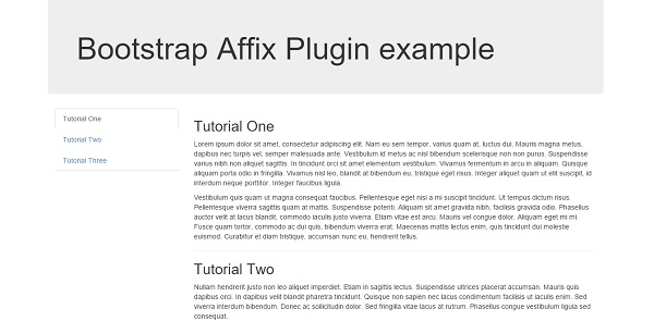
Via JavaScript - 您可以使用JavaScript手动添加元素,如下所示
$('#myAffix').affix({
offset: {
top: 100, bottom: function () {
return (this.bottom = $('.bs-footer').outerHeight(true))
}
}
})
例子 (Example)
以下示例演示了数据属性的用法 -
<div class = "container">
<div class = "jumbotron">
<h1>Bootstrap Affix Plugin example</h1>
</div>
<div>
<div class = "col-md-3">
<ul class = "nav nav-tabs nav-stacked affix" id = "myNav">
<li class = "active"><a href = "#one">Tutorial One</a></li>
<li><a href = "#two">Tutorial Two</a></li>
<li><a href = "#three">Tutorial Three</a></li>
</ul>
</div>
<div class = "col-md-9">
<h2 id = "one">Tutorial One</h2>
<p>Lorem ipsum dolor sit amet, consectetur adipiscing elit.
Nam eu sem tempor, varius quam at, luctus dui. Mauris magna metus,
dapibus nec turpis vel, semper malesuada ante. Vestibulum id metus
ac nisl bibendum scelerisque non non purus. Suspendisse varius nibh
non aliquet sagittis. In tincidunt orci sit amet elementum vestibulum.
Vivamus fermentum in arcu in aliquam. Quisque aliquam porta odio
in fringilla. Vivamus nisl leo, blandit at bibendum eu, tristique
eget risus. Integer aliquet quam ut elit suscipit, id interdum
neque porttitor. Integer faucibus ligula.</p>
<p>Vestibulum quis quam ut magna consequat faucibus.
Pellentesque eget nisi a mi suscipit tincidunt. Ut tempus dictum
risus. Pellentesque viverra sagittis quam at mattis. Suspendisse
potenti. Aliquam sit amet gravida nibh, facilisis gravida odio.
Phasellus auctor velit at lacus blandit, commodo iaculis justo
viverra. Etiam vitae est arcu. Mauris vel congue dolor.
Aliquam eget mi mi. Fusce quam tortor, commodo ac dui quis,
bibendum viverra erat. Maecenas mattis lectus enim, quis tincidunt
dui molestie euismod. Curabitur et diam tristique, accumsan nunc eu,
hendrerit tellus.</p>
<hr>
<h2 id = "two">Tutorial Two</h2>
<p>Nullam hendrerit justo non leo aliquet imperdiet. Etiam in
sagittis lectus. Suspendisse ultrices placerat accumsan. Mauris
quis dapibus orci. In dapibus velit blandit pharetra tincidunt.
Quisque non sapien nec lacus condimentum facilisis ut iaculis enim.
Sed viverra interdum bibendum. Donec ac sollicitudin dolor.
Sed fringilla vitae lacus at rutrum. Phasellus congue vestibulum
ligula sed consequat.</p>
<p>Vestibulum consectetur scelerisque lacus, ac fermentum lorem
convallis sed. Nam odio tortor, dictum quis malesuada at,
pellentesque vitae orci. Vivamus elementum, felis eu auctor lobortis,
diam velit egestas lacus, quis fermentum metus ante quis urna.
Sed at facilisis libero. Cum sociis natoque penatibus et magnis dis
parturient montes, nascetur ridiculus mus. Vestibulum bibendum
blandit dolor. Nunc orci dolor, molestie nec nibh in, hendrerit
tincidunt ante. Vivamus sem augue, hendrerit non sapien in,
mollis ornare augue.</p>
<hr>
<h2 id = "three">Tutorial Three</h2>
<p>Integer pulvinar leo id risus pellentesque vestibulum.
Sed diam libero, sodales eget sapien vel, porttitor bibendum enim.
Donec sed nibh vitae lorem porttitor blandit in nec ante.
Pellentesque vitae metus ipsum. Phasellus sed nunc ac sem malesuada
condimentum. Etiam in aliquam lectus. Nam vel sapien diam.
Donec pharetra id arcu eget blandit. Proin imperdiet mattis augue in
porttitor. Quisque tempus enim id lobortis feugiat. Suspendisse
tincidunt risus quis dolor fringilla blandit. Ut sed sapien at
purus lacinia porttitor. Nullam iaculis, felis a pretium ornare,
dolor nisl semper tortor, vel sagittis lacus est consequat eros.
Sed id pretium nisl. Curabitur dolor nisl, laoreet vitae aliquam id,
tincidunt sit amet mauris.</p>
<p>Phasellus vitae suscipit justo. Mauris pharetra feugiat ante id
lacinia. Etiam faucibus mauris id tempor egestas. Duis luctus turpis
at accumsan tincidunt. Phasellus risus risus, volutpat vel tellus ac,
tincidunt fringilla massa. Etiam hendrerit dolor eget ante
rutrum adipiscing. Cras interdum ipsum mattis, tempus mauris vel,
semper ipsum. Duis sed dolor ut enim lobortis pellentesque ultricies
ac ligula. Pellentesque convallis elit nisi, id vulputate ipsum
ullamcorper ut. Cras ac pulvinar purus, ac viverra est. Suspendisse
potenti. Integer pellentesque neque et elementum tempus.
Curabitur bibendum in ligula ut rhoncus.</p>
<p>Quisque pharetra velit id velit iaculis pretium. Nullam a justo
sed ligula porta semper eu quis enim. Pellentesque pellentesque,
metus at facilisis hendrerit, lectus velit facilisis leo, quis
volutpat turpis arcu quis enim. Nulla viverra lorem elementum
interdum ultricies. Suspendisse accumsan quam nec ante mollis tempus.
Morbi vel accumsan diam, eget convallis tellus. Suspendisse potenti.</p>
</div>
</div>
</div>
<script type = "text/javascript">
$(function () {
$('#myNav').affix({
offset: {
top: 60
}
});
});
</script>
通过CSS定位
在上述两种情况下,您都必须提供CSS来定位内容。 affix插件在三个类之间切换,每个类代表一个特定的状态 - .affix, .affix-top, and .affix-bottom 。 按照以下步骤为上述任一使用选项设置CSS。
首先,插件添加.affix-top以指示元素位于其最顶端位置。 此时不需要CSS定位。
滚动浏览要粘贴的元素应触发实际粘贴。 这是.affix替换.affix-top并设置position: fixed; (由Bootstrap的代码CSS提供)。
如果定义了底部偏移量,滚动过去应该替换.affix和.affix-bottom 。 由于偏移是可选的,因此设置偏移需要您设置适当的CSS。 在这种情况下,添加position: absolute; 必要时。
选项 (Options)
某些选项可以通过数据属性或JavaScript传递,如下表所示 -
| 选项名称 | 类型/默认值 | 数据属性名称 | 描述 |
|---|---|---|---|
| offset | 号码| 功能| 对象Default: 10 | data-offset | 在计算滚动位置时偏离屏幕的像素。 如果提供单个数字,则将在顶部和底部方向上应用偏移。 要提供唯一的底部和顶部偏移,只需提供一个对象偏移:{top:10}或offset:{top:10,bottom:5}。 需要动态计算偏移量时使用函数。 |
